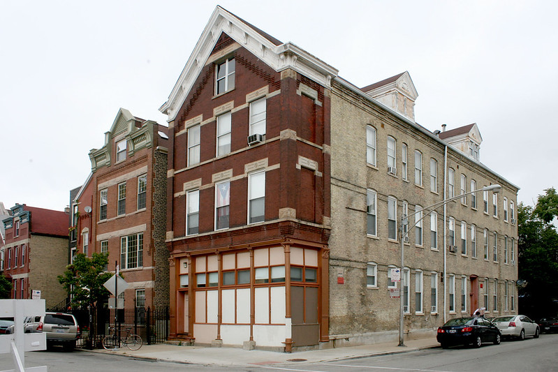
1048 N. Marshfield Ave. at Cortez
Robert Venturi famously grouped the ornamentation of buildings into two types: “The Duck”, a building with an iconic and usually literal exterior shape (named for a souvenir shop on Long Island built in the shape of a giant duck), and “The Decorated Shed”, a constructed box with ornamental systems applied to it – exemplified by the Gothic cathedrals with their huge ornamental facades standing in front of vast warehouses of religious space.

Our Lady of Sorrows Basilica, 3121 W Jackson Boulevard
Nearly all common Chicago architecture falls squarely into the second group, to the extent that the city’s architecture is often a structural system with a layer of cladding and ornament applied to the front, visible in the most literal (and sometimes comical) of ways. My own shorthand for these is “Wallpaper Buildings”.
2900 N. Mildred Avenue at W. George Street. This is the back and side of a massive U-shaped courtyard apartment. At left, the facade continues on minus the structure without missing a beat, adding one last bay to shelter the rear stairs from the street. We are not meant to notice the disconnect.
When you see it, you’ll see it everywhere. It makes you think about the nature of a building, of construction and design. Is architecture a frame with an elaborate weatherproof sculpture in front of it? Is it still architecture if you remove the frame? What happens when the sculpture ceases to be sculptural, or ceases to have mass, or ceases to have decoration? The story of the Wallpaper Building, its evolution over the years, is the story of architecture itself.
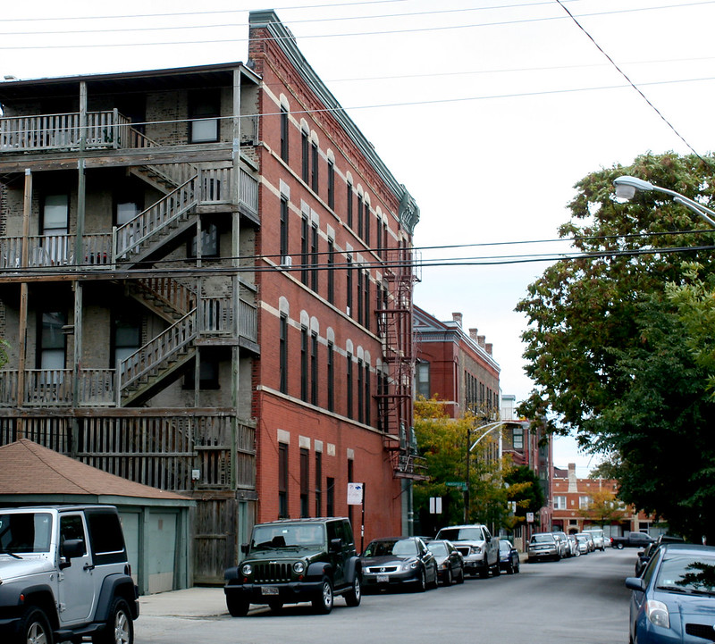
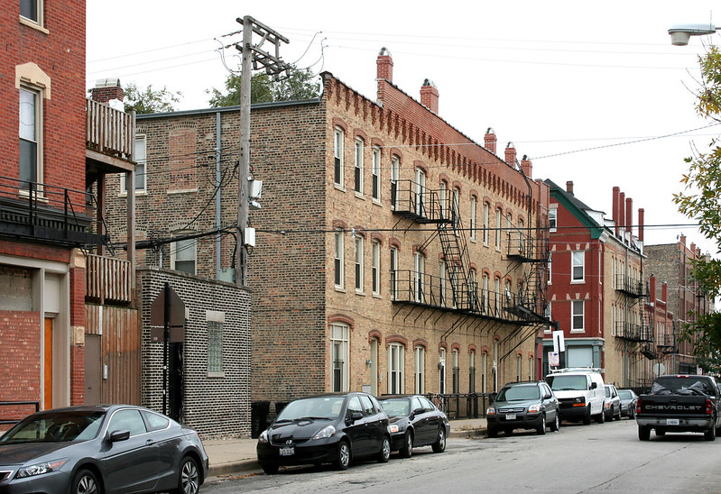
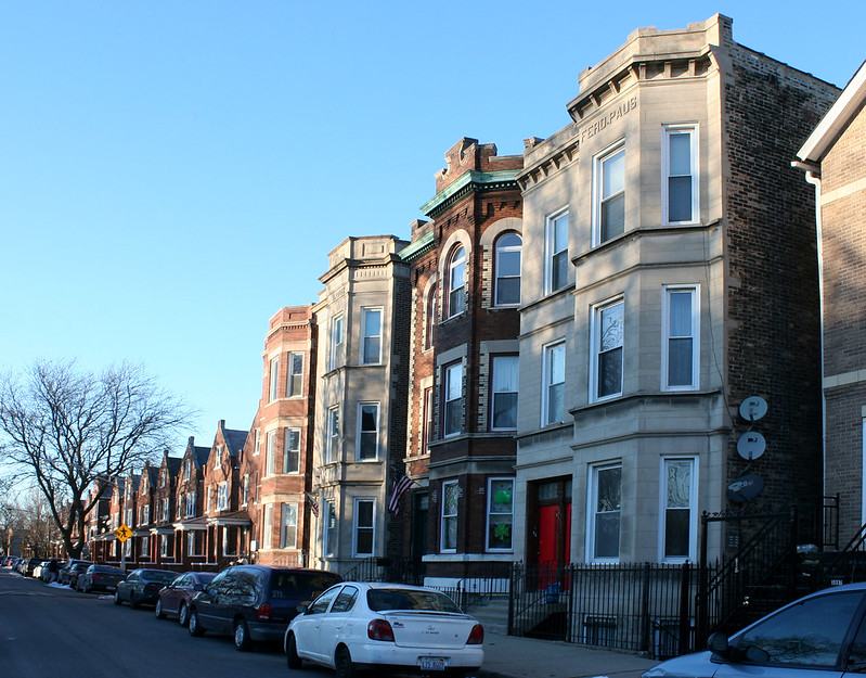
Most Chicago buildings are meant for urban settings, where the front facade is more visible than the sides or back. As a compromise between cost and quality, builders would load up the front facade with higher-grade materials and most if not all of the building’s ornament. The sides and alley-facing walls usually were built of beige-colored Chicago common brick, a softer, cheaper, lower-quality material than the highly finished brick used on the front.
1363 N. Bosworth. This building does a double downgrade. The front facade (above) is the most heavily composed side, with stone and heavily articulated finish brick; the side comes second, with a lesser grade of brick but still ornamented with considerable corbeled brickwork; the utterly plain backside (below) is done in Chicago common brick.
Sometimes, though, the sides and back weren’t nearly as invisible as the designer would like to imagine. My favorite example is in Buffalo, New York (where Louis Sullivan’s towering Guaranty Building has two insanely ornate sides facing the streets… and two completely plain brick wall sides facing the alleys) but there are plenty of similar instances in Chicago. The idea, obviously, is that a tall neighbor would eventually cover up the sides not facing the street. Sometimes it might have even worked out that way.
And sometimes it didn’t.
A view north from the Wilson Red Line stop in Uptown shows no less than 5 buildings with decorative facades and unornamented sides.
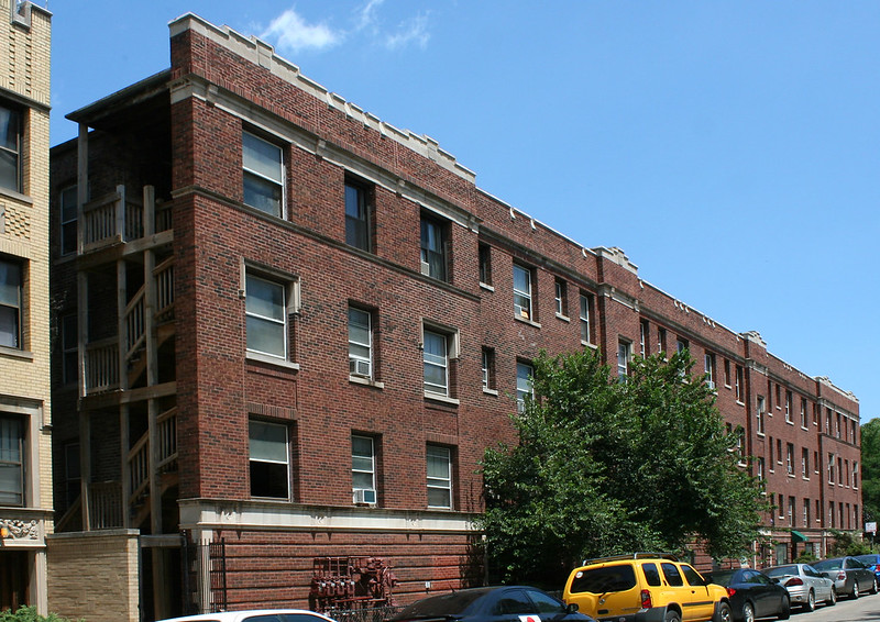
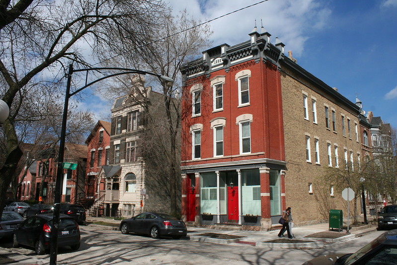
The design strategy was not limited to low-budget buildings. Some of the city’s most ornate and lavish buildings switch over to cheaper common brick on the sides. Many feature bay windows projecting from the common brick sides, a pointed acknowledgement that the sides are indeed visible and always would be.
2424-2428 N. Geneva Terrace, Lincoln Park
1547 N. Dearborn Parkway, Gold Coast – an 1891 mansion by architect August Fielder, still a private residence. Yours for only $13.75 million!
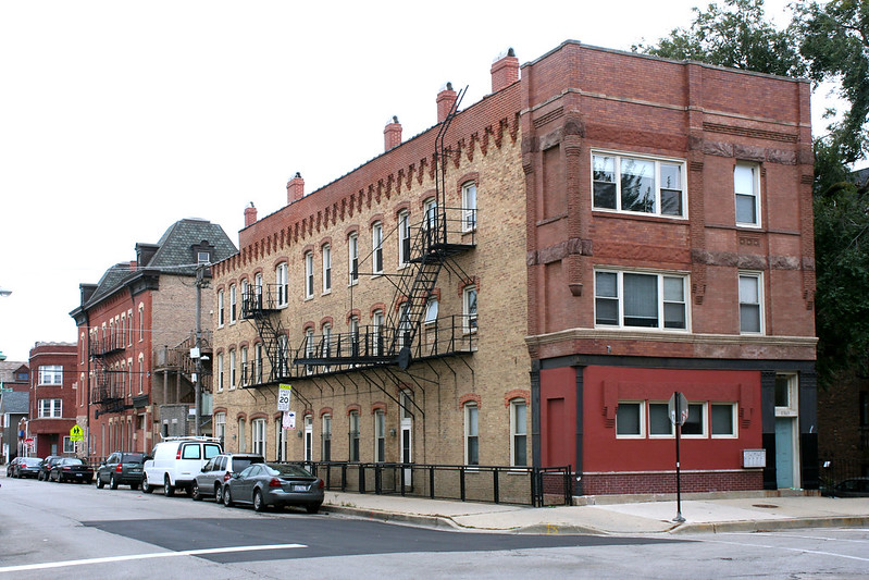
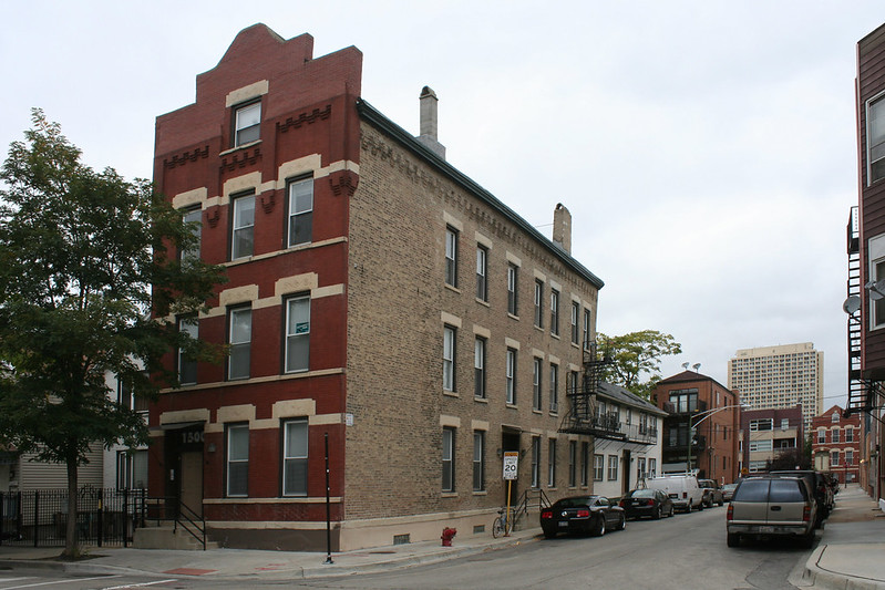
The approach was more successful with mid-block buildings on neighborhood streets, where a builder could count on having similarly scaled neighbors only a few feet away from his sidewalls.
3000 block of S. Bonfield Avenue, Bridgeport
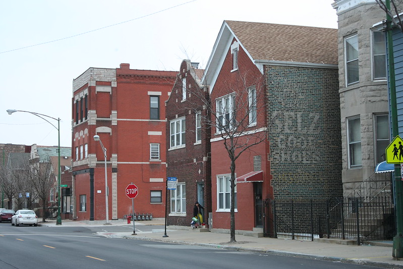
2700 block of S. Wallace Street, Bridgeport. The exposed wall bears a faded ghost ad for long-vanished Selz shoes brand, possibly a reference to the Selz Good Shoes Lady.
At some point, this common design response changed from an adaptive strategy to a default setting, used even when it didn’t make a lot of sense. Hence the full-lot houses in many neighborhoods with their plain brick sides exposed for all the world to see. A more cohesive design approach might have found a middle-grade material to use on all sides while evening out the cost between expensive front facade brick and cheap common side brick, or just left off the front facade upgrade altogether, since in these cases it only serves to call out the lower quality materials adjacent to it. But builders of the time just weren’t rolling that way. Why? I have only guesses.
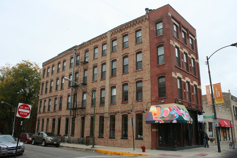
1329 W. Chicago Avenue at Throop, West Town
1500 N. Walton Street, West Town
1301 N. Greenview Avenue at Potomac, West Town – Chicago
All this stuff drove the early Modernists crazy. They couldn’t stand the notion of buildings having hierarchy, fronts and backs, important sides and secondary sides, decorative skin and hidden structure. To the most dogmatic among them, these things reflected the hierarchies of unjustly stratified societies, the moral decay that precipitated the First World War.
Today, of course, we take a different view. The ornate facade is seen as a gracious gesture, a polite and noble contribution to the public space of the street. Decorating the front of the building is about living up to social norms and expectations, treating your neighbors well, showing respect for the people around you, saying “hello”, enhancing the public space.
1901 N. Bissell Street at Wisconsin, Ranch Triangle – Chicago
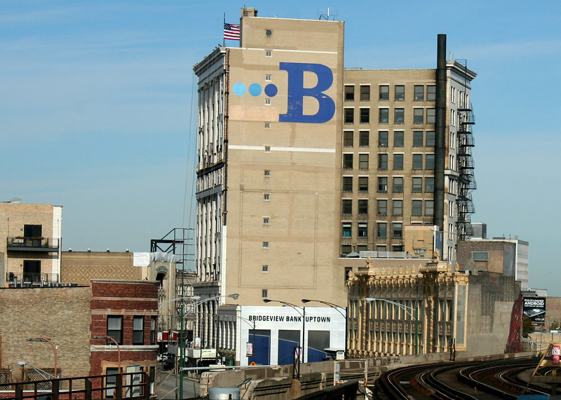
It does still raise the question, though: why is the person riding the Red Line or walking through the alley somehow less deserving of social graces than the person on the front sidewalk? Is the Bridgeview Uptown Bank building a gracious neighbor, or a dowager in a hospital gown, with the backside hanging open and flapping in the breeze, mooning the rest of the world?
The disconnect between the artistically designed components of a building and the bulk of its mass was a driver of Modernist philosophy, as its young masters sought to design buildings as complete entities – respectfully and properly clad on all sides, among other things. There would be no hidden back; all sides of the building would be forever visible as it sat on its site in splendid isolation.
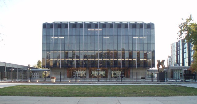
University of Chicago D’Angelo Law Library, Eero Saarinen, 1958
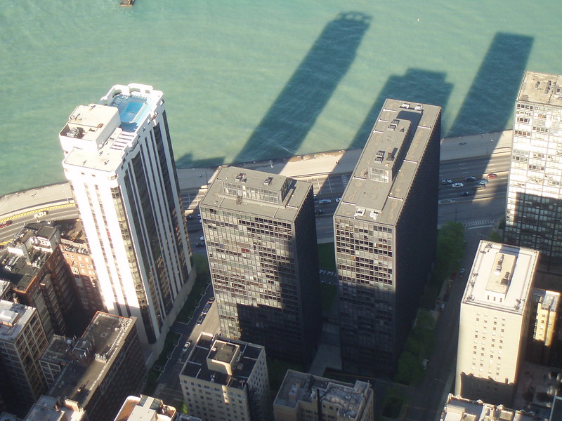
The Esplanade Apartment Buildings at 900-910 Lake Shore Drive, Mies van der Rohe, 1956 – essentially an expansion of his famous 860-880 Lake Shore Drive Apartments from 1949, next door.
Structure and cladding would become one. The facade ceased to be a thing of mass, of sculpture, of elaboration, of separation; it became a mere cladding, a pattern, an expression of the structure that lay just beneath it.
Pre-war buildings are sometimes subjected to “facadectomies”, with everything but the decorative front wall torn down and a new structure erected behind the old facade. It’s physically possible because old masonry facades are structural entities, capable of carrying their own weight even if they weren’t structurally integral to the building behind them.
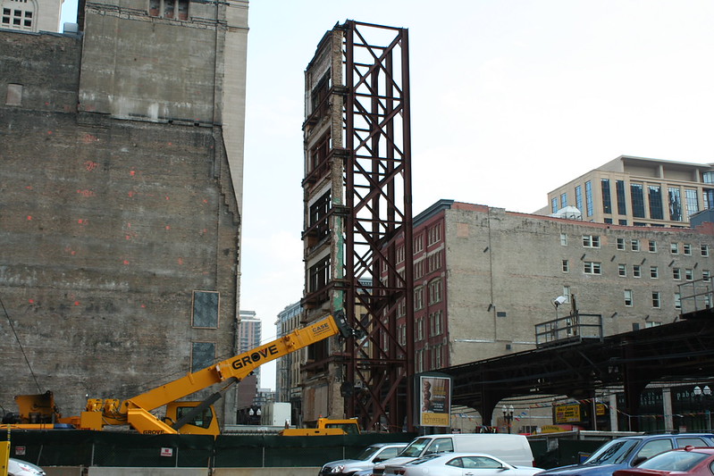
The facade of the Fine Arts Building Annex, 421 S. Wabash Ave, suspended in place after the rest of the building was demolished in 2010. It was subsequently had a new Roosevelt University building grafted onto it from behind.
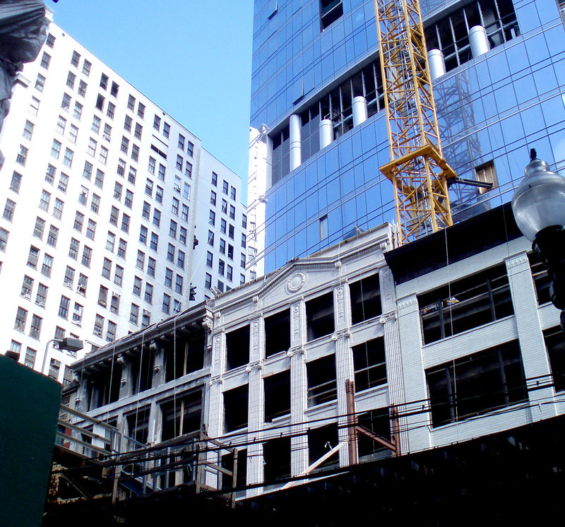
Group facadectomy on the 000 block of S. Wabash Avenue, 2008
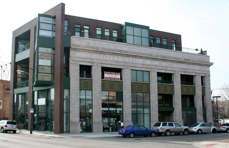
Citizens State Bank of Chicago, just off Lincoln Avenue, creatively remade into loft apartments circa 2007.
Chicago’s had its fair share of them, though usually the city’s ethos is just to knock everything the hell down and start over, because, hey, history don’ make money, know what I’m sayin’? An anyway, all dem old things is old, y’know? (By comparison, stronger preservation laws mean the practice is absolutely rampant in downtown Washington DC, where almost no pre-war buildings remain in their original state.)
No orthodox Modernist building could survive such an operation. Take down the building and the skin has to come with it.
The IBM Building – 330 N. Wabash Avenue, Mies van der Rohe, 1969
You do not tear down the building while leaving behind a Modernist facade; if you were interested, though, you could rip off the facade while keeping everything else, and transform the building into something different. This possibility was painfully rendered evident during the recent demolition of Prentice Hospital.
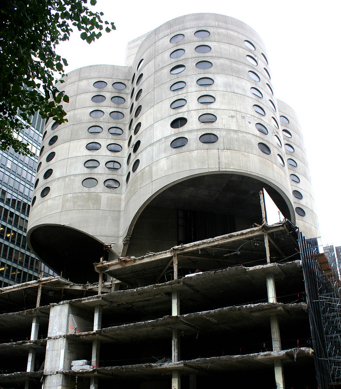
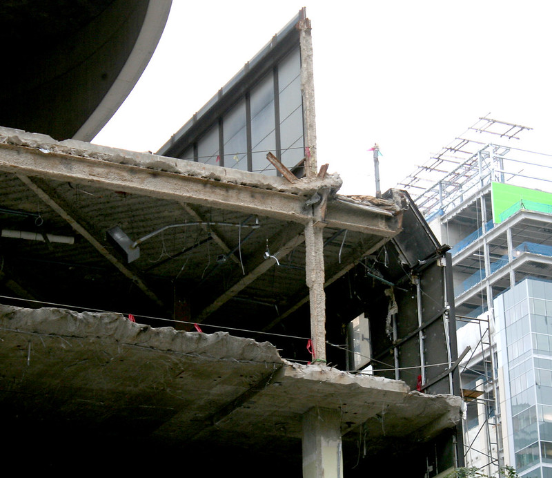
The “pedestal” portion of Prentice was a steel and concrete frame supporting a thin, non-structural outer skin.
However, late Chicago Modernists, as I’ve discussed before, weren’t always adherents to orthodoxy. Finish brick on the front, common brick on the side – step away from the Loop, and the old patterns rolled right on into the 1960s.
1111 W. 47th Street, Back of the Yards – Chicago
There’s beauty to be found in both approaches, and some part of me admits: a neighborhood street with a solid wall of elaborate facades is a lot nicer than a more middling approach. Who cares about those side walls anyhow? Some of Chicago’s most beautiful streets have been created this way. It’s not orthodox or pure… just pretty. Pleasant. Human. “Pretty” may sound vapid, but it’s hard to argue with “human”.
Modern construction techniques, however, have come down firmly on the side of the structure-and-skin approach. One might say that the thin-skinned buildings of today are more covered in something akin to wallpaper than ever before – layers of thin and varied materials, each serving a particular function – sub-structure, moisture protection, framing, insulation. To build a structurally self-supporting facade – a facade with significant mass, heft and depth – requires a massive material, like stone, brick or concrete. Stone is too expensive to transport, cut and lay up; brick has been reduced to just another facade material, just another form of thin skin. Nobody’s managed to use concrete block in a way that doesn’t look hideously ugly, the lessons of Frank Lloyd Wright’s textile block phase apparently having been forgotten.
The last stand of the facade-as-mass approach could be found in Brutalism, since poured-in-place concrete is the last massive material that can be affordably transported. The style died out with the 1970s, when architects found that almost nobody liked the look of exposed concrete (except architects). It is currently one of the most hotly contested architectural styles around as its buildings age into their 40s and 50s, their structural skins flaking and spalling in the weather; beating up on it online is currently in vogue with folks everywhere.
Chicago never had many Brutalist buildings, and as of 2014 it has one fewer still.
 Most significant remaining examples are likewise Bertrand Goldberg designs.

The Vic Theater, 3145 N. Sheffield Avenue, Lakeview; architect John Pridmore, 1912
With the passing of Brutalism, the victory of attached skin over embedded mass is complete; the Modernists have had their way – though it was via the economies of materials and labor, rather than a triumph of philosophy. The Wallpaper Building as described above is now a relic of a bygone age.