Madison Street West, Part 3: Slip Coverin’ Away

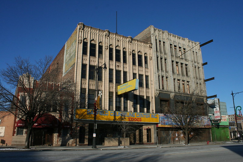
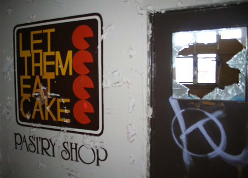
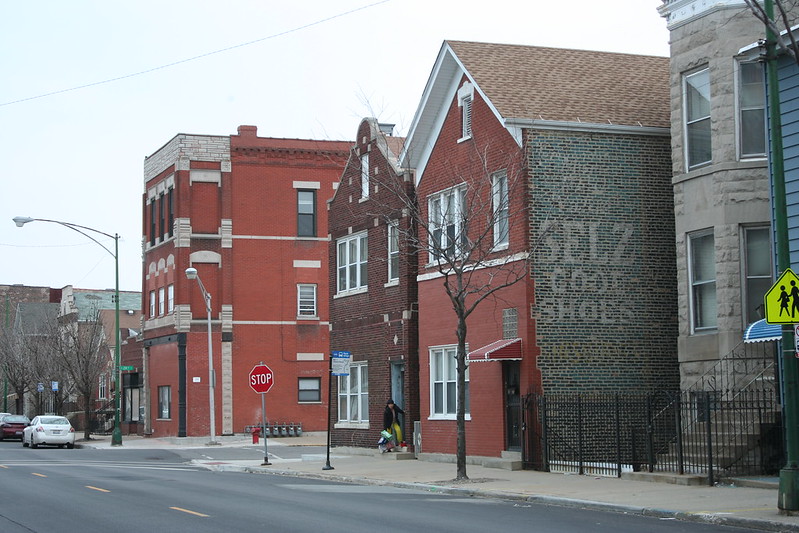
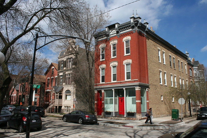
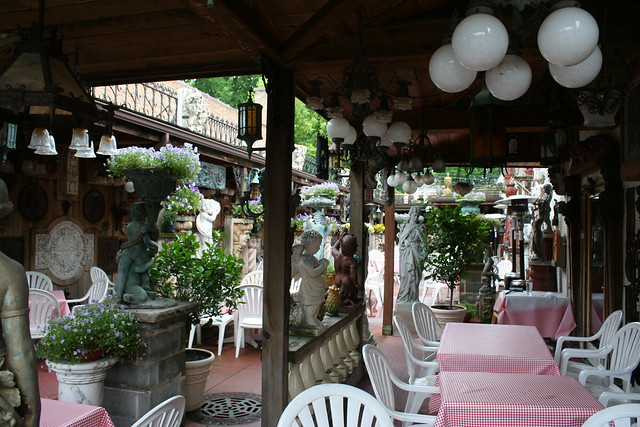
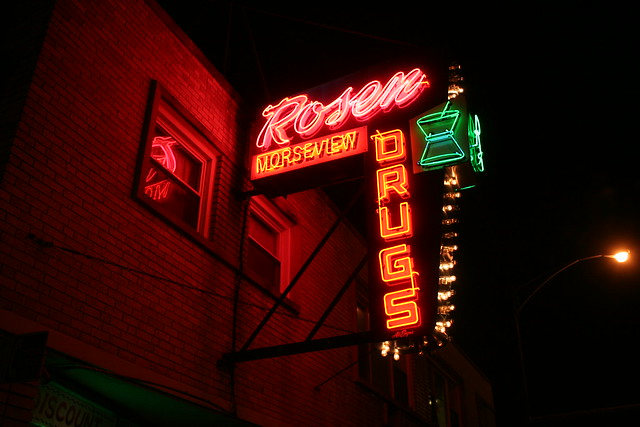
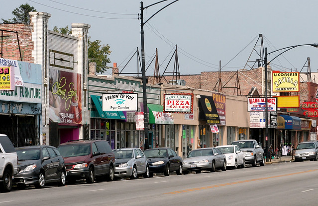
Any respectable commercial street has gone through some cycles of renovation and rejuvenation. In the decades after World War II, that often meant putting a new facade on your building – sometimes tearing off the old completely, but sometimes taking a cheaper route and just hanging something new right on top of the old, an approach known as the slipcover.

West Madison is no exception; some of its seemingly unremarkable storefronts have quite a bit of history behind them.

IMG_4736a

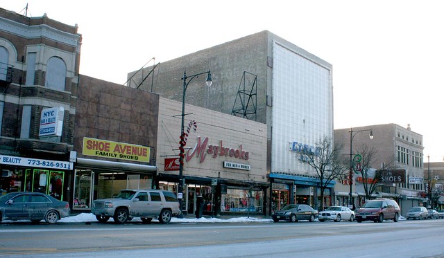
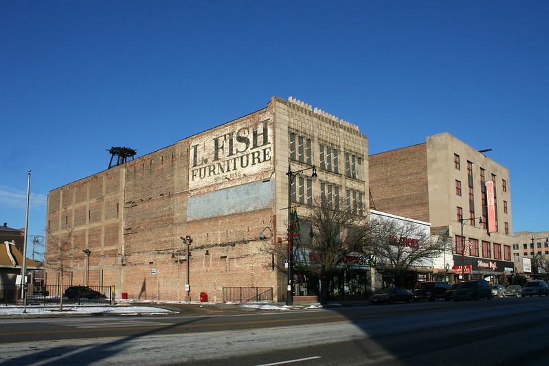
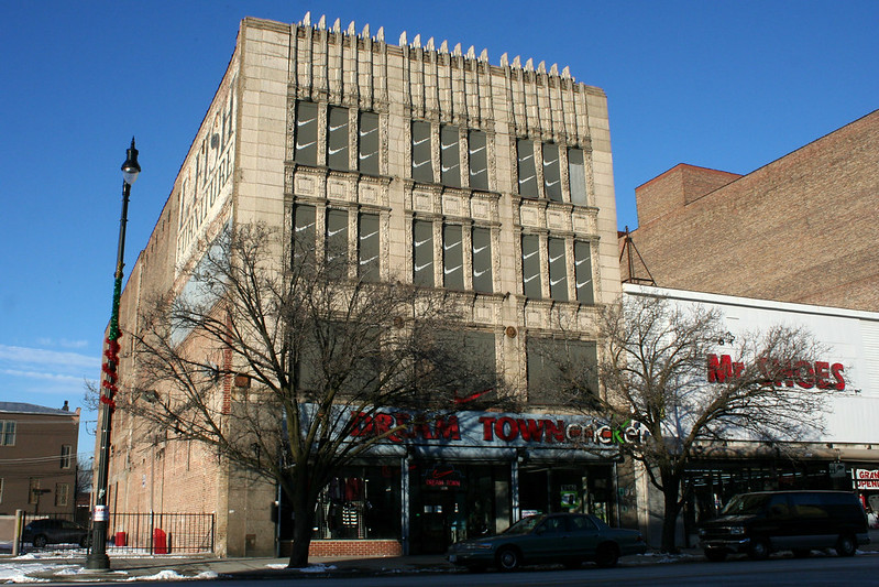
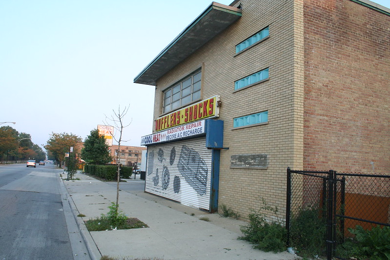
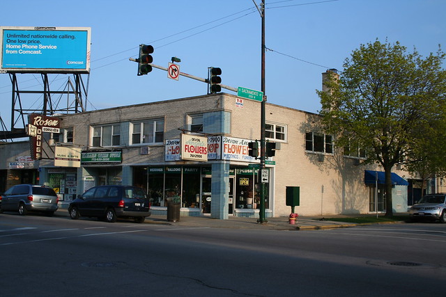
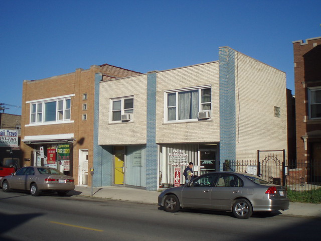
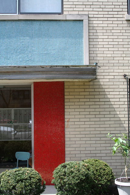
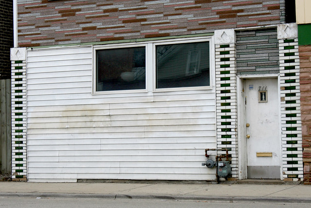
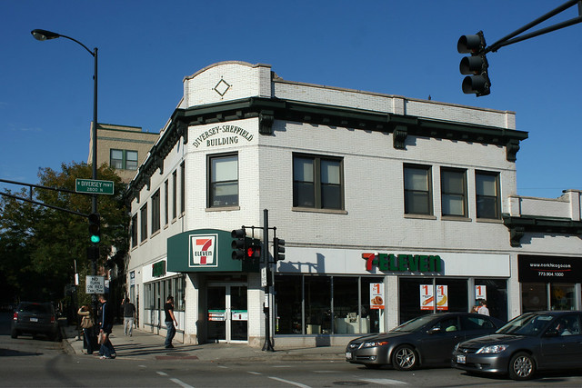
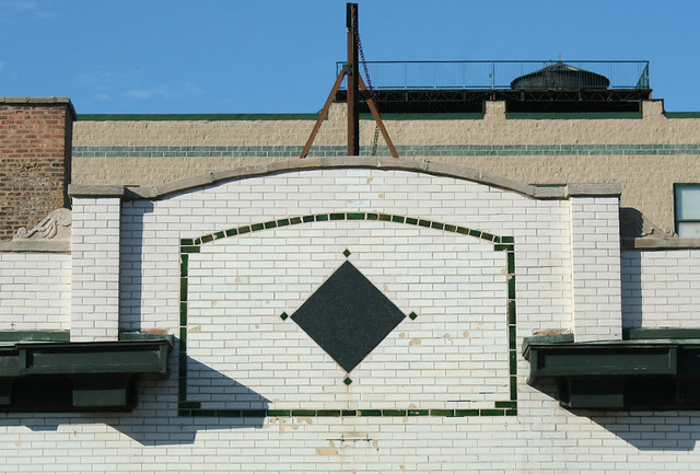
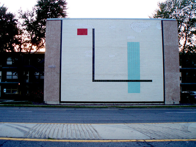
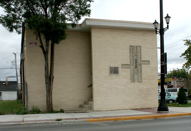
4019 W. Madison Street (Shoe Avenue): Two upper floors hide behind that checkered brown granite facade.  A parade of businesses has occupied the building, sometimes more than one at once. Articles from 1941 and 1987 both mention people listing it as their residential address, as well. Businesses I could find, and dates they were definitely there, include:

  • A. Rost and Son shoe store, 1917-1920
  •  Wormser Hat Store, 1930-1940
  • York Women’s Apparel, 1943
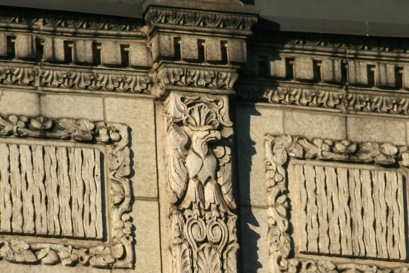
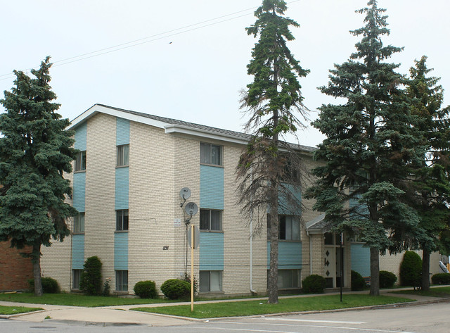
  • Jerome Millenery Store, 1948-1962 – the building was renovated by architects Lowenberg & Lowenberg in anticipation of this store’s opening, giving it its current Modernist facade. The upper floors used for making women’s accessories by hand, seemingly run as a separate business, the Una Harvey Shops. Lowenberg & Lowenberg was a prolific architectural firm whose successor is still in business today; the company also worked on the iconic University Apartments in Hyde Park, several sumptuous high rise apartment buildings, the Colony Theater on 59th Street, and a similarly radical recladding job on a building right near my old home in Rogers Park.
  • Two Legs Inc. – 1953
  • Today: Shoe Avenue Family Shoes.

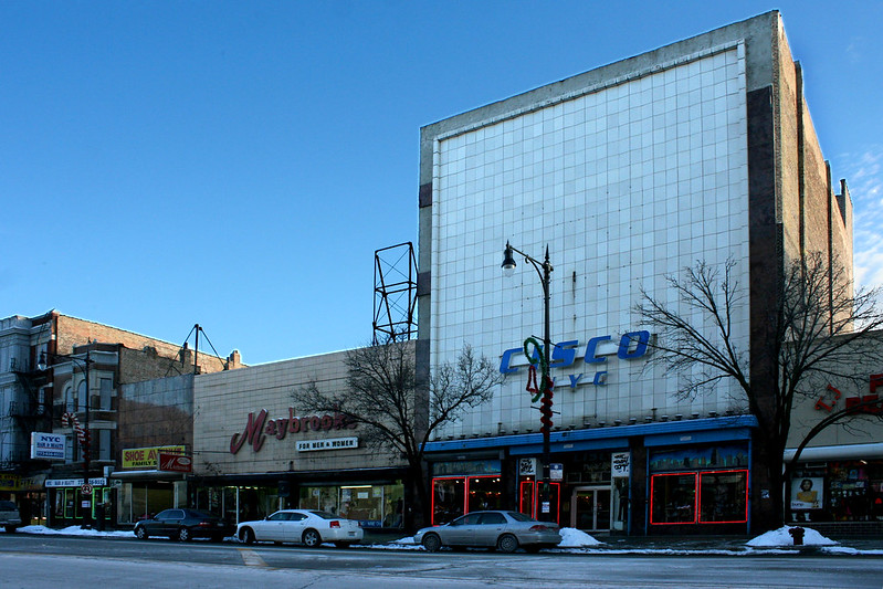
4021 W. Madison Street (Maybrooks) – a two story building, either built or re-built in 1951. A one-story garage and store – visible in the postcard below – stood on the site originally.

  • Keen and Howe clothing store – 1915
  • E. Newman Paint Company – 1924
  • A. Rost & Son – 1927 (moved from next door!)
  • Father & Son shoe store – 1942-45
  • Lynn Niles Shoes – 1946-1950
  • Bond Clothing Store – opened Nov 30, 1951; operated at least through 1968. Their opening seemingly triggered the replacement of the original structure with the present one.
  • Maybrooks – For Men and Women – 1986-2011
  • Present: YOLO Ladies Ware & Shoes, since ca. 2012


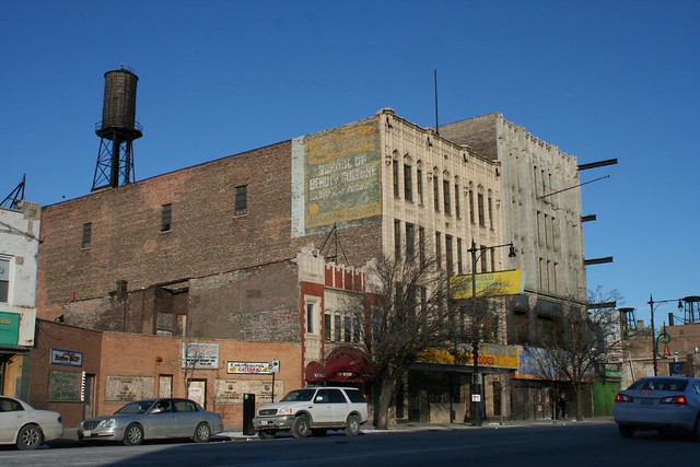
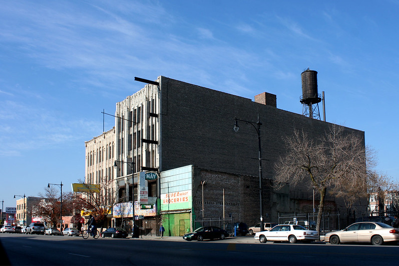
4027 Madison Street (aka 4025-29 W. Madison) –  James Burns, architect; Henry Ericsson Co., general contractor

4025-29 W. Madison
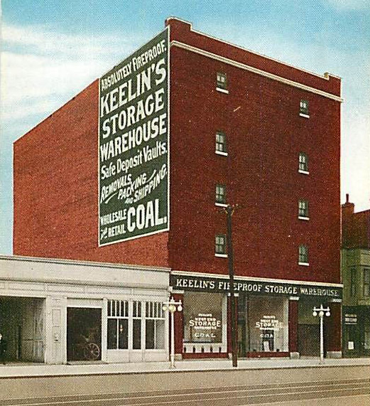
Postcard view – compare with the previous photo

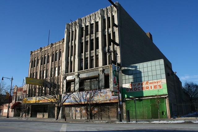
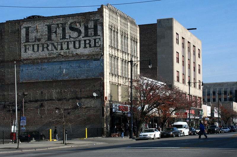
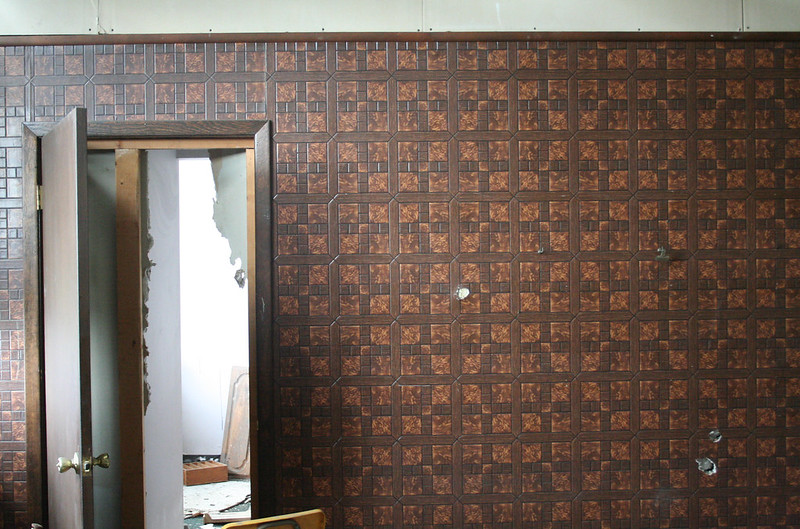
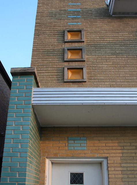
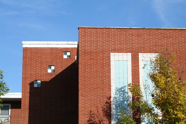
Towering above the 1- and 2-story stores around it, this blank-walled hulk was designed in 1910 and built by 1911, for the Keelin Fireproof Warehouse Company. On the east party wall, a faded ghost sign still announces the original occupant with a barely-legible “Keelin’s Storage Warehouse”. Fireproof storage warehouses are a whole genre of buildings in Chicago (and the topic of a future post). Like most, this one – also known as the West End Storage Warehouse and the Keelin Brothers Warehouse – was built of reinforced concrete, with steel doors and minimal windows (illuminating only the corridors), and a facade of pressed brick. It’s among the simpler of its kind, with its already minimal ornament now lost to age and a mid-century rehab that covered the facade with a grid of square tiles.

West Madison Street, Chicago

The Keelin brothers were a prominent business family with their hands in coal and grain interests. Two of the brothers were indicted on conspiracy and fraud charges in 1921. Architect James Burns (ca. 1858-1933) was a Chicago practitioner, active from the 1890s into the 1920s, and the designer of various houses, flats, stores, factories, and most prominently, several significant Catholic churches: St. Columbanus on E. 71st, St. Gertrude’s in Rogers Park (Burns’ neighborhood), and St. Keven at Torrence and 105th.

In 1912, the address made small-headline news when a 14 year old boy died in the building while trying to exit its elevator.

Gold Point Hosiery Stores leased the ground floor in 1928 and converted it into a retail storefront; they remained there at least through 1930. In 1947, the building was sold, and O’Conner and Goldberg leased the entire building, opening a new store at the location which lasted from 1949 into the 1960s. This major turnover was likely the point at which it gained its  new Mid-Century facade of square panels.

In recent years, the storefront has been home to Cisco NYC, a high-end clothing and shoe store specializing in hip hop culture. Cisco NYC got some unwanted attention in late 2014 when it became the latest victim of a string of smash-and-grab robberies happening all around the city. A gang of thieves used a mini-van to smash through the store’s gated front entrance at 4am on a November night; 20 masked robbers poured into the store, stripped it of thousands of dollars worth of a single brand of designer jeans, and escaped within three minutes. Despite the devastating loss, the store was soon open again and joined in a local Madison Street tradition of opening on Christmas Day.


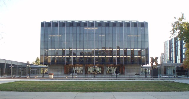
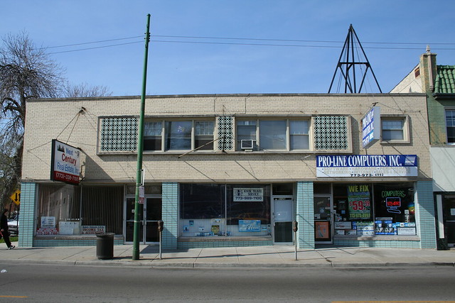
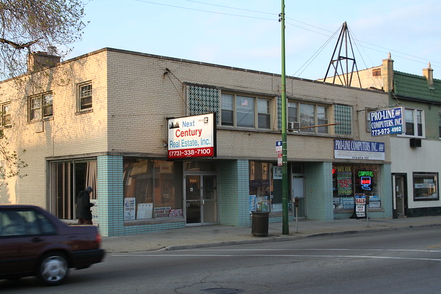
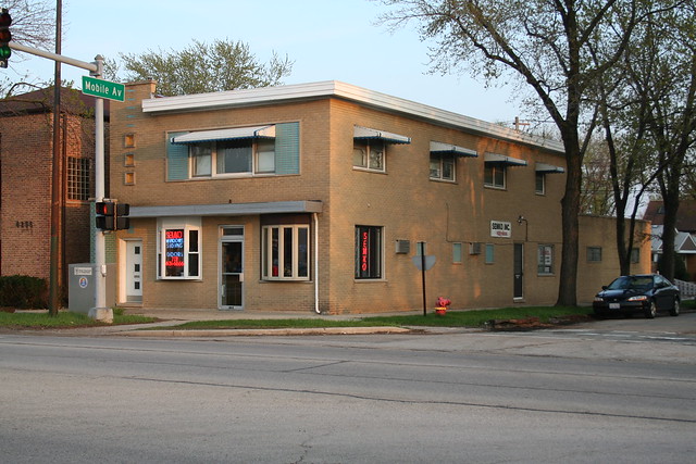
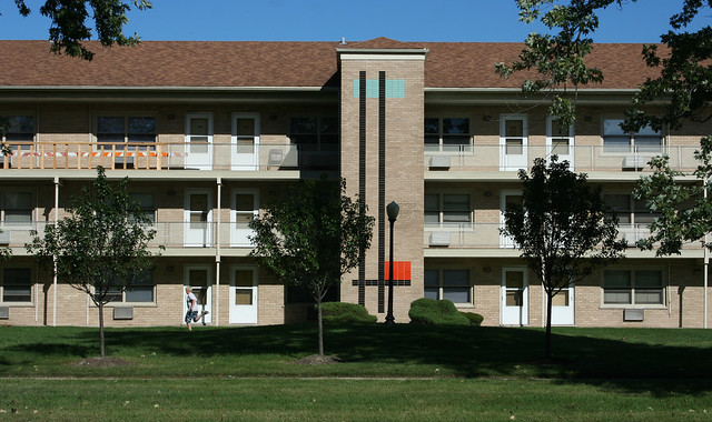
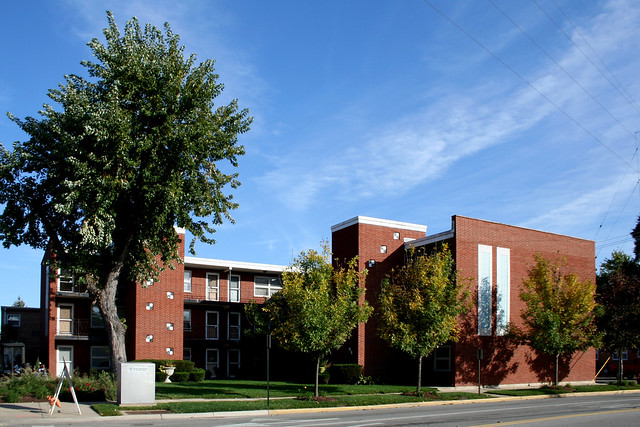
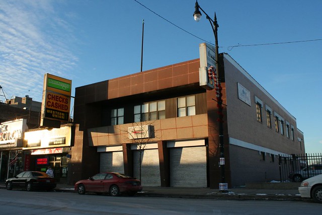
3932 W. Madison (Catholic Charities)

West Madison Street, Chicago

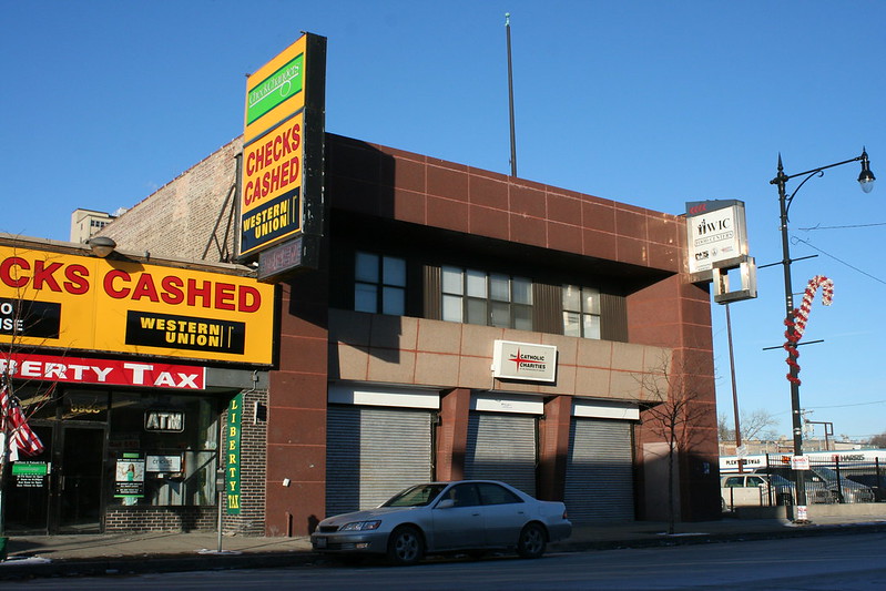
Appears to have been built in the 1920s. Today it’s covered in polished granite panels, a massive frame surrounding 2 stories of windows with a sheltered balcony, and accented with a two-part stainless steel sign. 65 years after the new facade was added on, it still looks terrific.

  • 1925-1930 – Apex Stores (refrigerator dealers)
  • 1936-1963 – Apollo Savings and Loan, who remodeled the building into its current form. Grand re-opening for the renovated structure was November 16, 1950. Apollo moved downtown in 1963, before imploding in 1968. They sold the building in 1967.
  • 1967 – Headquarters and later Credit Union of the Christian Action Ministry
  • Today – The Catholic Charities of the Archdiocese of Chicago / WIC Food CentersIMG_4786


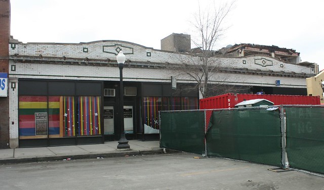
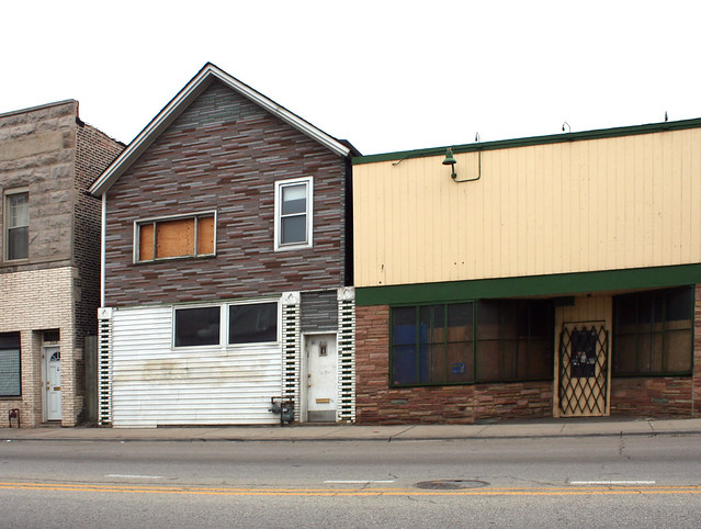
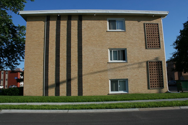
4126 W. Madison Street (Green Star Groceries)West Madison Street, Chicago

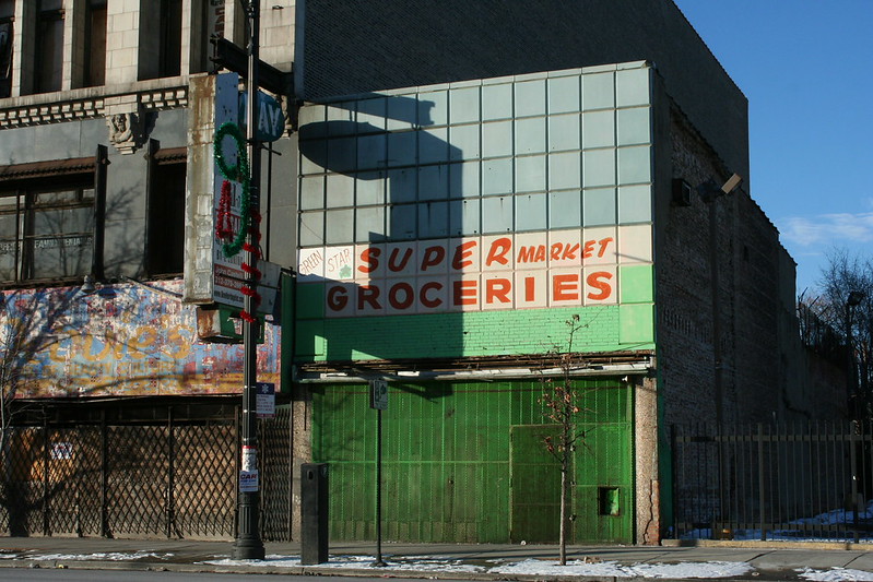
This sad little two-story building was built around 1927. It’s barely visible in its original form in the background of this photo of the Marbro Theatre, which stood next door until its 1964 demolition. With its pale green color, the slipcover screams early 1960s.

  • 1926 – Fignter(?) Scott Co. (furniture finishing? hardware?)
  • 1930 – Western Radio & Electric Stores
  • 1932-34 – Lee Radio Stores / Lee’s Radio Shop / Lee’s Radio & Refrigerator Store
  • 1935 – Straus & Schram (Lee’s had moved a few doors away. Or it’s a typo.)
  • 1938-42 – Singer Sewing Company
  • 1956-63 – Little Dutch Mill Candies
  • Most recently – Green Star Super Market Groceries

Due to a text resolution issue (4126 looks a lot like 4128 to an OCR scanner), this address is almost entirely overshadowed in the Tribune archives by the Spiegel store that operated next door.


4034 W. Madison – City Sports Shoes & Sportswear

West Madison Street, Chicago

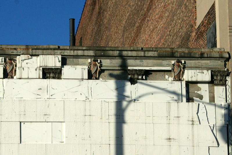
Sometimes slipcovers are just a flagrantly bad idea – they make a building look worse to begin with, and that’s before they start falling apart and exposing bits of the vastly superior facade they hide. Such is the case here, where column capitals and ornate shield emblems in colored terra cotta have forced their way out from beneath a plain grid of rectangles, painted over in white.

  • 1934-36 – Grossman’s shoe store
  • Burt’s shoe store – Burts – then a subsidary of Edison Brothers Stores – opened an outlet at this location in 1937 with a $25,000 “modernization program”, which seems too early to have been the date of the slipcover. In 1956 the chain changed its name to Bakers, in keeping with their shoe line in other cities, and continued on here through 1962.
  • 1971 – Mary Jane Shoes
  • 1977 – A.S. Beck Shoes
  • Today – City Sports Shoes

And finally, a note about some of the trends I’ve seen in researching these places. First is turnover – many stores only last a few years before vanishing. Some of it is just the economy – it’s almost guaranteed a small store present in 1929 will be gone by 1932, wiped out by the Depression. Similarly, many stores had good long runs from the late 40s into the 1960s or early 70s, boom years for the city. Even then, many beloved retail institutions were really only around for a couple of decades.

Second is consistency – if a storefront started off as a shoe store, it was very likely to stay a shoe store, even as ownership and names changed repeatedly. Clothing stores stayed clothing stores – Cisco NYC, for example, is continuing an almost 90 year tradition of clothing sales in that space.

Third is the abruptness with which a business can vanish. A tempting assumption is that the advertising budget was the first thing to go when times went sour. Many places ran weekly display ads for years – until suddenly they’re just gone from the Tribune, no going out of business notice, no clearance sales, no nothing. Just – poof! Gone!


Research log for Keelin’s Storage Warehouse:

  • 1910 – The American Contractor, September 10 1910 p. 30 col. 1 – notice of drawings on file and bids being taken
  • 1912 – Tribune article, Sept. 20
  • Assessor: 1914; CityNews: 1947
  • Appears in “The Transfer and Storage Directory” of 1916.
  • Sold: April 13 1947 article (erroniously gives date of construction as 1900)
  • Gold Point Hosiery Stores – leased Feb 1928 (real estate transaction article); display ad April 9 1928 (4027), through 1930
  • O’Conner and Goldberg – short article Sep 1 ,1949; display ads through 1966
  • 4126: Cook County Assessor puts the date at 1932; CityNews Chicago says 1927; Realtor.com says 1926.


Madison Street West, Part 2: The Gothic Block

On the 4100 block of West Madison Street, a trio of commercial buildings in the Gothic Revival mode:

4100 W. Madison Street

From left to right, they are:

  • 4138 W. Madison Street – most recently Westgate Funeral Home
  • 4132 W. Madison Street – Garfield Counseling Center
  • 4128 W. Madison Street – vacant and covered in an melange of overlapping signs

The little two-story funeral home is quite overshadowed by its larger neighbors, but harmonizes perfectly with them. It is Tudor Gothic by vintage, with a two-toned material pallet of red brick and cream terra cotta. Th ornament includes faux quoins of stone at the windows,  crenelations along the roofline, and tiny blind arcades of cusped arches in terra cotta, along the outer piers and above the main windows.

4138 W. Madison Street

Opened by 1927, the funeral chapel here did a steady business for five decades. In the 1970s, the business there was the Baldridge Funeral Home; in the 1990s, the Westgate Funeral Home, whose signs still adorn ground floor canopies. The commercial portion of the building is shuttered today. The narrow building runs the full depth of the block; the Cook County Assessor’s database says it contains three apartments and a garage – where it all fits is a bit of a mystery.

4100 W. Madison Street

Next door is 4132 W. Madison Street, a four story building with a Gothic-ornamented facade in creamy terra cotta. Four slender piers, capped by faux statuary niche canopies, demarcate three bays. Double rows of blind pointed arches fill the spaces between windows and march across the roofline, giving the facade a busy, heavily shadowed appearance. The original ground floor design is long lost.

No definitive word on the architects or date of construction, but 1928 is a good bet. That’s the year  that Joseph Marschak Sons Furniture began appearing in ads with this address. By 1948, it was owned by the Amber Furniture Company – who had a long run in the building next door – and by 1951, it had been taken over by Baer Brothers & Prodie. They in turn went out of business in 1967; the building housed the Erie Clothing Company for a few years.

West Madison Street, Chicago

By 1973, it was occupied by Debbie’s School of Beauty Culture. In 1980 the school became a subsidiary of Johnson Products, sellers of cosmetics and hair care products, and began developing its own line of cosmetics. The school would later expand to five locations around the city and eleven more in other states. The company eventually moved to Houston, but their fading green-and-yellow painted sign still remains on the building’s brick party wall.

IMG_4693

By 1987, the building was home to the Garfield Counseling Center, an outpost in the struggle against the drug abuse which had swept over the neighborhood; in the early 90s, it ran a group home for women trying to break drug habits. The agency operated from at least 1987 and continues today.

IMG_4700a

4128 Madison has the most complex decorative program of the trio. Its surviving second floor facade gives some hints as to what the first floor might have originally look liked like, with ornamentally framed windows. Above, three floors of Gothic terra cotta with a faint greenish tint rise to the sky. Four carved bosses in the form of grumpy looking grotesques support the four major piers. The piers are capped with pinnacles, seemingly truncated at the roofline. The spandrel panels, however, are where the real action is: they are laden with heraldic shields, fleur-de-lis panels, a yin-yang shape I’m going to tentatively call a doublefoil, and bits of floral carving.

4100 W. Madison Street

Along the roofline runs a row of large, elaborate blind trefoil or cusped arches adorned with crockets, capped with a row of smaller blind trefoil arches, further capped with a twin parapet cap with a shield motif. It’s quite an extravaganza of terra cotta.

4100 W. Madison Street

Again, my research came up empty on date, architect, original occupant, and anything about that long-lost vertical sign; I’m taking a guess of 1929.

ETA: the demolished Marbro Theater was nearby – and so Cinema Treasures offers up a distant view of this block when new. The giant sign on this building isn’t legible; behind it, a smaller, similar sign for Marschak Sons Furniture next door can be seen.

The building first appears in the Tribune through 1930 ads for Straus & Schram, a furniture refurbishing business. Straus-Schram was bought out by Spiegel in 1945, who promptly opened a new home store at this location on October 13 of that year, complementing their clothing store down the street at 4020 W. Madison. Spiegel was a heavy advertiser who ran weekly ads for years, selling televisions, washers and dryers, sofas, and all manner of mid-century furniture, until quitting the retail furniture business in 1954 to focus on their mail order catalog sales.

Amber Furniture was the next occupant, taking over by 1955. Their run didn’t end well; in 1961, a public auction was held of all the store’s inventory and equipment.  The vacant storefront was used as a Civil Defense information center for a while that year, at the height of Cold War nuclear fears, distributing information on “first aid, home protection, fallout, and other survival information.”

The store was still vacant in December 1963 when a team of robbers entered it, cut a hole through three and a half feet of brick and concrete walls into Baer Brothers & Prodie next door, and stole 750 suits. The robbers were caught in the act when a security patrolman spotted one of them in the store, prompting an escape attempt and police pursuit that ended with a car crash and three of the four in custody.

By 1968, the shuttered Amber Furniture had been replaced by *E*mber furniture, who almost certainly chose their name based on the economy of altering the exterior signs the least amount possible. This store had it going on – they had their own slick soul-styled promo 45, “The Ember Song” by Sidney Barnes in 1969, now widely available again thanks to the magic of YouTube. Give it a listen and feel the vibe of late 1960s Chicago.

Alas, Ember was not forever, and the store disappeared from the Tribune after 1983. 4128 Madison was subsequently absorbed by its neighbor, Debbie’s School of Beauty Culture, whose faded blue and yellow logo is one of several overlapping painted signs still visible on the storefront today. “Amber Furniture – Since 1872” can also be made out in red, and a third occupant’s lettering in white is also visible. Tattered signs in the windows still advertise long-ago furniture lines, while the equally tattered storefront and facade signs are barely legible through the melange of paint and letters. Even the 2nd floor windows still bear the painted logo of a “Family Dental Offices”. The vertical facade sign, meanwhile, still reads “May” and “Easy Credit Terms”, along with a painted-over section I have not been able to decipher. The building is apparently vacant, though some facade work was done in 2008; despite an ancient banner hanging from its signage, it’s no longer listed as for sale online.

4100 W. Madison Street

Research log, 4138:
1924 – Ben Gross Jewelers, from December 14th Tribune ad – likely an earlier building
1927 – funeral home chapel – from July 21st Tribune death notices, for George D. Fletcher
1971 – last appearance in Death notices
1978 – Baldridge Funeral Home – from April 9, 1978 Tribune column
1997 – Westgate Funeral Home – from Jan 3, 1997 Tribune obituary
Now closed – per Yelp

Research log, 4132:
1928 – Joseph Marschaks Sons furniture – Oct 7 1928 display ad for Chase Velmo mohair upholstery; May 4 1930 display ad for Vanity Fair mattresses – through 1950, Jun 25 diplay ad for Arrow Sport Shirts
1950 – October 1950 – address appears in classifieds 2x
1948 – Amber Furniture Company – Dec 5 1948 display ad for Thor Gladiron
1951 – Baer Brothers & Prodie – Apr 15 1951 display ad for Cricketeer Sport Coats
1967 – Baer Brothers & Prodie goes out of business – display ad Jan 26, Feb 23
1967 – Erie Clothing Company – Dec. 10 display ad for Florsheim dress shoes
1973 – Debbie’s School of Beauty Culture – Feb 15 1973 feature article.

Research log, 4128:
Straus & Schram – Apr 6 1930 Tribune display ad for Vanity Fair mattresses (also includes their competitors Joseph Marschaks Sons, right next door); Nov. 18 1940 Tribune display ad; Dec 6 1944 display ad; Feb 25 1945 display ad – last one.
Spiegel bought out Straus-Schram in 1945 (article, Jan 19 1945)
Spiegel Store – Opend October 13, 1945 (display ad, Oct. 12.). Ran weekly partial or full page display ads for years. Goes out of the Chicago furniture business  – display ad Sep 2, 1954
Amber Furniture – display ad Feb 27 1955 – newly opened
Apr 10, 1961 – public auction of inventory and store equipment. (notice Apr 9 1961). T
Civil Defense information center – article, Oct 22 1961

Madison Street West, Part 1: 4042 W. Madison

L. Fish Furniture / Dream Town Shoes building

Madison Street, west of Garfield Park – where to even start?! A grandiose commercial district, with landmark after landmark. Historically, it rose fast and fell hard; today it’s a tattered place, but still busy. Second- and third-tier businesses persist in buildings created for far richer occupants. We’ll take a closer look at some of them in the next few posts, starting with my personal favorite.

L. Fish Furniture / Dream Town Shoes building

The building at 4042 W. Madison Street is a genre-defying show stopper. A buff terra cotta facade rises three stories above the street to a magnificent crest. The ornamental style is an impure Art Deco – the line of fins recalls streamlining and the tall, thin masses of New York skyscrapers, while the eagles and floral ornament are more organic, more harmonious with traditional styling.

L. Fish Furniture / Dream Town Shoes building

The building was erected by Spiegel’s, a Chicago furniture seller who later morphed into a nationwide catalog house. Architects were B. Leo Steif & Co.; the firm also designed another Spiegel’s location at 64th and S. Cottage Grove at the same time (long since demolished) as well as a variety of apartment buildings around town. Mr. Steif (1894-1953) described the style as Spanish Renaissance and claimed the details were adapted from a town hall on the Spanish island of Majorca, though I don’t see it. Those fins sure didn’t come from Spain! As with most American architecture, it’s a free composition drawing liberally from many sources. The interiors were reported to be ornate and finely furnished as well. A small cable-suspended canopy over the entry has been lost.

The building opened on May 14, 1927, to no small fanfare – radio station WGES broadcast from the new store, an orchestra performed on site, and an airplane dropped cash-redeemable prizes onto the crowd. The roaring 20s indeed!

L. Fish Furniture / Dream Town Shoes building

At some subsequent point, the building was expanded to the north, with a concrete-frame addition filling the lot all the way back to the alley.

Spiegel’s furniture business was bought out in 1932 by Hartman’s, a regional chain with over 30 stores.  By 1938, Kennedy Furniture Company was in business there instead. The biggest chapter of the building’s life began in 1939, however, when it was bought by the L. Fish Furniture company. A local chain with four locations around town and more elsewhere, L. Fish was founded in 1858 and was a long-lived Chicago institution. Their faded painted sign remains on the building’s west party wall today, above the ghost outline of a lost three-story building.

L. Fish Furniture / Dream Town Shoes building

After a 44-year run on West Madison, L. Fish Furniture was bought out by North Carolina company Heilig-Meyers, Inc. in 1993. Heilig-Meyers closed its Chicago stores in 1999 and went bankrupt in 2000. It seems they’d already sold off this location, however, because in 1992 the current occupant opened: Dream Town Shoes.

Dream Town started in ironic circumstances. Named for the 1992 Olympic Dream Team, it opened in the wake of the riots that followed the Bulls’ 1992 victory. The store’s owners suffered looting and a devastating fire at their older Diana Department shoe store, two doors east, but forged ahead nonetheless. Both stores have thrived and remain in business today, focused on the most trendy shoes. Dream Town even has an indoor basketball court inside the store!

L. Fish Furniture / Dream Town Shoes building

Research log:
1924 – Forrester and Schjoldager Jewelers – Jul 6 1924 ad for Navarre Pearls – either a prior building on the site or a wrong address.
1926 – designed and leased. Tribune article, October 3 1926
1927 – Spiegels opened – May 14 1927 display ad. Dec 11 1927 ad for Clements Jewel Electric Vacuum Cleaners.
1932 – Hartman’s – Apr 26 1932 help wanted ad for furniture salesmen. Open by May 20, per display ad.
1938 – Kennedy Furniture Co. – Mar 27 1938 ad for Stewart-Warner Ice Boxes.
1939 – L. Fish Furniture Company – Oct 1 1939 ad for Congoleum flooring (a Spiegel’s product, ironically.)

The ruins and sundry of Washburne Trade School

I photograph a lot of abandoned buildings, and have been doing so for somewhere between 15 and 20 years. I can’t say I’ve never found a romantic aspect to decay, nor can I deny finding architectural decay a fascinating subject for photography. The slow falling out of place of things, nature’s patient labor of unbuilding, creates visually rich patterns that naturally stir the soul and raise all manner of questions about the ultimately transient nature of our built world.

Washburne Trade School

But photographing the ruination of the American cityscape has always had a social dimension for me. I consider it my ongoing and ever-present mission to document endangered architecture – to call attention to its plight, and to save its memory even if I can’t save its form. I haven’t always been disciplined about sticking to that principle, but I try. If I’m going to post a photo of building ruins, it better be because I want to call attention to that specific site, to a building’s history, to its architecture, its style, its neighborhood – something beyond just LOOK BUILDING FALL DOWN, I MAKE PURTY PICTURE.

In recent years, the popularization of “ruin porn” has given new dimensions to the ethical issues surrounding urban abandonment and decay, especially when considered in conjunction with the wide spread of urban gentrification. Alongside the earnest preservationists decrying the collapse of great buildings, a generation of urban explorers and their internet audience seems to revel in decay for its own sake. Again, I’ve been on a number of urbex jaunts myself, and can’t deny the fun and the thrill of it – but I try to come away with more than just pictures of stuff that’s falling apart.

Washburne Trade School

The Internet is one big race to the bottom, though, and what was a niche culture ten years ago, shared on a few discussion boards, is today a vigorous source of clickbait for lowest common denominator sites like Buzzfeed and UpWorthy. Even this could have been used as a chance to educate and motivate, but instead these sites give us vapid headlines about the “strangely haunting beauty” of decay (or “beautiful and chilling images of abandonment”, or “the 30 most astounding abandoned places in the Solar System”, or whatever other collection of adjectives are making the rounds this week), which lead to isolated single images with minimal context. The state of things in ruin is treated as an aesthetic experience; people shake their heads, briefly wonder what the world’s coming to, and then click on with their lives.

Whichever way you choose to interpret the cultural and economic insanity that has allowed multitudes of fantastic American buildings to be abandoned and destroyed over the decades, there’s no shortage of photographs of the results online.

Washburne Trade School interior

So when I decided to do a post on Chicago’s late, great Washburne Trade School, I had to stop and think for a moment. What am I trying to achieve here? Because at Washburne, decay – ludicrous, profligate, wasteful, narratively rich decay – was half the point.

I settled on two things as a focus:
1) Washburne was a cool building.
2) Washburne was full of insane crap.

In the process of illustrating these two points, I may include photographs of ruins. Hopefully they’re good photographs, and if they make the ruins look beautiful, well, don’t confuse a beautiful photograph with a beautiful state of affairs. Washburne should not have been abandoned, should not have been left to rot, and should not have been demolished – not in a sane world. Alas, our world is frequently certifiable, and Washburne is no longer with us.

Enough prelude! On with the show!

Washburne Trade School

TREATISE #1: Washburne was a cool building

Washburne Trade School stood at the southwest corner of 31st and Kedzie. The school was contained in a massive complex of buildings, taking up the rough equivalent of three city blocks.

The historical basics: the buildings were originally home to the Liquid Carbonic Corporation plant, manufacturer of soda pop fizz. The huge red brick building with the classic Chicago tower dates to 1910 (architect: Nimmons & Fellows); the Streamline Deco office building to 1935 (architect: S.D. Gratias). The Chicago School District bought the buildings in 1958, spent a million bucks renovating them, and installed Washburne at the location, consolidating many programs in one place; there  it stayed till it closed for good in 1996 (the school’s renowned chef training program survives as the Washburne Culinary & Hospitality Institute, part of the City College system.) The buildings were left abandoned until their 2008-09 demolition.

The primary building was a huge concrete structure with brick facing, with two long 4-story wings at a right angle. Where they met stood a tower with faintly Prairie School accents, of a style that can also be seen on a few Rogers Park apartment buildings (and probably elsewhere): horizontal bands of stone, square piers, shallow arches, and cubic volumes.

Washburne Trade School

The rest of this marching monolithic mass of building, however, was pure Chicago School: concrete frame with brick cladding. Minimal ornament. Huge windows between narrow brick piers made up its bulk, and a simple overhanging roof element capped it off without elaboration.

Washburne Trade School

To the west, a totally prosaic annex was tacked on in 1936 for bottling machinery assembly and metalwork; I never photographed it intact, but Google Streetview shows it to be an unremarkable concrete frame infilled with industrial windows.

Washburne Trade School

To the east, the school was connected by two skybridges to the former Liquid Carbonic Corporation office building, a Streamline Deco edifice with an inwardly-curved main entryway (echoed by a more modest building across the street that survives to the present.)

Liquid Carbonic Corporation buildingWashburne Trade School

Washburne Trade School

THE Liquid Carbonic Corporation

The Streamline building was already 2/3rds gone when I arrived on the scene in 2008 – but by chance, I’d snapped a few shots of it while driving by in 2005, while it was still intact.

An expansive garage stood on the block-interior side of the main building, gone before I ever got there; its outline appears on the main building.

Washburne Trade School

This was classic Chicago School architecture, as Preservation Chicago notes – impressive for its size, for its architectural purity, for its unabashed hugeness. Not as famous or glamorous as the skyscrapers of the Loop, buildings like Washburne nonetheless made Chicago what it was and is – a sprawling hub of manufacturing, a modern city that sprang up out of nothing and spread like wildfire across the prairie. They were landmarks of their neighborhoods, sources of jobs, and iconic images for the city. With huge windows, concrete structures and open floor plans, they should lend themselves readily to adaptive reuse – but they have fallen in alarming numbers.

Washburne Trade School

The Washburne buildings were demolished because… well, nobody seemed to have a good answer at the time. The ol’ E-word was apparently batted around some – you can justify tearing down anything you don’t like by calling it an “eyesore”, and you can justify calling it an eyesore basically if anything at all is wrong with it, regardless of how simple it would be to fix it. Broken windows? EYESORE! Tear it down, quick! (And pray nobody ever breaks a window on your house.)

Another driving factor was desire for green space. Normally I lobby against this desire tooth and nail, because most American cities have far too much green space, not too little – but Little Village actually does need a park. And they will get one – just… not on the Washburne site, it turns out. A huge brownfield site designated Park No. 553 – closer to a sizable residential population, incidentally – will instead be turned into public green space.

In fact, the Washburne site is still sitting vacant five years after the demolition was finished.

Saint Anthony Hospital has stepped with a pretty fantastic program for the site, announced in 2012 – an 11 story hospital building, some smaller wellness-related buildings, some retail, and a modest public park. It is as good a project as anybody could want for such a site  – urban, modern, dense, mixed use, integral to the community – and it’s an economic engine that will likely offer spillover benefits to the area around it. The city is well on board and a design team was announced last year; hopefully further progress will follow soon.

Washburne Trade School interior
Seriously, look at the light in that room. Magnificent. Who wouldn’t want that?

TREATISE THE SECOND: Washburne was full of insane crap.

I mean it. The school’s buildings were absolutely loaded to the hilt with crazy, wacky, random, quirky stuff, the likes of which you’ve never seen in all your life. Visiting it was a non-stop stream of “what the hell?” moments.

Washburne Trade School interior

Washburne Trade School interior

Washburne Trade School interior

Some of it was bizarre by virtue of age. With a history on the site going back to 1958, some of the materials had become quite dated by the time the school closed. Even the most modern of equipment would have been over a decade old by the time the building came down, but everything left behind was likely quite a bit older.

Washburne Trade School interior

1970s style font

Washburne Trade School interior

Washburne Trade School interior

1960s style sign

Washburne Trade School interior

Washburne Trade School interior
Gloriously dated curtains

Washburne Trade School interior

Other portions are just strange by virtue of being inside a classroom. Framed-up mini-buildings, random plasterwork, set-like storefronts lining the hallways, disassembled automobiles, massive saws, metalworking machines – the range of things found inside a trade school is massive.

Washburne Trade School interior

Washburne Trade School interior

Washburne Trade School interior

Odd juxtopositions abound as students practiced their craft using the building as a test subject. You never knew what style or material of decoration you might find in a room or a hallway.

Washburne Trade School interior

Washburne Trade School interior

Washburne Trade School interior

Washburne Trade School interior

Washburne Trade School interior

Washburne Trade School interior

Washburne Trade School interior

Washburne Trade School interior

Washburne Trade School interior

Again, not to romanticize decay, but… the abandoned site was a big ol’ playground for any number of urban adventurers, and part of me is sad over its loss for that reason alone. Explorers of all stripes – taggers, architects, photographers, historians, urbexers, perhaps an odd New Years Eve celebrant or two – wandered the rotting hulk, leaving their mark or documenting their passage.

Washburne Trade School interior

Washburne Trade School interior

And finally, there’s just the volume of stuff left behind in the building. Chairs, desks, equipment, lockers, projects, cabinets, shelves, machinery, hardware, tables, signs, posters, pamphlets, books, computers – a huge amount of paraphernalia was simply left where it stood. Other explorers, arriving sooner, found even more, some of which they carried out with them.

Washburne Trade School
Mr. Henley didn’t even bother to erase the blackboard! (And what kind of phone number is that? And how long is this class, anyways?)

Washburne Trade School

Washburne Trade School
No home for a circa-1970 PA system in a new school? Blasphemy!

Of course, when you think about it, the motivation to bring a lot of it along to a new location is pretty lacking. New building usually equals new equipment, and anyway, plenty of the stuff was heavily dated by the time Washburne closed. There’s no telling how much gear did leave the building along with its occupants.

Washburne Trade School interior

Washburne Trade School

Forgotten Chicago has a terrific post on the opening and the closing of Washburne, with a lot more historical detail than what I’ve posted. A simple Google search will also bring up plenty more photos of the school’s dilapidated interior in the years before was razed – amazingly, I’ve barely scratched the surface here. Thanks to Chicago’s prolific architectural exploration community, you can still spend hours wandering the halls of this lost landmark in digital form.

Wallpaper Buildings

IMG_6705a

1048 N. Marshfield Ave. at Cortez

Robert Venturi famously grouped the ornamentation of buildings into two types: “The Duck”, a building with an iconic and usually literal exterior shape (named for a souvenir shop on Long Island built in the shape of a giant duck), and “The Decorated Shed”, a constructed box with ornamental systems applied to it – exemplified by the Gothic cathedrals with their huge ornamental facades standing in front of vast warehouses of religious space.

IMG_2135a

Our Lady of Sorrows Basilica, 3121 W Jackson Boulevard

Nearly all common Chicago architecture falls squarely into the second group, to the extent that the city’s architecture is often a structural system with a layer of cladding and ornament applied to the front, visible in the most literal (and sometimes comical) of ways. My own shorthand for these is “Wallpaper Buildings”.

IMG_1017a

2900 N. Mildred Avenue at W. George Street. This is the back and side of a massive U-shaped courtyard apartment. At left, the facade continues on minus the structure without missing a beat, adding one last bay to shelter the rear stairs from the street. We are not meant to notice the disconnect.

When you see it, you’ll see it everywhere. It makes you think about the nature of a building, of construction and design. Is architecture a frame with an elaborate weatherproof sculpture in front of it? Is it still architecture if you remove the frame? What happens when the sculpture ceases to be sculptural, or ceases to have mass, or ceases to have decoration? The story of the Wallpaper Building, its evolution over the years, is the story of architecture itself.

Most Chicago buildings are meant for urban settings, where the front facade is more visible than the sides or back. As a compromise between cost and quality, builders would load up the front facade with higher-grade materials and most if not all of the building’s ornament. The sides and alley-facing walls usually were built of beige-colored Chicago common brick, a softer, cheaper, lower-quality material than the highly finished brick used on the front.

Polish housing

1363 N. Bosworth. This building does a double downgrade. The front facade (above) is the most heavily composed side, with stone and heavily articulated finish brick; the side comes second, with a lesser grade of brick but still ornamented with considerable corbeled brickwork; the utterly plain backside (below) is done in Chicago common brick.

Polish housing

Sometimes, though, the sides and back weren’t nearly as invisible as the designer would like to imagine. My favorite example is in Buffalo, New York (where Louis Sullivan’s towering Guaranty Building has two insanely ornate sides facing the streets… and two completely plain brick wall sides facing the alleys) but there are plenty of similar instances in Chicago. The idea, obviously, is that a tall neighbor would eventually cover up the sides not facing the street. Sometimes it might have even worked out that way.

And sometimes it didn’t.

IMG_1336a

A view north  from the Wilson Red Line stop in Uptown shows no less than 5 buildings with decorative facades and unornamented sides.

The design strategy was not limited to low-budget buildings. Some of the city’s most ornate and lavish buildings switch over to cheaper common brick on the sides. Many feature bay windows projecting from the common brick sides, a pointed acknowledgement that the sides are indeed visible and always would be.

IMG_6101

2424-2428 N. Geneva Terrace, Lincoln Park

IMG_6481a

 1547 N. Dearborn Parkway, Gold Coast – an 1891 mansion by architect August Fielder, still a private residence. Yours for only $13.75 million!

The approach was more successful with mid-block buildings on neighborhood streets, where a builder could count on having similarly scaled neighbors only a few feet away from his sidewalls.

IMG_3074a

3000 block of S. Bonfield Avenue, Bridgeport

IMG_4791
2700 block of S. Wallace Street, Bridgeport. The exposed wall bears a faded ghost ad for long-vanished Selz shoes brand, possibly a reference to the Selz Good Shoes Lady.

At some point, this common design response changed from an adaptive strategy to a default setting, used even when it didn’t make a lot of sense. Hence the full-lot houses in many neighborhoods with their plain brick sides exposed for all the world to see. A more cohesive design approach might have found a middle-grade material to use on all sides while evening out the cost between expensive front facade brick and cheap common side brick, or just left off the front facade upgrade altogether, since in these cases it only serves to call out the lower quality materials adjacent to it. But builders of the time just weren’t rolling that way. Why? I have only guesses.

IMG_6743

1329 W. Chicago Avenue at Throop, West Town

IMG_6728a

1500 N. Walton Street, West Town

Polish housing

1301 N. Greenview Avenue at Potomac, West Town – Chicago

All this stuff drove the early Modernists crazy. They couldn’t stand the notion of buildings having hierarchy, fronts and backs, important sides and secondary sides, decorative skin and hidden structure. To the most dogmatic among them, these things reflected the hierarchies of unjustly stratified societies, the moral decay that precipitated the First World War.

Today, of course, we take a different view. The ornate facade is seen as a gracious gesture, a polite and noble contribution to the public space of the street. Decorating the front of the building is about living up to social norms and expectations, treating your neighbors well, showing respect for the people around you, saying “hello”, enhancing the public space.

IMG_6598

1901 N. Bissell Street at Wisconsin, Ranch Triangle – Chicago

It does still raise the question, though: why is the person riding the Red Line or walking through the alley somehow less deserving of social graces than the person on the front sidewalk? Is the Bridgeview Uptown Bank building a gracious neighbor, or a dowager in a hospital gown, with the backside hanging open and flapping in the breeze, mooning the rest of the world?

The disconnect between the artistically designed components of a building and the bulk of its mass was a driver of Modernist philosophy, as its young masters sought to design buildings as complete entities – respectfully and properly clad on all sides, among other things. There would be no hidden back; all sides of the building would be forever visible as it sat on its site in splendid isolation.

UofC Law Library

University of Chicago D’Angelo Law Library, Eero Saarinen, 1958


P5120523

The Esplanade Apartment Buildings at 900-910 Lake Shore Drive, Mies van der Rohe, 1956 – essentially an expansion of his famous 860-880 Lake Shore Drive Apartments from 1949, next door.

Structure and cladding would become one. The facade ceased to be a thing of mass, of sculpture, of elaboration, of separation; it became a mere cladding, a pattern, an expression of the structure that lay just beneath it.

Pre-war buildings are sometimes subjected to “facadectomies”, with everything but the decorative front wall torn down and a new structure erected behind the old facade. It’s physically possible because old masonry facades are structural entities, capable of carrying their own weight even if they weren’t structurally integral to the building behind them.

IMG_3555

The facade of the Fine Arts Building Annex, 421 S. Wabash Ave, suspended in place after the rest of the building was demolished in 2010. It was subsequently had a new Roosevelt University building grafted onto it from behind.

PA034255a

Group facadectomy on the 000 block of S. Wabash Avenue, 2008

IMG_7400a

Citizens State Bank of Chicago, just off Lincoln Avenue, creatively remade into loft apartments circa 2007.

Chicago’s had its fair share of them, though usually the city’s ethos is just to knock everything the hell down and start over, because, hey, history don’ make money, know what I’m sayin’? An anyway, all dem old things is old, y’know? (By comparison, stronger preservation laws mean the practice is absolutely rampant in downtown Washington DC, where almost no pre-war buildings remain in their original state.)

No orthodox Modernist building could survive such an operation. Take down the building and the skin has to come with it.
P9264098

The IBM Building – 330 N. Wabash Avenue, Mies van der Rohe, 1969

You do not tear down the building while leaving behind a Modernist facade; if you were interested, though, you could rip off the facade while keeping everything else, and transform the building into something different. This possibility was painfully rendered evident during the recent demolition of Prentice Hospital.

Prentice Hospital

Prentice Hospital
The “pedestal” portion of Prentice was a steel and concrete frame supporting a thin, non-structural outer skin.

However, late Chicago Modernists, as I’ve discussed before, weren’t always adherents to orthodoxy. Finish brick on the front, common brick on the side – step away from the Loop, and the old patterns rolled right on into the 1960s.

IMG_8452

1111 W. 47th Street, Back of the Yards – Chicago

There’s beauty to be found in both approaches, and some part of me admits: a neighborhood street with a solid wall of elaborate facades is a lot nicer than a more middling approach. Who cares about those side walls anyhow? Some of Chicago’s most beautiful streets have been created this way. It’s not orthodox or pure… just pretty. Pleasant. Human. “Pretty” may sound vapid, but it’s hard to argue with “human”.

Modern construction techniques, however, have come down firmly on the side of the structure-and-skin approach.  One might say that the thin-skinned buildings of today are more covered in something akin to wallpaper than ever before – layers of thin and varied materials, each serving a particular function – sub-structure, moisture protection, framing, insulation. To build a structurally self-supporting facade – a facade with significant mass, heft and depth – requires a massive material, like stone, brick or concrete. Stone is too expensive to transport, cut and lay up; brick has been reduced to just another facade material, just another form of thin skin. Nobody’s managed to use concrete block in a way that doesn’t look hideously ugly, the lessons of Frank Lloyd Wright’s textile block phase apparently having been forgotten.

The last stand of the facade-as-mass approach could be found in Brutalism, since poured-in-place concrete is the last massive material that can be affordably transported. The style died out with the 1970s, when architects found that almost nobody liked the look of exposed concrete (except architects). It is currently one of the most hotly contested architectural styles around as its buildings age into their 40s and 50s, their structural skins flaking and spalling in the weather; beating up on it online is currently in vogue with folks everywhere.

Chicago never had many Brutalist buildings, and as of 2014 it has one fewer still.

Prentice Hospital Most significant remaining examples are likewise Bertrand Goldberg designs.

The Vic Theatre

The Vic Theater, 3145 N. Sheffield Avenue, Lakeview; architect John Pridmore, 1912

With the passing of Brutalism, the victory of attached skin over embedded mass is complete; the Modernists have had their way – though it was via the economies of materials and labor, rather than a triumph of philosophy. The Wallpaper Building as described above is now a relic of a bygone age.

Riotous Restaurants

An early discovery in my time in Chicago – probably before I even lived there – was Gulliver’s Pizza (2727 W. Howard Street, Chicago), just across the border from Evanston.

Gulliver's Pizza, Evanston

Gulliver’s lets you know something’s going on before you even walk in the door. The front facade of this totally ordinary one-story building is festooned with architectural ornament of all kinds – sculptures, brackets, ironwork, lamps, columns, and more. Gulliver's Pizza, Evanston

Inside, the place is a riot of lamps and woodwork.

Gulliver's Pizza, Evanston

Gulliver's Pizza, Evanston

Gulliver's Pizza, Evanston

Gulliver's Pizza, Evanston

Gulliver’s opened in 1965 as a partnership between restauranteers Jerry Freeman and Burt Katz. The name came from Katz’s affection for the classic novel Gulliver’s Travels. The independent-minded Katz soon left, starting a series of other pizza joints around town (with likewise literary-themed names). Freeman stayed and grew the business, expanding into the storefronts next door as they became available. The architecture bits come from the late owner’s collecting habits, as I was told by the staff, and were obtained from antique shops as well as buildings slated for demolition.

Gulliver's Pizza, Evanston

Gulliver's Pizza, Evanston

Gulliver's Pizza, Evanston

Mr. Freeman passed away in 2006, but Gullivers continues to this day.


An all-too-late discovery, coming only in my last year or so in the city, was Walker Brothers Original Pancake House (153 Green Bay Road, Wilmette IL).

Walker Brothers Original Pancake House

Walker Brothers is a Chicago institution, the kind of restaurant that always has a line out the door on weekend mornings. That line moves quickly, though, and once you’re in you’ll be treated to mountains of comfort food, fresh squeezed orange juice, and a stunning interior.

Walker Brothers Original Pancake House

While Gulliver’s goes for the overwhelming look of an antique shop, Walker Brothers has a more refined if not restrained aesthetic. Wood and stained glass panels separate rooms and diners. There is a unified emphasis on an early 1900s Arts and Crafts style. It is claimed around the internet that the look dates to the filming of the 1980 Robert Redford flick Ordinary People at the location. Certainly not all the stained glass is vintage, though much of it is, if not of verifiable heritage. In common with Gulliver’s, no info on the history of individual pieces is available.

Walker Brothers Original Pancake House

Walker Brothers Original Pancake House

Walker Brothers Original Pancake House

Walker Brothers Original Pancake House

Ironically for a “Chicago institution”, Walker Brothers is actually a franchise restaurant. Opened in 1960, the restaurant combined the local Walker Brothers Snack Shop name with Portland, Oregon’s Original Pancake House chain. This was back in the days when franchise outlets were allowed to have a bit more personality; there was also a Walker Brothers Kentucky Fried Chicken. Today, the pancake house is one of over 100 “Original Pancake Houses” around the country, but still a unique place, beloved by thousands. Locals Phil Donahue and Bill Murray have been among its repeat customers.

Walker Brothers Original Pancake House

Walker Brothers Original Pancake House

Walker Brothers Original Pancake House


Walker Brothers Original Pancake House

Walker Brothers Original Pancake House

This is certainly the first time – and likely the last – that you will find food on this blog. It’s just too good to leave out.

Walker Brothers Original Pancake House

Careful, though. You’ll have a heart attack just looking at it.

Blue on Blonde, Part 2: Stuck Inside Chicago with the Glazed Brick Blues Again

Devon Avenue

A blue-brick accent at the Devon Avenue storefront of Rosen’s Morseview Drugs. Note the vertical stacking pattern of the bricks, as well as the deeply troweled, straight-edged mortar line between them, both of which emphasize the geometric quality of the pier.

The blue-on-blonde brick combo, so common on multi-family residential buildings, can also be found on a few commercial and mixed-use buildings here and there. Three of them are on Devon Avenue:

IMG_1871a

6404 N. Richmond Avenue / 2936-2938-2942 W. Devon Avenue – largely a plain box, this mixed-use building has two levels of apartments over retail at the ground floor. The brick shows up in a few framed panels on the side street, and, more interestingly, in the side walls of the shallow balconies. 

Devon Avenue

2955 / 2957 / 2959 W. Devon Avenue / 6347/6357 N. Sacramento Avenue – opened in 1962. Four stores with one level of apartments above. 

The colored brick pops up a lot more on this one, showing up in a window band, turning a corner, and covering all the building’s retail-level columns, piers and storefront bases.  Limestone trim frames the upper level.

This building has been home to Rosen’s Pharmacy (and its successor, Rosen-Morseview Pharmacy) since the building’s opening. It moved in from across the street, where it had operated since at least 1949.  As a bonus, here’s a shot of the fantastic Rosen Morseview Drugs neon sign shining bright, as it still does to this day; it is the last surviving vintage neon on Devon Avenue.

Devon Avenue

Devon Avenue
3120/3122/3124 W. Devon Avenue / 6401/6411 N. Troy Street – opened by 1960, when the real estate dealer for the building – Bernard Katz & Co. – moved in to have larger quarters. They had previously been located about 9 blocks east; they remained here until moving to Skokie in 1978.

The building is a close sibling of the previous one, with one level of apartments over four retail outlets, one on the side street and three on the main avenue. Also repeating are the blue brick piers and storefront bases at street level, the banded windows, and the limestone framing; this time, however, there’s a far more harmonious composition of windows, infilled not with the usual blue brick but with matching blue pattern blocks.

IMG_1874

These two buildings have a pair of close cousins out on Bryn Mawr, in the commercial district that’s sandwiched between the North Branch on one side and the old TB sanitarium on the other.

IMG_6747
3412-3420 W. Bryn Mawr Avenue – appears in one of People’s Gas ads, nailing its date down to 1963. Architect Irwin A. Sugarman, an Armour Institute graduate in practice since the 1930s; builder Broadway Construction Co.

The building form is the same – 12 solid-walled apartments over 5 glass-walled storefronts – but the color scheme is inverted. Glazed white bricks form the piers, the infill panels, and the base of the storefronts, while a dull blue brick is the primary wall material. The doorway to the apartments upstairs is dressed up with 1×1 mosaic tile and a snazzy mid-century door.

IMG_6744

IMG_6742


IMG_6740a
3401-05 W. Bryn Mawr / 5552 N. Kimball Avenue – open by 1963.  The address made headlines in 1982 when a resident claiming to be a sea captain, and to own a vessel in Florida, offered to transport local residents’ relatives from Poland. The cops arrested him in a full captain’s outfit.

The color scheme here becomes cream-on-blonde, but the form is the same. This building has lost the piers, and the windows are inexplicably smaller than their decorative brick surrounds, leaving L-shaped patches of cream brick.


California, south of Devon
6329-6331 N. California, south of Devon – opened 1965?

A sad and tattered little specimen. Three piers of blue brick demarcate two bays, with angled storefronts between; the building is utterly bereft of ornament or interest otherwise. Those actually are a couple of apartments over the stores, accessed through a little door in the right-hand storefront bay.


IMG_2007
6259 W. Touhy Avenue, Chicago –  1966.

Taking a big leap west, we come across this lovely specimen on the northwest city limits. The blue brick accents the building multiple times: at a single window band on the second floor, on a couple of outlined rectangles on the side, on a pier at the entrance, and in a delightful little geometric design over the door that combines brick elements and geometric glass block with limestone frames. The primary brick is a much dirtier blonde than on previous examples.
IMG_2012a


Howard Street
4348-4356 W. Howard at Kostner – open by 1965

An unusual mixed-use building. At ground level, the building is currently home to four storefronts including the Kostner Korner convenience store, a dry cleaners, a barber shop, and a daycare center. Above, it houses four breezeway apartments with front and back access, reached by a single-run stairway projecting out from the building; thanks to that stair, it has a most curious relationship with the storefront building next door (4346 W. Howard), as they share a wall and are both part of the same daycare business. Somehow I missed their symbiotic relationship when I was standing in front of them and hence never got a shot showing them both, but from the Google Streetview it’s obvious, and makes it seem likely they went up together.

IMG_0241a

The railings, and the screen separating the apartment balcony from the roof of the one-story building, are particularly lovely.

Howard Street

Reflecting the walk-up vocabulary of the Rogers Park buildings, blue brick is used in a corner pier, accent stripes, window bands, and ornamental rectangles, all in stacked bond. The awning overhang has been painted to match, approximately.

IMG_0236

And that’s not all. Tune in next week for Blue on Blonde part 3, when we’ll be bringing it all back home!

Blue on Blonde, Part 1: Most Likely You Build Your Way (and I’ll Build Mine)

IMG_5902a

9801-9811 S. Kedzie Avenue, Evergreen Park

In the 1960s, Chicago builders loved do to the same thing over and over and over. You’ll find the same architectural elements on buildings scattered all across the city and its suburbs. One of my old favorites: baby blue glazed brick panels, accents and piers, laid in a stacked bond, on a background of cream, beige or tan brick in running bond. It’s used on dozens of mid-century apartment buildings from Evanston to Burbank and beyond; there is a particularly heavy concentration of them in Rogers Park and West Ridge.

IMG_7990

Here we’ll look at a group of a dozen or so that share many distinctive elements: corner piers; rectangular ornamental groups of blue brick, sometimes outlined in limestone; sculpted glass blocks;  long, vertical, open rectangles of blue brick with single blue bricks floating in the center; and windows grouped into horizontal bands by limestone surrounds, with the intervening space filled by blue brick.

Whether you just skim the pictures or read every detail, bear in mind the old question I’ve raised again and again on this blog: was it one designer cranking out variations on a theme, or was it multiple designers copying and adapting ideas from each other?

SPOILERS: I found almost no evidence of a common point of origin. However, at best I have only the names of “builders” – which could simply mean the contractor who constructed the building using plans from an independent architect, or a design-build development company with an in-house architect, or even a real estate development company who contracted out all aspects of design and construction to others. It’s entirely possible that a single architect sold drawings to multiple developers and construction companies, and equally possible that several architects swiped details from one another. Several “builders” were responsible for multiple similarly-styled buildings on the list, but multiple builders can also seen using the same details and styles as each other.

You can see most of the basic decorative elements on our first example, below:

2740 W. Pratt Blvd.
2740 W. Pratt, West Ridge – Chicago. David W. Schultz Co., builder; opened by 1965.

Vertical piers of blue brick punctuate the building’s bays. Decorative elements include the open rectangle of blue brick above the entrance – a motif found on several other buildings around the Rogers Park area, in a variety of brick colors. A large section of blank wall is dressed up with a grid of square blue panels floating on a field of cream brick.

1322 W. Chase Avenue
1322 W. Chase Avenue, Rogers Park – Chicago. Opened 1965, by Birger Construction Co., replacing a converted house previously on the site. Birger also did  an apartment building at 7621 N. Sheridan that uses the same corner-pier vocabulary, but in reddish-orange brick. 

This building and the previous one share similar entry detailing as well as the blue corner piers. The “tower”  – a raised bay marked by colored piers on both sides – lends interest to the building’s massing.


Paulina
6116 N. Hermitage Avenue, opened 1964, with studio, 1- and 2-bedroom apartments; operated at the time by the McCarthy Management Corporation. No word on the builder.

This is a third building with corner piers. Sculpted glass block marks the entryway, as well as a tiny folded plate canopy. It also shares the same “tower” massing as the previous building, as well as nearly-identical window treatment – windows rimmed by a limestone band, with blue brick in the surrounded wall space.

Ohhhh, snazzy.
Stacks and angles


Somewhere on Paulina.
4850-4856 N. Paulina Avenue – opened by 1966, by Luna Construction Co., replacing a house on the site (previously home to a family whose four sons all served in World War I.)

A U-shaped courtyard building. The piers, the open rectangle, the folded plate entry canopy, and the banded windows all recur. There’s also a band of colored brick near the roofline, looking a bit like a sweatband on a jogger’s forehead which becomes a cross motif at the courtyard.
Cream & blue courtyard!


IMG_3799

7256 N. Bell, Rogers Park – Chicago. J. & H. Construction Co. builders, 1967.

Piers and a grid of squares recur from previous buildings. The balcony railings are similar to those at our next stop…

7241 N. Claremont Avenue

7241 N. Claremont Avenue, West Ridge – Chicago. Opened in 1962, replacing a 4-unit apartment building on the same site.

In addition to the prominent blue corner pier and “tower” massing, banded windows, outlined rectangles of stacked-bond brick, and sculpted glass block modules over the entryway, this one features lovely matching metal balcony railings. The entry canopy is probably not the original. If my dates are all correct, this would seem to be the prototype for the others in this group.

The vertical bands of glass block over the entryway recur on our next two buildings:

1635 W. Touhy
1535 W. Touhy, Rogers Park – Chicago. Open by 1968, possibly by 1965.

Piers, banded windows, glass block entry. The grid of stripes is a variant on the grid of squares seen earlier. It is echoed in the bands of glass block over the entry, whose verticality is further emphasized by the unusual decision to turn the blue brick on end.
YAY!


IMG_7982
1631 W. Farwell, Rogers Park – opened in 1964. This site follows a familiar historical arc for the time period – in April 1963, a doctor living at this address passed away. In August, the “old house” and its lot went up for sale for $26,000. Thirteen months later, the new building was ready. 

A particularly stylish example with multiple stepbacks as it moves back through its lot. It breaks with the others by banding its windows vertically. Lots of decorative activity, from the framed rectangles to smaller unframed squares, curly-cue canopy supports, and glass block at the stairwell.
IMG_7989
IMG_7985a

The vertical bands of brick and glass block are nearly identical to those at 1535 Touhy, but banded and with plain clear block in addition to the colored geometric ones.


IMG_9995
1918 W. Touhy Avenue, Rogers Park – opened 1966. It was under the same rental management as the previous building (1631 Farwell).

A much simpler example with banded windows and a grid of rectangles.


1615 W. Touhy
1615-17 W. Touhy, Rogers Park – Chicago. Doesn’t appear in the classifieds until 1971, which would make it rather a latecomer, but would also perhaps explain the unusual gabled roof.

Piers, banded windows (minus the limestone outlines), open rectangle at the entry, grid of unframed rectangles.


IMG_6064a
7555 N. Oakley Avenue, Rogers Park – Chicago. Open by 1965, M. Chapelski Construction Co. builders.

A dark-blue variant with simplified detailing, south of Howard Street. Piers, a stack of framed rectangles, banded windows.


IMG_3803
7418 N. Oakley Avenue, Rogers Park -Inside, 6 apartments: three 1-bedrooms and three 2-bedrooms. No word on the builder, but in 1963 it was owned by the First National Bank of Skokie.

Very nearly the same building as the previous one, with the more common light blue accents, right down the street. Piers, banded windows, and framed rectangles recur from previous buildings; the vertical stripes on the side are new.


IMG_16304744-46 N. Paulina, opened in 1967.

Folded canopy, corner piers, and the open rectangle. The lack of banding at the windows leaves the front facade feeling disjointed and ad hoc.

IMG_1631


There are some buildings – again, around Rogers Park – which use the same decorative vocabulary, but in different shades of brick.

IMG_9761
2700-2704 W. Pratt Avenue, West Ridge – Chicago. A 15-apartment building opened by 1967; builder David Schultz, who also built the blue-toned one across the street.  Familiar elements include the piers, the grid of rectangles, and the open rectangles over the entries.
IMG_9764


IMG_9988a
2001-2007 W. Touhy  Avenue, Rogers Park – Chicago, open by 1968.

A third building by David Schultz; this one uses the piers, and the same sweatband/cross banding seen at 4850 N. Paulina. But that building was put up by a different company!


IMG_6072

1844-1846 W. Birchwood Avenue – an 11-apartment building open by 1967; builder Sam Toporek Construction Company. Piers and the open rectangle.


IMG_0008

1813-1819 W. Touhy  Avenue, Rogers Park – Chicago. Open by 1966; builder: Sam Toporek Construction Company, same as the previous building. Piers, grid of rectangles, sweatband, open rectangle.


IMG_7980

 1534-1536 W. Farwell  Avenue, Rogers Park – Chicago; opened by 1968. Builder: Louis Bender.  Piers, grid of framed rectangles, open rectangle.


IMG_0076

1623-27 W. Greenleaf Avenue, Rogers Park – Chicago.  Piers, grid of unframed rectangles, open rectangle.


IMG_00511538-40 W. Chase Avenue, Rogers Park – Chicago. Open by 1966; builder M. Chapelski Construction.  Piers, grid of unframed rectangles, open rectangle.

So, taking the open rectangle as a sample, we’ve got at least five different builders (Schultz, Bender, Luna, Chapelski, Toporek) using the same ornamental detail. Did they share an architect, or just an idea?


Returning to our color theme, there are plenty of blue-on-blondes which don’t use the distinctive design vocabulary outlined above. Some examples:

IMG_9092

8308 Kilpatrick Avenue, Skokie IL

A suburban outlier that is also a design outlier, this building demonstrates how the features seen before aren’t necessary or unavoidable, but rather were intentional decisions. Here we have no corner piers, no glass block, no brick rectangles, and no banded window groups. Ornament is instead formed by raised vertical stripes and grids of single blue bricks between the windows. Is it merely chance that this building is far away from the others in both style and geography?

Here’s one more outlier, down in Berwyn:

Cermak Road
Kenilworth Arms Apartments, 6850-54 W. Cermak Road, Berwyn – a 1959 building by George V. Jerutis & Associates builders.

This one uses the blue brick in a completely different way, framing and outlining windows groups with it.  The white panels appear to be some kind of plaster or stucco, and might not be original.

Many other buildings beyond the core Rogers Park group use the same material palette and color scheme, though without the distinctive sense of style and fewer recurring design elements:

IMG_6081
7744 N. Eastlake Terrace, Rogers Park – opened in 1963, advertised by Sunset Realty.

This elevator building features both vertically and horizontally banded windows; the entry is marked by glass block and a dimensional Flemish bond brick pattern. The little baseball cap brim overhang on the outer bays also hearkens back to the core group.
IMG_6079a


Just south of Warren Park
2155 W. Arthur Avenue, West Ridge – Chicago, south of Warren Park. 

Awkward massing, but the horizontal bands of accent brick give it some style.

West Ridge - Granville Avenue
6117 N. Mozart Avenue – Chicago

This building limits itself to one big flashy move, as its blue brick window bands wrap around the most visible corner. Like almost all these buildings, the blue brick is laid in a stack bond rather than the running bond used on the common brick; here especially it adds some geometric punch to the fields of blue.


Lest you think all this is a given, or somehow obvious: there are some which are almost painfully dull, almost willful in their refusal to ornament beyond the bare minimum. What do you think of a building that only does the bare minimum?

1628 W. Touhy
1628 W. Touhy, Rogers Park – Chicago

1236 W. Touhy, or thereabouts.

1236 W. Touhy, Rogers Park – Chicago

Lawrence Avenue
5710 W. Lawrence Avenue, Portage Park – Chicago. Opened 1964. Vertical window bands, diamond patterned doors and not much else. The gabled roof looks bizarrely out of place, like it landed from another city.


Below are a trio of larger and slightly older buildings that used the blue-on-blonde color scheme before any of the previous buildings did. Naturally, like the no-effort ones above, they don’t follow the Rogers Park vocabulary, but they show the color scheme in a slightly earlier incarnation.

Evanston - Ridge
737 Ridge Avenue at Madison, Evanston – opened in 1960 as “Madison Tower Condominium”.  It was meant to be condos, but was rented out as apartments, not going full condo until 1976. The developer at the time noted that the building was “a bit ahead of its time” regarding the then-new condo concept.

A rather dreadfully plain building, which uses blue glazed brick to infill the space between window bands in the projecting windows bays.

Not sure if this one counts.

6107 N. Kenmore – today it’s the Sacred Heart Friary, home of the St. Bonaventure Province of Conventual Franciscans. In 1959 it opened as The Charleroi, an apartment building of 1 bedrooms and efficiencies advertised by Meister-Neiberg & Associates. It’s not clear when the friars moved in, but they renovated a ground-level space as a chapel, with small stained glass windows.

A blue accent at the corner, smaller blue accents at the entryway. The brick here is not stacked bond.


N. Kenmore Ave

Kenmore Place, at 6012 N. Kenmore – a 4-Plus-1 near Loyola University. Appears to have opened 1958, which if correct would make it the oldest building in this set.

IMG_1524

This one doesn’t even feature blue brick – just 1×1 mosaic tile in three bordered bands between the windows – but still follows the same color scheme to infill the space between windows in its large projecting bays.

You might think this is enough of a single color scheme to last a blog for a lifetime, but dear reader, you’d be mistaken. Tune in next week, when Blue on Blonde plugs in, sells out and goes commercial!

Green on White, Volume 3 – A Baker’s Dozen of Bakery Brick

Another batch of white and green glazed brick storefronts – about a dozen total. At this point I have documented well over 50 of these buildings in and around the city, all featuring the same material and color pallet, and often the same style of design and ornamentation. And still no answer to the simple question of why! Why this color combination, why so many of them, why this style, why right in this one concentrated time period around 1920?

IMG_2894a741-749 W. 79th Street at Halsted. The westernmost of the four storefronts was the Auburn Park Library from the late 1930s until 1963. This building was next door to the corner commercial building demolished several years ago following a wall collapse.


Clark Street, Rogers Park7051 N. Clark Street, Rogers Park. Originally the Casino Theater, one of a legion of early theaters, most of which lasted only a few years before larger and more modern competitors overtook them. Cinema Treasures lists the Casino as operating from 1913-14; it was cited by the city in 1913 – along with dozens of other theaters – for a total lack of any ventilation. By 1919, it was a car dealership. In recent years, the building has lost a curved parapet wall.

Before this building went up, the site was home to Patrick Leonard Touhy, an early settler, businessman and land trader in the area, who married the daughter of Phillip Rogers, platted Rogers Park, and lent his name to one of the area’s major east-west arterial streets. Separated from his wife, Mr. Touhy lived at this address alone until he passed away in 1911; his house was demolished and replaced with the theater. His wife’s mansion, at 5008 Clark (old system, 7339 Clark new system) was torn town in 1917 and is now the site of Touhy Park.

Western Avenue

2241 and 2245 N. Western Avenue


IMG_1172a
2403 W. Chicago Avenue – Liz’s Pet Shop, with thin triangular and diamond patterns surrounding a beautiful bulls-eye of stained glass above, and a completely altered storefront below. In the 1930s it was the office of Dr. Marco Petrone (1902-1966), a gynecologist and city Health Department inspector whose office also seemed to have a knack for attracting crime victims seeking emergency treatment. By 1945 it housed the Roncoli Grill.

IMG_4679a
4230 1/2-4234 and 4236 S. Archer Avenue – two adjacent buildings with matching facades.

The lower, longer building on the right contains three retail storefronts; the peculiar 4230 1/2 address indicates that the third was shoehorned in at some point. 4234 was a Brighton Hobby store in the 1970s; recent occupants include the recently departed Vision To You, a pizza parlor, and a salon.

4236 S. Archer opened as the Crane Theater in 1916 – hence the grand archway; it operated as a theater into the 1950s. More recent retail tenants included a Color Mart wallpaper store in the 1970s, the Brighton Flower Shop until around 2007 (with a great neon sign), and the China Spa in 2008.

Both stores were refaced with modern red brick recently, first the theater in 2012 and then the storefronts on either side in 2013. All three came out much the worse – though at least the now-anomalous archway is no longer covered with a giant banner. The renovation included installation of bulbs into the long-disused sockets of the arch; the milky stained glass in the arched window appears to be an earlier addition by the short-lived China Spa. The current tenant, responsible for the red brick ruination, is the Gads Hill Center, a family and community support organization.

DSC_0155a

DSC_0156a

IMG_9256a

6901 S. Halsted Street – green brick striping punctuated by terra cotta medalions. The building contains apartments above and four retail outlets at the street level. The Family Loan Corporation was a long-time tenant, from the late 1940s through the 1950s. A liquor store came later, in the 1960s.


IMG_9280a

711 W. 47th Street – another curious specimen, a wood framed house tarted up with masonry accents at the street. The house is likely much older than the other buildings in this post, which likely date from the 1910s.

IMG_9281a


IMG_0646a2209 W. Cermak Road, at far right – another apartment-over-storefront configuration. It was a music store in 1919, likely the first tenant. After that the storefront housed a series of doctor’s offices, including one who practiced there for many years before moving out in 1942. The address made headlines in 1977, as another physician operating there was one of several who carried a notable new type of glasses case that the Tribune reviewed. The same doc made headlines again in 1981 under less auspicious circumstances – he and another physician were busted for supplying drugs to street gangs. 

IMG_9065a

3311 W. Montrose Avenue – Chicago Import, Inc. The storefront has been infilled with blonde brick, and the limestone panels in the center appear to be a Mid Century addition.IMG_9070a

IMG_6355

2107 N. Cleveland Avenue – Custom Hair Lounge + Spa – the green brick is merely a small accent amid handsome corbelling and an arched parapet wall, capped with limestone trim. It opened as a grocery store in 1919, and was the White House tavern in the 1950s (when an out of town patron tried to commit suicide in the restroom.) 

IMG_6359a

IMG_5998

6241 N. Broadway, Uptown – Green Element Resale. Like the Casino Theater, this building has lost its upper parapet wall – as evidenced by a geometric design that is abruptly sliced off at the roofline. It was the Leon Beloian Rug Company in 1981.


IMG_8966a
3707 W. 26th Street. Civic Savings and Loan in 1957. Vanek Travel Service in 1960. Mena Mexico Travel Agency today. This is actually a storefront addition – there’s a wood frame house behind it, still in use as a residence in 1964 when Mr. Arthur Vanek, owner of the first travel agency, passed away. The green was painted over some time between 2007 and 2011.


IMG_8722a

Diversey-Sheffield Building, 946-958 W. Diversey / 2801 N. Sheffield Avenue. Built in 1916, according to Chicago Architecture Info, this one featured an actual name emblazoned on the corner facade.  As with the Archer Avenue buildings, that facade was recently lost. According to the architect’s Facebook page, “the glaze on the brick was failing, the walls were deteriorating and the cornices falling off due to rust.” Modern brown brick replaced the 100 year old white glazed look. Its multiple storefronts have, and still do, housed a variety of tenants.

IMG_8723a

IMG_8726aThe fate of the two refaced stores flags up a major issue facing all these buildings – the glazing tends to flake off as the buildings age, particularly if water gets into the walls (due to poor roof or parapet maintenance) and can’t get out (due to a variety of factors.) The glazing is the brick’s finished surface, and without that surface the brick decays faster. These buildings could become an endangered species if owners continue to defer maintenance.

The Stripes Make It Go Faster

One of my favorite Mid Century Chicago decorative motifs is also among the simplest: patterns of overlapping vertical and horizontal bands, usually done in contrasting colors of brick, on the building’s walls. It’s a simple and stylish way to dress up a large wall space with no windows, particularly one on the building’s street frontage. They’re most powerful when used on a completely blank, flat, rectangular wall – a bold mass with a bold pattern inscribed on it. Often the accent brick is a bright color with a glazed finish, contrasting with the matte background brick around it.

These geometric patterns show up on MCM buildings across Chicagoland, but especially on the south side and inner south suburbs. Sadly, I was not able to uncover much about these buildings’ builders or designers, but there are some definite correlations among disparate sites that raise the old question of whether a single designer was repeating their style, or multiple designers were copying one another.

Chicago Mid-Century apartment building 7859 S. Rutherford Street at 79th, Chicago Ridge. Inevitably, those fantastic Mid-Century doors have been replaced by something cheap and inappropriate, some time during 2011-2012. This building is one of a row of four along 79th Street, and the last to retain its original entryway configuration. All four give street addresses for the side streets, rather than for their primary entries along 79th Street. Chicago Mid-Century apartment building   Chicago Mid-Century apartment building 10200, 10216, 10232 S. Crawford (aka Pulaski) Road, Oak Lawn – opened in September 1960, this trio of breezeway apartment buildings features a blank wall at the street, providing some measure of protection against the noise of busy Pulaski (aka Crawford); the geometric pattern serves as adornment for what would otherwise be an unfriendly gesture toward the street. These apartments are located only a block from Saint Xavier University and are home to many students. Chicago Mid-Century apartment building The backs of the same buildings features simple vertical stripes in a corresponding spot facing the alley: Chicago Mid-Century apartment building Chicago Mid-Century apartment building     Chicago Mid-Century apartment building The Riviera Apartments – 9739 S. Kedzie / 9732-9742 S. Troy Avenue, Evergreen Park. Opened 1962. Another breezeway building, with ornamental patterns on the end walls and the sheltered exterior stairwells.  Large light blue band, small red rectangle, connecting black stripes – if it is not the same designer as the Crawford buildings, then it’s at least someone who noticed them.  Chicago Mid-Century apartment building Chicago Mid-Century apartment building     Chicago Mid-Century apartment building 1436 W. Farwell Avenue, Rogers Park – Chicago, built by 1964

1131 W. Lunt 1125-1131 W. Lunt Avenue, Rogers Park – Chicago – opened 1963, replacing an “8 room brick” house that had stood on the lot previously. Developed by L & L Builders as luxury condominiums, when condos were a brand new commodity. The developers, apparently unaware of the doings down at south Kedzie, billed this building as “The Riviera Condominium at the Lake”.  (Or maybe they knew all too well, but figured nobody from that deep on the south side would ever venture up this far on the north side!)Chicago Mid-Century apartment building


Chicago Mid-Century apartment building Deanville Condos at 9105-9111 S. Roberts Road, Oak Lawn – a pair of back-to-back walkup buildings with lower-level garages between them. Here, the vertical band is made of lava rock. Seemingly of a later vintage than the previous buildings, this pair also makes dramatic use of a quasi-mansard roof over the entryways.Chicago Mid-Century apartment building

Chicago Mid-Century apartment building 6616 S. Stewart Avenue, Englewood – Chicago. The entryway is marked by a pattern of colored geometric glass block.

Chicago Mid-Century apartment building 2030 N. Cleveland Avenue, Lincoln Park – Chicago, opened 1963. Perhaps the simplest possible iteration of the motif, but accented with a grid of raised bricks. The raised brick grid is itself another common Mid Century architectural motif that appears on many buildings across the region.


Chicago Mid-Century apartment building 5439 S. 55th Avenue at 25th Street, Cicero  – a unique example that uses concrete panels to form its decorative pattern.


Chicago Mid-Century apartment building 4343 W. 95th Street at Kostner, Oak Lawn, opened 1963. A variation on the theme, with thicker vertical bands and glass block accents. The color pattern is very similar to the alley wall of the Crawford/Pulaski buildings.Chicago Mid-Century apartment building

Some designs dispensed with the horizontal accents altogether, instead using a simple column of stacked brick banding.

Chicago Mid-Century apartment building 6148 Gage Avenue, Rosemont  


Chicago Mid-Century apartment building 9600? -9610? N. Greenwood Avenue, Niles – almost certainly the same builder as the previous example. The style is startlingly similar to that used on S. Harlem Avenue by Western Builders.

Chicago Mid-Century apartment building10425 & 10433 S. Longwood Lane, Oak Lawn – again, top to bottom vertical brick bands on a blank sidewall.