Chicago Mid-Century: St. Thomas More Catholic Church

IMG_2887a

St. Thomas More Church sits on S. California Avenue at 81st Street, amid vast stretches of post-World War II semi-suburban cityscape.  Founded in 1947, it was the first new parish established in the city after the war, and is older than most of the development around it. The far south side of Chicago boomed in the post-war years as new, modern houses went up, and the parish’s growth was rapid. St. Thomas More began holding services in a 300-seat temporary building a few blocks east, at Talman and 81st Street. Meanwhile, a series of buildings went up on the larger site on California Ave., beginning with the school, followed by the convent, the main church building, and a rectory.

The parochial elementary school leapt from an enrollment of 250 to 450 in a single year. In 1950 a second story was added to the school building, bringing its student capacity to 800. In the following decade, even that would not be enough, and students would be split between morning and afternoon shifts. A second addition of 8 classrooms followed in 1954, designed by architects Barry and Kay; this building sits on the south border of the property. At its peak, the parish school had 2,000 students. Enrollment fell over the following decades, leading to the school’s closure in 2005. Today the building houses a charter school.

The convent, seen to the left of the church above, was built in 1954 with housing for 21 residents.

IMG_2791a

All these buildings were designed by Chicago architecture firm Barry and Kay. The firm’s principal was Gerald Ward Barry Jr. (1924-2005). Presumably aided by his prominent family connections (his relatives founded Barry University in Florida; his father, Gerald Barry senior, was also a local church architect), Barry & Kay designed many Catholic churches and school in Chicago and around the country. Other works by the firm include the magnificent St. Ferdinand Church on the far west side and Chicago’s St. Cajetan Church, also on the deep south side.

Planning for the new church building began in 1956, to replace the temporary structure at Talman Street. The cornerstone was laid in November, 1957, and the new building was dedicated at the end of 1958. Described as “ultra-modernistic”, the new sanctuary seated 1,300, was fully air conditioned, and included a large chapel in the basement.

St. Thomas More Church

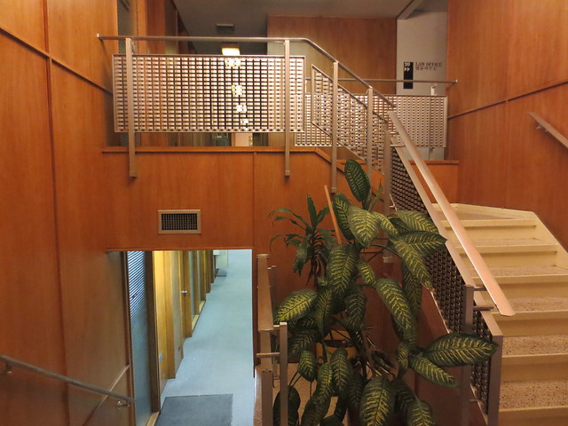
St. Thomas More’s main building consists of an oval drum sitting atop a one-story rectangular base. The base contains chapels, side wings, the lobby, stairs, entrances and other assorted service spaces. The drum, of course, is the main sanctuary space, distinctly articulated inside and out. Flagstone and harmoniously colored 1×1 tile cover the ground level facade, with orange brick above. A high-relief sculpture group centered on the church’s namesake saint marks the entryway.

IMG_2786

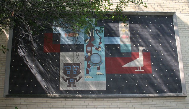
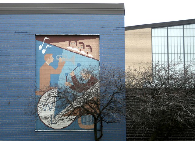
Inside, the sanctuary is simple in form, with a flat ceiling and no columns in the primary space – but elaborate in ornament. Tile mosaics enliven the walls with images and delightfully stylized text, and the hanging lamps are a 1950s delight.

The deeply recessed stained glass windows are made of faceted glass, designed by Gabriel Loire (1904-1996) of Chartes, France; they portray the life of Thomas More, recognizable by his peaked cap.

Stained glass

IMG_2854

The reredos is a curvaceous affair, rising up behind the altar and swelling up to the heavens, covered with a massive tile mosaic and lit from above by three circular skylights.

IMG_2851

IMG_2820a

Stained glass and details

I am particularly fond of the designs on the window recesses, a melding of abstract shapes and symbolic imagery, and the aggressively whimsical font used on the text.

IMG_2870

Plenty of little period details enliven the rest of the building, as well, such as the holy water basin in the lobby.

IMG_2875a

The baptistry gates are another high point, loaded with abstracted imagery.

IMG_2781a

A tiled holy dove is emblazoned on the ceiling of the entry canopy, whose tapered columns dissolve seamlessly into the ceiling.

IMG_2765

The same tile pattern carries all the way around the building’s exterior.

IMG_2838

During one visit I was gently greeted by an aged priest; during another, two older women were raptly offering alternating Hail Marys in the sanctuary.  I did not visit during services and so have no notions about the congregation’s size or health, though the school closing obviously speaks to changing local demographics – likely a home-owning population that’s aging in place while their children have moved elsewhere. Regardless, the church building and its harmonious ancillary buildings are one of the area’s best Mid-Century religious complexes, intact and well-maintained to this day.

Chicago Mid-Century Modern: St. John Vianney Parish, Northlake

IMG_4464a

When I sat down to write this post, I discovered that I had no photographs of this church’s front facade (probably because crossing Wolf Road on foot to get them would entail taking my life into my hands.) Fortunately, the Church fathers saw fit to leave this lovely model of the building on display inside it.

The building of St. John Vianney Church (46 N. Wolf Road, Northlake) was begun in 1962, to the designs of architect Joseph W. Bagnuolo (1908-1996). The firm would also design the tile murals within. Seen from the air, the building is shaped like a fish, a common Christian symbol. Concrete panels with aquamarine stone and quartz embedded in them act as “scales” to continue the metaphor.

IMG_9431a

IMG_9441

IMG_9439

Inside, the sanctuary is an unbroken space, with side aisles separated by a sharp change in ceiling height.

IMG_4493a

Two giant stained glass windows dominate each end of the sanctuary. There are abstract faceted glass patterns on the side windows, but the bulk of the windows are flat glass.

IMG_4483a

IMG_4514a

IMG_4519a

The altar is in the center of the sanctuary, illuminated from above by a round skylight. The design is a “church in the round” approach based on the post-Vatican II updates of the Catholic liturgy.

IMG_4523a

The walls carry 150-foot long tile mosaic murals, depicting seven sacraments,  seven miracles, and the life of Christ.

IMG_4526a

IMG_4513a

IMG_4458a

Details small and large enhance the period feel of this church. These elegant light fixtures give style and panache to an ordinary stairwell, and the handsome door paddles below are a grace note as one enters the building.

IMG_4530a

The baptistry is a separate round structure connected by a small hallway. Articulated brick patterns give it an additional dose of 1960s pizazz.

IMG_9446a

Mid-Century Office Space on Lincoln

Lincoln Avenue’s western reaches benefited from the same office construction boom in the early 1960s that blessed Peterson Avenue with so much great Mid-Century design. Between Western Avenue, and its intersection with Peterson, Lincoln holds quite a few fine examples of 1960s office design (in addition to its famed skeezy motels):

5700 Lincoln Avenue
Lincoln Avenue Mid-Century

Opened in 1962 as the headquarters of Liberty Federal Savings (then celebrating 75 years in business), this bank building is today home to a Charter One branch. It follows a common basic scheme for 1960s banks – a big wall of glass, with a double-height atrium behind it, and a mezzanine balcony above. A surprising amount of the original fixtures are still in place, including railings and check-writing stands.

Lincoln Avenue Mid-Century

Lincoln Avenue Mid-Century

Lincoln Avenue Mid-Century

5940 Lincoln Avenue
IMG_1935a

This angular little building first appears in the Tribune classifieds in 1953. Today it houses a Christian Science Reading Room, and still has its original ceiling vents inside.

EDITED TO ADD: This was originally the Slick Chick Drive-In restaurant, open for about 10 years (it drops off the classifieds after 1962.) It was robbed in its first year by three teenagers. In 1965, it was converted to the CS Reading Room – so the interior likely dates to that year. Thanks to reader Brian W. for identifying the original occupant and their matchbook ad campaign (see here) which they shared with the motel next door.

Lincoln Avenue Mid-Century

5875 Lincoln Avenue – Lincoln Office Building
Lincoln Avenue Mid-Century

Comprising several sections, the Lincoln Office Building is dominated by a long International Style facade. This main portion went up in two parts, the second built in 1957 to the designs of architects Eugene A. Meyers & Associates. At the corner of Richmond and Lincoln, two other sections at 5865 Lincoln continue the building’s materials and style, in a different design.

Lincoln Avenue Mid-Century

Lincoln Avenue Mid-Century

5850 Lincoln Avenue – Simgreen Building
Lincoln Avenue Mid-Century

Following the same pattern as the bank building, this little office building includes a delightful tile mosaic in its lobby – as covered here.

5757 / 5765 Lincoln Avenue – The Executive North Building
Lincoln Avenue Mid-Century

A stylish International Style building in blue-black paneling, this building opened in 1961 and retains much of its original decor in the lobbies – stainless steel railings, geometric railing screens, and wood paneling.

Lincoln Avenue Mid-Century

Lincoln Avenue Mid-Century

Lincoln Avenue Mid-Century

Lincoln Avenue Mid-Century

The nearby Stephen Tyng Mather High School is yet another Mid-Century complex, done entirely in white brick. Designed in 1957 by Loebl Schlossmann and Bennett, it appears to have had a small addition or two, but mostly remains as originally built.

IMG_9815

IMG_9825

IMG_9841

IMG_9828

1×1 Tile Mosaics

I love finding convergent architectural elements scattered about the city. Geometric glass block, Midcentury 2-flats, green-on-white glazed brick storefronts – whenever I see something popping up in a variety of places all over town, I’m hooked.

My latest find in this vein – 1960s-era 1×1 tile mosaics. Using common construction materials, which could be installed by commonly-skilled workers, 1×1 tiles allowed an artist to create colorful additions to a building’s exterior. For curves and added levels of detail, the titles could be cut in half with a 90-degree angle.

I have found about half a dozen examples of note scattered around Chicagoland:

169 Grove Avenue, Oak Park

An apartment building from circa 1960 turned condo, with wonderful projecting balconies on two of the corners, trimmed out with blue metal spandrel panels.  Inside, the lobby features  a wonderful abstract mosaic along one side. The mosaic extends through the glass front wall into the vestibule.

IMG_8685a

IMG_8694a copy

1040-1044 Ontario Street,  Oak Park

A curious little courtyard apartment building from around 1963, with 4-Plus-1 style parking under one wing, and the other wing at ground level. On the street facades, two tile mosaics reflect Native American or Aztec themes. Unfortunately, the eastern mosaic was mostly covered by climbing vines when I photographed it.
IMG_8589a

IMG_8590b

IMG_8574a

IMG_8574b

IMG_8575b

IMG_8609a

El Lago

A residential highrise at 6157 N. Sheridan, by architect Irving M. Karlin Associates (J.J. & I.M. Karlin). Planned in 1957, El Lago broke ground in Sept. 1958, built on the site of the George Leahy home, president of Republic Coal and Coke.  The structure was built utilizing federal housing insurance that covered mortgages. 22 stories, 268 apartments.

IMG_2348

The El Lago tower was built with a “Mexican motif” meant to convey a warmth missing from contemporary buildings. The primary result seems to be the two tile mosaics flanking the entrance, portraying a man and a woman of Mexican heritage.
IMG_6041a

IMG_6040a

5850 Lincoln Avenue, the Simgreen building

This multipurpose commercial building was built for real estate developers  M. Suson & Associates, circa 1959. Inside the curvaceous lobby, a tile mosaic depicts the building trades at work, reflecting the primary tenant’s occupation. Other offices located here over the years include  Vacations Enterprises in 1959  and Simgreen Jewelers by 1989. Today it houses an alderman’s office and a gold shop.

IMG_1974

IMG_1957

IMG_1960a

2411 W. Fargo / 7420-7428 N. Western

A mixed-use building with commercial spaces facing Western Avenue, and access to the upper-floor residences on the side street. The apartment entry is marked by an abstract design in 1×1 tiles.

IMG_0040a

1809 N. Harlem Apartments

his  pair of 6-flat apartments is  part of a long row on Harlem Avenue of the same vintage and scale. These two  feature an abstract pattern of colored tiles, with a minor echo of the motif around the entrance.
IMG_9023a

IMG_9028a

IMG_7778a

West Leyden High School

1000 Wolf Road, Northlake. A 1957 building with somewhat workmanlike mosaics decorating its wings, portraying the various areas of academics, learning, athletics and high school life.
IMG_3561a

IMG_3574a

IMG_3563a

IMG_3562a

St. Demetrios and the Pod Buildings From Beyond!

This is the older portion of St. Demetrios Greek Orthodox Church (1929, 2727 W. Winona), a touchstone of Greek cultural life in Chicago for eight decades:

IMG_4265

And this is the interior of the sanctuary:
IMG_4227

It’s nice and pretty and all that. Yadda yadda. What really makes this church pop, though, is the St. Demetrios Cultural Center – a pair of gleaming pod-like additions to the north and south sides.

IMG_6780a

IMG_6809a

On both sides, a round vestibule section greets visitors, acting as a foyer for larger adjoining spaces. The north wing houses an auditorium (with some cool funky recessed lighting), a library, and various smaller rooms. The south wing is part of the church’s affiliated school, and contains a gym, locker rooms, game room, classrooms, and stairs.

IMG_6795a

Ground was broken on the Cultural Center in October 1962, and the motherships opened their doors in 1964. The additions are almost symmetrical, and wrap the full backside of the church, save for the southeast corner of the block. There, a single house stands untouched. Was it a holdout? Was it used by the church?

IMG_6803a

The buildings are exquisite – covered in a shimmering aqua blue tile highlighted with flecks of gold, set amid stainless steel window mullions and broad expanses of glass, and decorated with fabulous dimensional lettering, also in stainless steel.

IMG_4217a

The north pod features this cool curvy fountain. If you rent out the auditorium for an event, you can pay a bit extra to have the fountain running too.

IMG_4219a

This is complete design, top to bottom – the tile and stainless steel set the motifs and are carried to the interior, and even onto the entry overhangs. When was the last time you saw a tiled overhang?

IMG_4214a

IMG_5002a

The tile has seen better days – in quite a few places, individual tiles are missing. One panel on the south pod has almost fallen off entirely.

The pod buildings were designed by the still-extant firm of Camburas & Theodore; they submitted an earlier design illustrated in the March 9, 1960 Chicago Tribune, a more staid stand-alone building which was discarded (and looks too big to fit on the portion of the block left open by the church building.)

Industrial art

IMG_8627a

A friend’s blog post from a while back extols the architectural merits of a St. Louis industrial park… then leadingly wonders if there might be any comparably architectural industrial park elsewhere. I haven’t managed to find a Chicago counterpart just yet, but I did turn up this place a while back.

IMG_8623

This is the building of Continental Electrical Construction Co. at 5900 W. Howard. Though it is otherwise an unremarkable 1960s brown brick office building, its western face bears a mosaic tile mural designed in 1967 by Leo W. Witz, son of the company’s founder and its CEO until his retirement in 1973. The mural, titled Shakespeare’s The Seven Ages of Man, is accompanied by a small plaque quoting the piece in question.

IMG_8626a

Common to the era, it’s a highly stylized and abstracted work, combining forms, curves and colors with identifiable subject matter. The result works as both an aesthetically pleasing composition and an illustration.

IMG_7606a

IMG_7607

In a nice touch, the false window panels around the corner are filled in with a continuation of the same design.

The Cubic Zirconium Coast

The northern reaches of Chicago’s lakefront offer relatively affordable lakeside living, via a series of massive highrises that went up in the 1960s along Sheridan Road. One particularly big cluster stands south of Loyola University, where Sheridan meets Granville.

IMG_4759

IMG_9277a

Some of them have their merits. Others… less so.

IMG_4755

But at least two are of some interest.

IMG_6188 copy

6166 N. Sheridan – the Granville Tower – derives interest from its remarkable zigzag balconies. Modernistic bay windows protrude from the west face, as though the building’s framework couldn’t quite contain all the activity within. Emporis lists the architect as Seymour S. Goldstein (1920-2006 – the same guy who designed the Second City building and incorporated the salvaged terra cotta from Louis Sullivan’s demolished Garrick Theater into it), and notes that all the condos within are two-level units.

IMG_4732

IMG_6009

IMG_4736

IMG_6028

Across the street, the El Lago condominiums (6157 N. Sheridan) present a serene, handsomely composed facade to the street… even if the building’s broad face is just another sea of undifferentiated brick and glass.

IMG_4745

IMG_4749a

Down at the entrance, a couple of slick little tile mosaics provide some liveliness and color, along with a handsome font for the building’s name.

IMG_4743

IMG_4744a

Emporis gives the name of Irving M. Karlin Associates as the architect, and dates the building to 1959. Mr. Karlin lived from 1902 to 1993.

Loyola says goodbye to an old… friend? Acquaintance, maybe?

IMG_9276a

I’ve seen quite a few campus buildings meet the wrecking ball, mostly at my own alma mater but elsewhere as well. But seldom have I seen a campus demolition greeted with such a quirky, open, mixed bag of emotions as that of Loyola University’s Damen Hall.

IMG_5545

From the layman’s perspective, Damen Hall is the quintessential 1960s building – big, bland, banal, ugly, and horrible. Designed with no operable windows, looming massively over everything around it, utterly bereft of ornament – Damen is a hard building to love. Students and faculty likened it to a radiator, a toaster, and a prison, and it’s hard to argue with those assessments. Even I, the all-things-Midcentury guy, never bothered to get a full-body shot of the place in life, only snapping a few details that caught my eye. Demolition prep work is well underway, so it’s a bit late now.

IMG_5057

But despite its reputation as a monstrous pile of awfulness, Damen’s impending demolition has inspired an outpouring of affectionate commentary from the Univesity community.

While the building was still in use, a 3-minute video tour was produced, a sardonic pastiche of Lifestyles of the Rich and Famous that manages to be informative, fond, wry and hilarious all at once. The University ran a contest to see who should be the last Loyolan to leave the building and lock its doors. The building has its own Facebook page, lamenting its own impending demolition and missing the days when students filled its corridors and strange elevator system.

Much of this is probably just the result of the building as a shared experience, a minor trial that most students had to endure at some point in their career. But I’d like to think that underneath it all, there’s some wisps of appreciation for the building’s genuine merits, for it did have a few.

IMG_5549

For starters, those marching concrete columns are a powerful statement, and the play of light across them is beautiful. I never saw that massive auditorium, but as shown in the video link above, it’s a stunning piece of Midcentury space.

IMG_1515

And then there’s the front lobby. The lobby and its grand tile mosaic mural was one of my first Midcentury discoveries in Chicago. There wasn’t much to the space: the mosaic on one side, two wall of glass on the other, a row of vintage seating that Mies van der Roes would have welcomed on the IIT campus.

IMG_1513

“Wonders of Creation” is a 1966 work designed and executed by Melville Philip Steinfels. The mural is a delight, an abstract plunge through the natural sciences as filtered through a 1960s lens.

Loyola University Chicago

The mural is gone now, bare concrete block walls left in its wake. It will be relocated to Loyola’s medical campus, in the inner southwest suburb of Maywood.

IMG_5058

You can see more details of the mosaic, and read the artist’s thoughts on the work, in the Loyola Nursing School’s Annual 2008 Report. The main Loyola campus, meanwhile, will be diminished for its loss.

A coda: I’m not too keen on the new building that will go up in Damen’s place, either; it’s a historicist replica that mockingly apes the oldest buildings on campus, rather than bringing any new ideas to the table (this is marketed as “complimenting” the older buildings.) Designed to be ultra-modern in technology and function, it hides those attributes as though they were badges of shame. Resorting to this sort of neo-historicist pastiche, as so many other universities now do, is a sad admission that our age has nothing of substance to say in built form; all we can do is copy ideas from a hundred years ago, badly.

St. Gall Catholic Church

St. Gall Catholic Church

In 1956, this UFO of a building touched down at the busy intersection of 55th and Kedzie. It hovers there still today, a circular pie-slice of building fronted by a thin-shell concrete pod. Architects Pavlecic & Kovacevic designed a stridently Modern building, utterly free of historical associations in ornament or form.

St. Gall Catholic Church

The baptistery is a building within a building, a circular form rendered in glazed orange brick, inset with gold-finished crosses.

St. Gall Catholic Church

The stained glass is unobtrusively simple, not particularly groundbreaking, but adequately modern.

St. Gall Catholic Church

Quite a few ornate period details remain. Check out the mosaic-tiled baptismal font, the grid of screens behind the altar, and of course that fabulously Fifties glossy blue-green brick.

St. Gall Catholic Church

The Stations of the Cross are done in a more stylized fashion than the stained glass, more befitting this stridently jet age building.

St. Gall Catholic Church

St. Gall is a shouting punctuation amid all the background paragraphs of the neighborhoods east of Midway Airport.

Link: A history of the church, with detailed information on this building, as part of a tour of church organs.

Immaculate Conception Church

I still remember the first time I saw Immaculate Conception Church (1963, 7211 W. Talcott Avenue.) We were hurrying out to O’Hare, southbound on Harlem to pick up the Interstate. Despite my attention being divided by dodging through traffic, my jaw dropped when I saw its looming cylinder of unbroken stained glass.

Immaculate Conception Church

It was immediately obvious that this building had a completely over-the-top case of Midcentury madness. It was More MidCentury Than Thou.

Immaculate Conception Church

Some months later, I found time for a closer inspection. The details confirmed my original impressions. Top to bottom, this building pulled no punches. It used every MidCentury trick in the book.

Immaculate Conception Church

Immaculate Conception Church

Immaculate Conception Church

Today, I finally got to go inside the building. Despite the grand setup, I was still blown away by the interior. The level of detail on the outside pales before the onslaught that awaits within.

Immaculate Conception Church

One enters the sanctuary by passing through the glass cylinder, and it is of course top-to-bottom stained glass, waves of bright color pouring in on arriving worshipers.

Immaculate Conception Church

The sanctuary itself is spatially plain, open and airy, but festooned with decoration and ornament.

Immaculate Conception Church

Overhead, a series of false skylights filled with stained glass designs bring colored light in from above. More of the stained glass designs pour down the towering windows.

Immaculate Conception Church

One-inch glazed tile coats the columns, the walls, and the floor of the altar space. The pastor commented that he finds it a bit like being in a swimming pool. Be that as it may, I’ve never seen a swimming pool with polished-gold tile patterns!

Remember those colored tiles on the outside? They aren’t just for decoration:

Immaculate Conception Church

If they look familiar, they should: colored glass block like this is a staple of the Chicago Midcentury style. So is the combo of cream-colored brick with baby blue highlighting patterns. Not only is Immaculate Conception a deliriously exuberant piece of Modernism, it’s also a localized design, in tune with the regional 1960s vernacular.

Immaculate Conception Church

The stained glass designs, by Chicago’s Michaudel Stained Glass Studio, are modern in their way. They lack the subtleties of an Emil Frei design, but the abstract patterns of flowing color, the drifting text, and the stylized figures all set the designs firmly apart from their Gothic and Renaissance antecedents. There is a cartoon-like punchiness to the designs; the windows are big and bold, loud and clear.

Oh, and I guess I shouldn’t have said that nuclear explosions aren’t “standard church fare“, because, here you go!

Immaculate Conception Church

Immaculate Conception Church

I’m still reeling from the visit. I could go again and again. In fact, if my DSLR camera ever gets out of the shop, I almost certainly will.

Immaculate Conception Church