Living walls of art

Go to the 3100 block of W. 36th Place – between Kedzie and Albany – and you’ll find a display of public art unlike any other in the city.
IMG_9419a

IMG_9419

IMG_9415

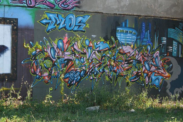
This elaborately detailed, fantastically complex composition is one of dozens – perhaps hundreds or thousands – that, over the last decade,  have graced Chicago’s Aerosoul Walls – home of Chicago’s biggest and best collection of graffiti art.

IMG_8364a

IMG_8337a

Standing at the corner of 36th Place and Albany – a dreary industrial zone south of the Ship & Sanitary Canal – the otherwise undistinguished Crawford Steel Building is Ground Zero for the Chicago graffiti community. Here, aspiring and prominent taggers practice their art, devising and executing larger-than-life works in the open air.

IMG_8354a

The display is ever-changing; new works are constantly underway, layered over the old.  Quite a few works had vanished between my first visit, in May, and my second, in early July. Photos posted a few years ago on local discussion boards show works that have all since vanished.

Each wall is “owned” by a group of particular artists, whose works are not to be painted over; violators will find their own work quickly painted over.

The most common subject of a tag is the artist’s own adopted name, often stylized beyond legibility. The message can be difficult or impossible to decipher. No matter – the art is in the craftsmanship and the creativity. Cartoon figures often augment designs, such as an appearance by Dragon Ball‘s Kami…

IMG_8343

…and a rabid Ewok from Return of the Jedi nearby in the same composition.
IMG_8342

The influence of the Aerosoul Walls extends well beyond the Crawford Steel property. One rule of thumb about graffiti artists – they have no interest in staying inside the lines. Give them an officially designated canvas and they will inevitably fill it up and move beyond it, as St. Louis learned when it invited taggers to decorate its industrial floodwalls some years back, and got tags on vacant historic buildings downtown.

So it is here – except that instead of damaging historic architecture, here taggers have bombed a group of run-of-the-mill industrial buildings. Several anonymous buildings on the same block, facing the  emptiness of the railroad tracks, are heavily slathered with layers of tags. These solid walls of graffiti are highly visible from passing Amtrak trains, which is how I first became aware of the place.

IMG_9379a

These more obscure locations tend to invite works of lower quality, as well as somewhat diminished respect for the better paintings that are done there.  A piece may last for several years, or only a few months or weeks. Technical craftsmanship and artistic originality are no guarantee of survival, though they sometimes help. More useful is getting your tag into a spot that’s harder to reach – above the nine-foot reach of the typical tagger, for example.

IMG_9295

There are elements of gang activity to some of the tags – though most gang tags lack the artistic quality of dedicated taggers’ work.

IMG_9310

IMG_9318

IMG_9323

IMG_9337

IMG_9357

I will make a half-hearted concession that this work is illegal and, essentially, is vandalism. Certainly, Crawford Steel is furiously vigilant in their efforts to prevent this lawless scourge from infecting our fair land:

IMG_9209a
Notice to Spray Painters: The City of Chicago has made it illegal to spray paint any walls with or without the permission of the property owners. In order to adhere to this law, please do not spray paint anywhere on Crawford Steel’s property. Thank you for your cooperation. March 2002

But I can’t say it really bothers me much. Truthfully, about the worst outcome I can see here is that this area acts as a prepping ground for writers to tag other walls elsewhere, with perhaps less harmless results.

IMG_9338a

I have seen works of far lesser craft and quality enshrined in museums. The Crawford Steel building looks much better with its ever-shifting array of artworks than it would without them. The adjacent buildings cannot be said to have any artistic merit – why shouldn’t they be used as a giant canvas? In my opinion, the city should have places like this – designated tagging grounds, places where artists can express themselves and stretch their creativity unencumbered. In this depressingly drab industrial section of town, it is a breath of fresh air and one of the few sources of beauty.

IMG_9343a

For good or ill, the graffiti valley on either side of the railroad tracks represents an outpouring of the community’s voice – a chorus of souls striving to be heard. Perhaps I’m putting a benign spin on a malevolent force – but in the aggregate, I find this collection of tags to be overpoweringly wonderful.

Mexican Grocery Store signs

They come in a rainbow of colors (mostly neon, entirely bright), and you can find them all across the city, from Pilsen and Little Village to Logan Square to Rogers Park.

Pulaski grocer
Near West Side

IMG_4637

IMG_2803
Little Village
P2203063
Rogers Park

Chicago has tons of Mexican grocers – there are three within a block of my residence alone – and a disproportionate number of them advertise with signs just like these.

IMG_7911

The style is universal: wavy lines top and bottom, in bright neon colors. Huge blocky numbers for the price, in red. Smaller font for the letters, but still in a bouncy, informal, chipper mood.

IMG_2839

IMG_8863

Like the builder’s Mid-Century style, it’s one of those cases of curious convergence. A quick chat with our local grocer reveals that they get them from varying places, sometimes making them themselves, and sometimes hiring guys to do it. I’ve seen the stamps of at least two different sign makers on these posters, though most of them remain anonymous.

IMG_2802

Why are they all the same style? Is it demanded, expected, or simply unexamined? Does it relate to some deep cultural strain, or is it just a thing that is?

How to Get to Sesame Street in Chicago

IMG_9276a

Every city has them – the day care centers with the window-paintings of popular childrens’ cartoon characters, slightly misproportioned, festooning large storefront windows or walls, cheerfully waving at passersby.

IMG_9298a

These creatures assure us that the place within is welcoming, friendly, comfortable, familiar – all the things a parent would want their children to have while they are away at work.

IMG_3276a

Their ubiquitous nature says a lot about the commonality of children’s television programming. Elmo and Dora the Explorer are popular favorites, though Big Bird remains the king.

IMG_1595a

IMG_5521a

IMG_3279

IMG_0750a

IMG_1400a

Also of note, they’re mostly seen in lower-income neighborhoods. I could speculate on a number of possible reasons why – perhaps the TV is a more common babysitter. Maybe there’s just less money for decoration. Maybe they’re fighting harder against an unpleasant built environment. Maybe these things aren’t seen as very classy in higher-income areas, or are prohibited by ordinance. Maybe they just aren’t as worried about using trademarked characters. Maybe small daycare centers just aren’t as common. But it’s all just speculation.

What’s remarkable is how universal the artistic style is. There’s almost always something a bit… off about the portrayal of Big Bird and company. I’ve noticed this for years.

IMG_1423a

The photo above was taken near the boundary between Chicago and Oak Park – right where incomes are starting to rise. And perhaps not coincidentally, it’s a rare example of the characters not looking slightly mutated.

IMG_3278

And finally…. all I can say here is that Mickey looks awfully excited by Minnie’s tush. Yikes!

Don’t Fight It

I am perpetually amused by buildings whose owners fight against the building’s basic nature. When it happens to great and significant buildings, it’s a tragedy, but when it happens to ordinary and common structures, it can be a bemusing commentary on tastes and desires.

It's an Olde Weste garage

Here we have a suburban Midcentury garage rendered in wood. The car door is a grid of squares. The side screens are a grid of squares. To this simple, clean composition has been appended Olde West “shutters” and a wood flower box. It apparently wasn’t enough to be living in the inner suburbs; the trappings of a frontier existence were needed.

I BELIEVE I AM LOOKING AT THE PARTHENON

Out on Touhy at the highway, Studio 41’s interior design store apparently couldn’t be seen in a MidCentury commercial building. So, a little Greek Classical makeup was applied, apparently in the hopes that four columns and an architrave would hide the grid of recessed brick, the polished granite panels, the massive storefront windows, and the total lack of any other applied ornament.

Is that a Greek Classical commercial awning I see? Perhaps a Greek Classical internally lit plastic sign, as well?

We're living in the country!

Fan that I am of Chicago’s MidCentury builder vernacular, I was a bit flabbergasted by this one. Three sculptural panels have been applied over the stock triple glass block openings by the front door. They could be original, especially given how neatly they fit into the openings, but it seems to run counter to the aesthetic. What’s definitely not original is that thin little wreath, attempting to bring rustic flavor to a Modernist stew.

Home Depot special

This is a form of abuse endured by many MidCentury buildings in Chicago. The original wood doors age, get damaged, or just wear out. Rather than repair or refinish them, owners find it easier (or cheaper) to pitch them out and install a low-cost door from Home Depot. Unfortunately, those doors are made for contemporary starter castles out in the far suburbs. They look very out of place alongside the geometric details and clean lines of MidCentury Chicago. Many of the original doors aren’t terribly special — just a square or diamond opening in a flat wood door — but it damages the building’s look, and probably a few spectacular doors have been thrown out because of this trend.

Um

And then there’s this. I don’t know what it is, where it came from, or what its creators were thinking, but it’s certainly unique. It’s a suburban-scaled micro-mansion, with two-story columns flanking its miniscule entry porch, but that’s just the start of the story. It’s got floral wrought metal scrollwork, images of birds and horses and eagles, and (not pictured) a Victorian greenhouse appended to one side. It’s got decorative brick patterns around the windows, and quoins at the corners. Quoins!! Round-topped faux-dormers break the roofline, there are flattened-arch-topped windows below, and on the far right (again not pictured) is a full-blown Palladian window.

It seems to be a mish-mash grab bag of about fifty architectural ideas, all thrown in together in the fervent belief that an assembly of beautiful parts would surely result in a beautiful whole. I can’t say I agree myself, but it sure is interesting to look at!