Blue on Blonde, Part 1: Most Likely You Build Your Way (and I’ll Build Mine)

IMG_5902a

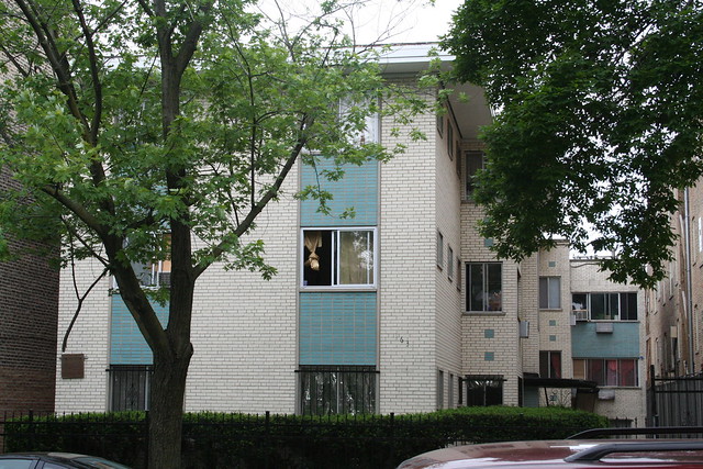
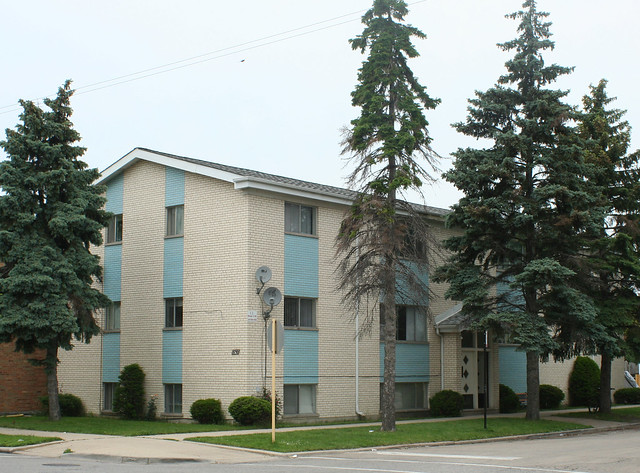
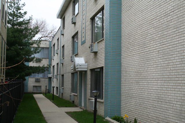
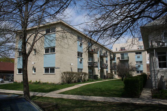
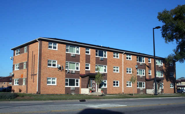
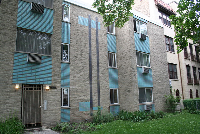
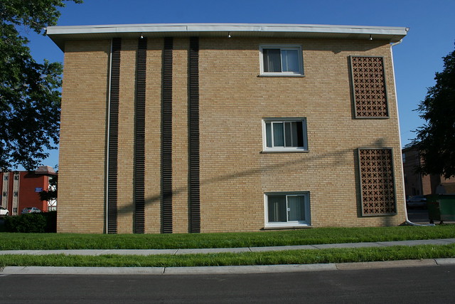
9801-9811 S. Kedzie Avenue, Evergreen Park

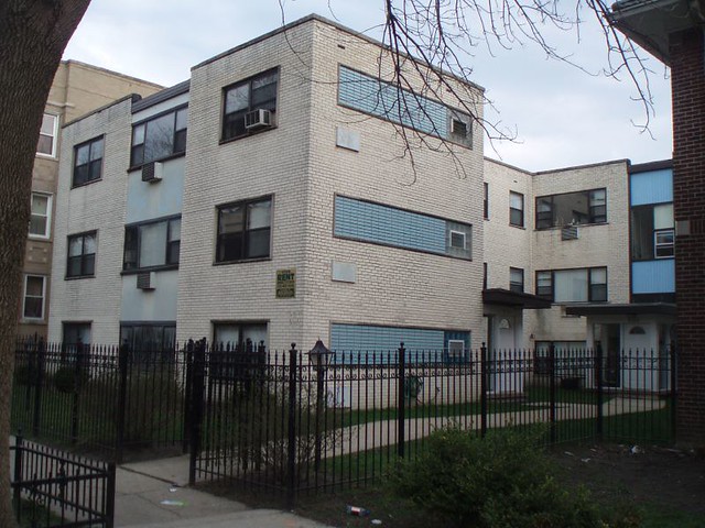
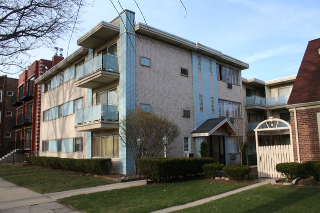
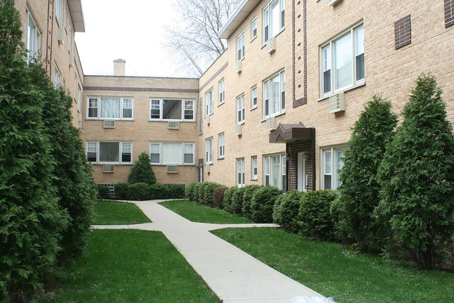
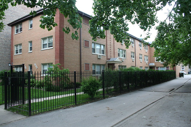
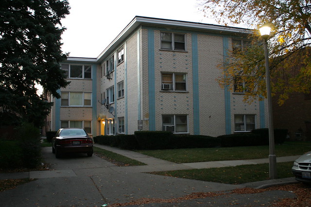
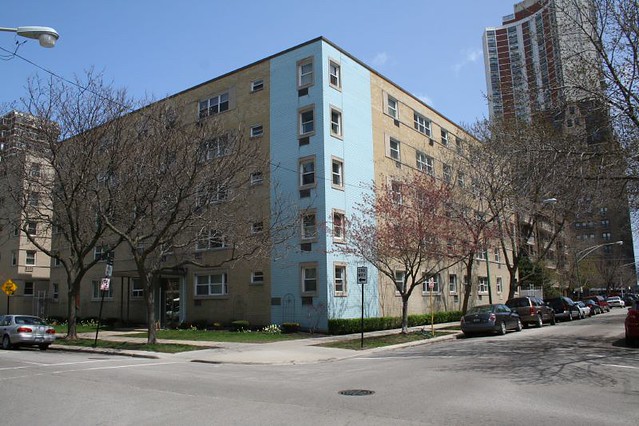
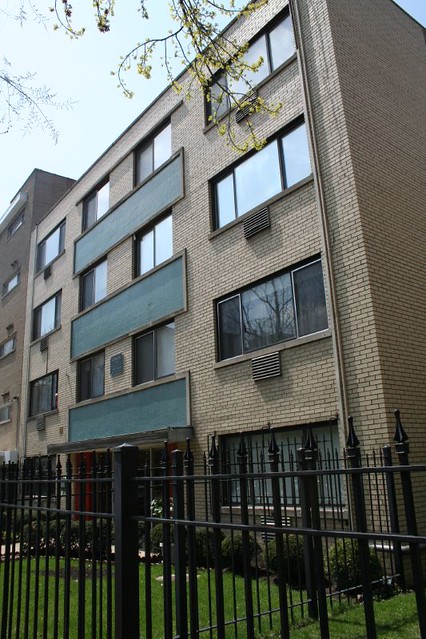
In the 1960s, Chicago builders loved do to the same thing over and over and over. You’ll find the same architectural elements on buildings scattered all across the city and its suburbs. One of my old favorites: baby blue glazed brick panels, accents and piers, laid in a stacked bond, on a background of cream, beige or tan brick in running bond. It’s used on dozens of mid-century apartment buildings from Evanston to Burbank and beyond; there is a particularly heavy concentration of them in Rogers Park and West Ridge.

IMG_7990

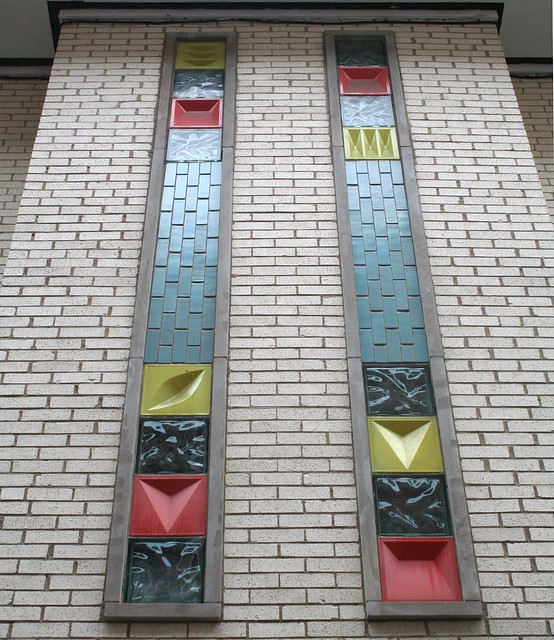
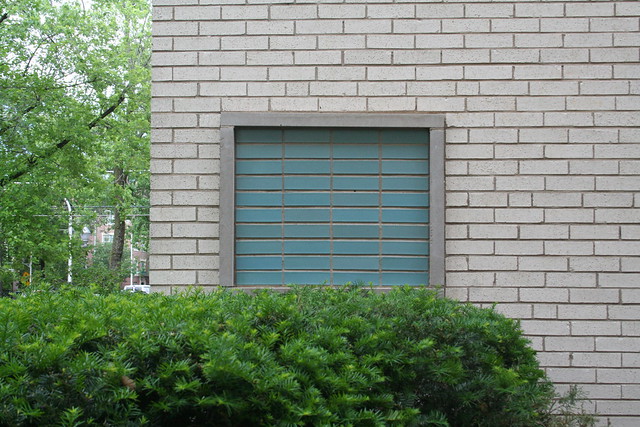
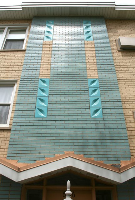
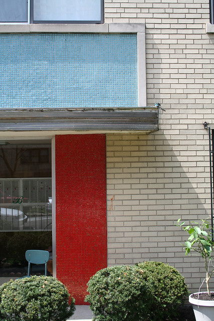
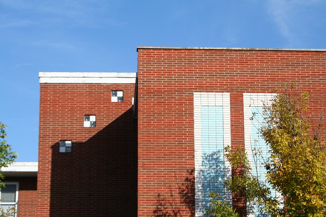
Here we’ll look at a group of a dozen or so that share many distinctive elements: corner piers; rectangular ornamental groups of blue brick, sometimes outlined in limestone; sculpted glass blocks;  long, vertical, open rectangles of blue brick with single blue bricks floating in the center; and windows grouped into horizontal bands by limestone surrounds, with the intervening space filled by blue brick.

Whether you just skim the pictures or read every detail, bear in mind the old question I’ve raised again and again on this blog: was it one designer cranking out variations on a theme, or was it multiple designers copying and adapting ideas from each other?

SPOILERS: I found almost no evidence of a common point of origin. However, at best I have only the names of “builders” – which could simply mean the contractor who constructed the building using plans from an independent architect, or a design-build development company with an in-house architect, or even a real estate development company who contracted out all aspects of design and construction to others. It’s entirely possible that a single architect sold drawings to multiple developers and construction companies, and equally possible that several architects swiped details from one another. Several “builders” were responsible for multiple similarly-styled buildings on the list, but multiple builders can also seen using the same details and styles as each other.

You can see most of the basic decorative elements on our first example, below:

2740 W. Pratt Blvd.
2740 W. Pratt, West Ridge – Chicago. David W. Schultz Co., builder; opened by 1965.

Vertical piers of blue brick punctuate the building’s bays. Decorative elements include the open rectangle of blue brick above the entrance – a motif found on several other buildings around the Rogers Park area, in a variety of brick colors. A large section of blank wall is dressed up with a grid of square blue panels floating on a field of cream brick.
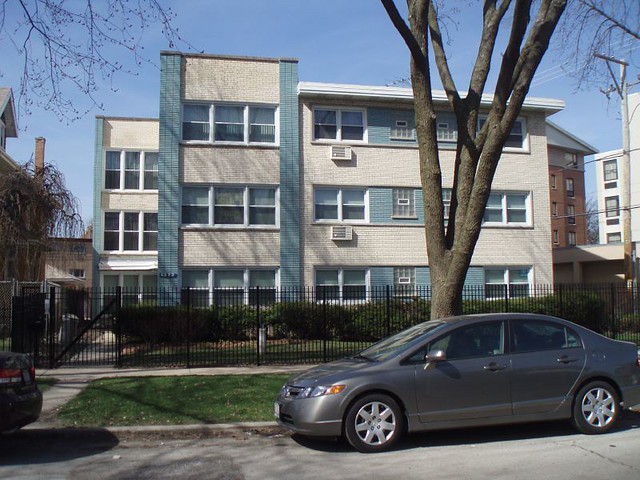
1322 W. Chase Avenue
1322 W. Chase Avenue, Rogers Park – Chicago. Opened 1965, by Birger Construction Co., replacing a converted house previously on the site. Birger also did  an apartment building at 7621 N. Sheridan that uses the same corner-pier vocabulary, but in reddish-orange brick. 

This building and the previous one share similar entry detailing as well as the blue corner piers. The “tower”  – a raised bay marked by colored piers on both sides – lends interest to the building’s massing.
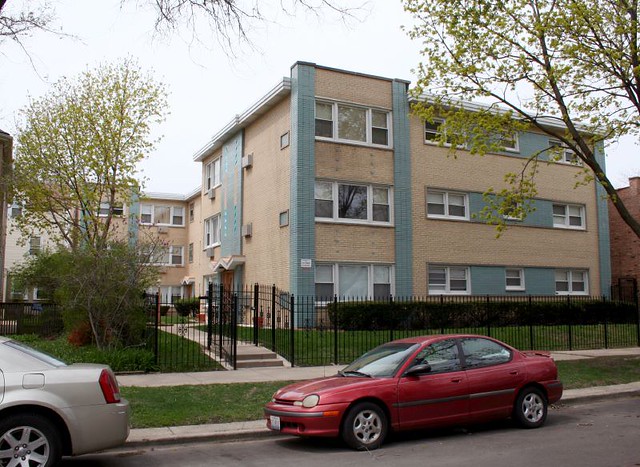
 

Paulina
6116 N. Hermitage Avenue, opened 1964, with studio, 1- and 2-bedroom apartments; operated at the time by the McCarthy Management Corporation. No word on the builder.

This is a third building with corner piers. Sculpted glass block marks the entryway, as well as a tiny folded plate canopy. It also shares the same “tower” massing as the previous building, as well as nearly-identical window treatment – windows rimmed by a limestone band, with blue brick in the surrounded wall space.
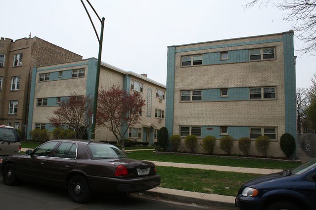
Ohhhh, snazzy.
Stacks and angles


Somewhere on Paulina.
4850-4856 N. Paulina Avenue – opened by 1966, by Luna Construction Co., replacing a house on the site (previously home to a family whose four sons all served in World War I.)

A U-shaped courtyard building. The piers, the open rectangle, the folded plate entry canopy, and the banded windows all recur. There’s also a band of colored brick near the roofline, looking a bit like a sweatband on a jogger’s forehead which becomes a cross motif at the courtyard.
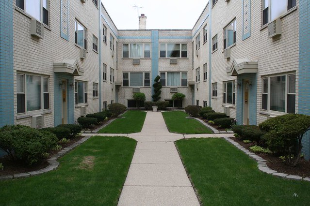
Cream & blue courtyard!


IMG_3799

7256 N. Bell, Rogers Park – Chicago. J. & H. Construction Co. builders, 1967.

Piers and a grid of squares recur from previous buildings. The balcony railings are similar to those at our next stop…

7241 N. Claremont Avenue

7241 N. Claremont Avenue, West Ridge – Chicago. Opened in 1962, replacing a 4-unit apartment building on the same site.

In addition to the prominent blue corner pier and “tower” massing, banded windows, outlined rectangles of stacked-bond brick, and sculpted glass block modules over the entryway, this one features lovely matching metal balcony railings. The entry canopy is probably not the original. If my dates are all correct, this would seem to be the prototype for the others in this group.

The vertical bands of glass block over the entryway recur on our next two buildings:

1635 W. Touhy
1535 W. Touhy, Rogers Park – Chicago. Open by 1968, possibly by 1965.

Piers, banded windows, glass block entry. The grid of stripes is a variant on the grid of squares seen earlier. It is echoed in the bands of glass block over the entry, whose verticality is further emphasized by the unusual decision to turn the blue brick on end.
YAY!


IMG_7982
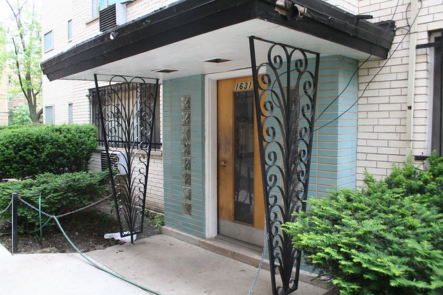
1631 W. Farwell, Rogers Park – opened in 1964. This site follows a familiar historical arc for the time period – in April 1963, a doctor living at this address passed away. In August, the “old house” and its lot went up for sale for $26,000. Thirteen months later, the new building was ready. 

A particularly stylish example with multiple stepbacks as it moves back through its lot. It breaks with the others by banding its windows vertically. Lots of decorative activity, from the framed rectangles to smaller unframed squares, curly-cue canopy supports, and glass block at the stairwell.
IMG_7989
IMG_7985a

The vertical bands of brick and glass block are nearly identical to those at 1535 Touhy, but banded and with plain clear block in addition to the colored geometric ones.
 

IMG_9995
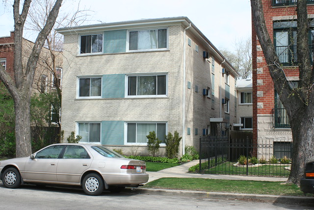
1918 W. Touhy Avenue, Rogers Park – opened 1966. It was under the same rental management as the previous building (1631 Farwell).

A much simpler example with banded windows and a grid of rectangles.


1615 W. Touhy
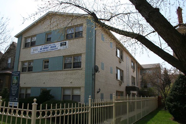
1615-17 W. Touhy, Rogers Park – Chicago. Doesn’t appear in the classifieds until 1971, which would make it rather a latecomer, but would also perhaps explain the unusual gabled roof.

Piers, banded windows (minus the limestone outlines), open rectangle at the entry, grid of unframed rectangles.
 

IMG_6064a
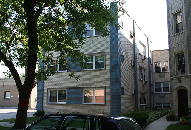
7555 N. Oakley Avenue, Rogers Park – Chicago. Open by 1965, M. Chapelski Construction Co. builders.

A dark-blue variant with simplified detailing, south of Howard Street. Piers, a stack of framed rectangles, banded windows.


IMG_3803
7418 N. Oakley Avenue, Rogers Park -Inside, 6 apartments: three 1-bedrooms and three 2-bedrooms. No word on the builder, but in 1963 it was owned by the First National Bank of Skokie.

Very nearly the same building as the previous one, with the more common light blue accents, right down the street. Piers, banded windows, and framed rectangles recur from previous buildings; the vertical stripes on the side are new.
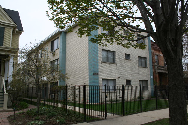
 

IMG_16304744-46 N. Paulina, opened in 1967.

Folded canopy, corner piers, and the open rectangle. The lack of banding at the windows leaves the front facade feeling disjointed and ad hoc.

IMG_1631


There are some buildings – again, around Rogers Park – which use the same decorative vocabulary, but in different shades of brick.
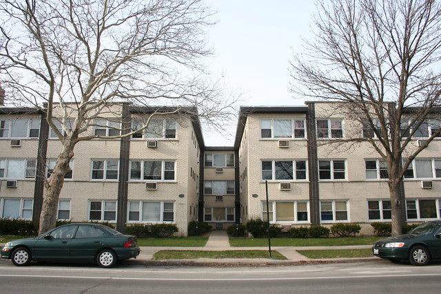
IMG_9761
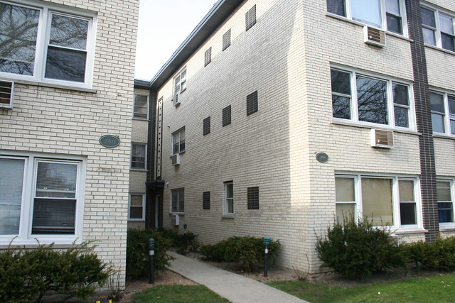
2700-2704 W. Pratt Avenue, West Ridge – Chicago. A 15-apartment building opened by 1967; builder David Schultz, who also built the blue-toned one across the street.  Familiar elements include the piers, the grid of rectangles, and the open rectangles over the entries.
IMG_9764


IMG_9988a
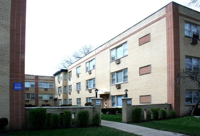
2001-2007 W. Touhy  Avenue, Rogers Park – Chicago, open by 1968.

A third building by David Schultz; this one uses the piers, and the same sweatband/cross banding seen at 4850 N. Paulina. But that building was put up by a different company!


IMG_6072

1844-1846 W. Birchwood Avenue – an 11-apartment building open by 1967; builder Sam Toporek Construction Company. Piers and the open rectangle.


IMG_0008

1813-1819 W. Touhy  Avenue, Rogers Park – Chicago. Open by 1966; builder: Sam Toporek Construction Company, same as the previous building. Piers, grid of rectangles, sweatband, open rectangle.


IMG_7980

 1534-1536 W. Farwell  Avenue, Rogers Park – Chicago; opened by 1968. Builder: Louis Bender.  Piers, grid of framed rectangles, open rectangle.


IMG_0076

1623-27 W. Greenleaf Avenue, Rogers Park – Chicago.  Piers, grid of unframed rectangles, open rectangle.
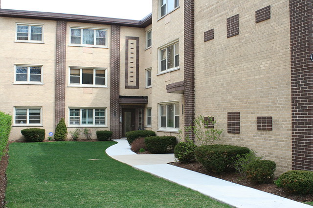
 

IMG_00511538-40 W. Chase Avenue, Rogers Park – Chicago. Open by 1966; builder M. Chapelski Construction.  Piers, grid of unframed rectangles, open rectangle.

So, taking the open rectangle as a sample, we’ve got at least five different builders (Schultz, Bender, Luna, Chapelski, Toporek) using the same ornamental detail. Did they share an architect, or just an idea?


Returning to our color theme, there are plenty of blue-on-blondes which don’t use the distinctive design vocabulary outlined above. Some examples:

IMG_9092

8308 Kilpatrick Avenue, Skokie IL

A suburban outlier that is also a design outlier, this building demonstrates how the features seen before aren’t necessary or unavoidable, but rather were intentional decisions. Here we have no corner piers, no glass block, no brick rectangles, and no banded window groups. Ornament is instead formed by raised vertical stripes and grids of single blue bricks between the windows. Is it merely chance that this building is far away from the others in both style and geography?

Here’s one more outlier, down in Berwyn:
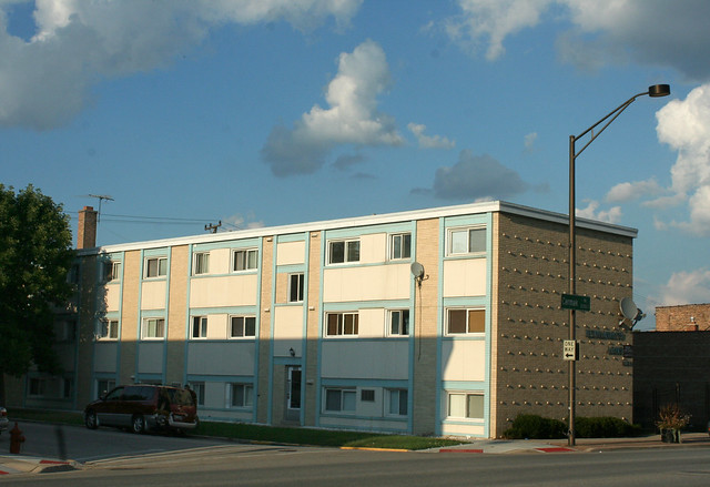
Cermak Road
Kenilworth Arms Apartments, 6850-54 W. Cermak Road, Berwyn – a 1959 building by George V. Jerutis & Associates builders.

This one uses the blue brick in a completely different way, framing and outlining windows groups with it.  The white panels appear to be some kind of plaster or stucco, and might not be original.

Many other buildings beyond the core Rogers Park group use the same material palette and color scheme, though without the distinctive sense of style and fewer recurring design elements:
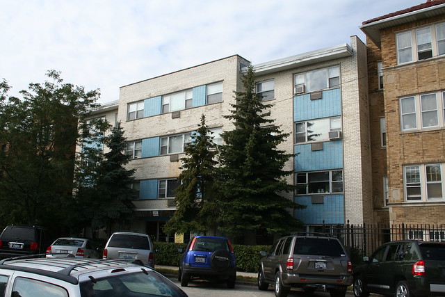
IMG_6081
7744 N. Eastlake Terrace, Rogers Park – opened in 1963, advertised by Sunset Realty.

This elevator building features both vertically and horizontally banded windows; the entry is marked by glass block and a dimensional Flemish bond brick pattern. The little baseball cap brim overhang on the outer bays also hearkens back to the core group.
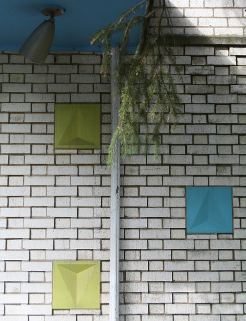
IMG_6079a


Just south of Warren Park
2155 W. Arthur Avenue, West Ridge – Chicago, south of Warren Park. 

Awkward massing, but the horizontal bands of accent brick give it some style.
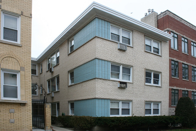
West Ridge - Granville Avenue
6117 N. Mozart Avenue – Chicago

This building limits itself to one big flashy move, as its blue brick window bands wrap around the most visible corner. Like almost all these buildings, the blue brick is laid in a stack bond rather than the running bond used on the common brick; here especially it adds some geometric punch to the fields of blue.


Lest you think all this is a given, or somehow obvious: there are some which are almost painfully dull, almost willful in their refusal to ornament beyond the bare minimum. What do you think of a building that only does the bare minimum?
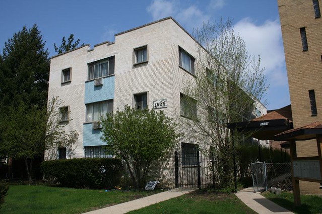
1628 W. Touhy
1628 W. Touhy, Rogers Park – Chicago

1236 W. Touhy, or thereabouts.

1236 W. Touhy, Rogers Park – Chicago

Lawrence Avenue
5710 W. Lawrence Avenue, Portage Park – Chicago. Opened 1964. Vertical window bands, diamond patterned doors and not much else. The gabled roof looks bizarrely out of place, like it landed from another city.


Below are a trio of larger and slightly older buildings that used the blue-on-blonde color scheme before any of the previous buildings did. Naturally, like the no-effort ones above, they don’t follow the Rogers Park vocabulary, but they show the color scheme in a slightly earlier incarnation.
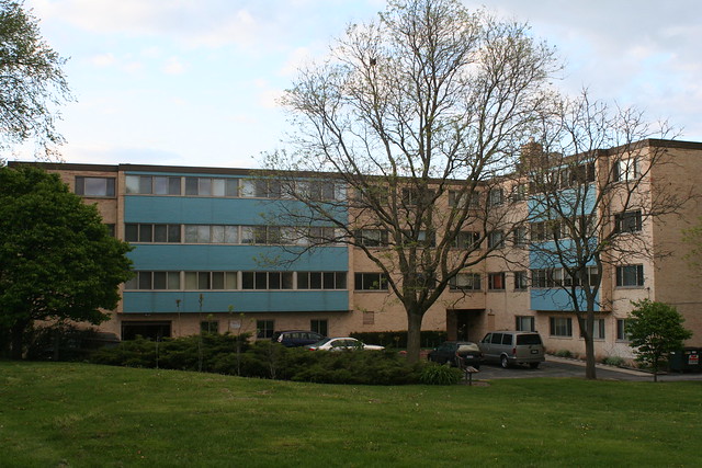
Evanston - Ridge
737 Ridge Avenue at Madison, Evanston – opened in 1960 as “Madison Tower Condominium”.  It was meant to be condos, but was rented out as apartments, not going full condo until 1976. The developer at the time noted that the building was “a bit ahead of its time” regarding the then-new condo concept.

A rather dreadfully plain building, which uses blue glazed brick to infill the space between window bands in the projecting windows bays.

Not sure if this one counts.

6107 N. Kenmore – today it’s the Sacred Heart Friary, home of the St. Bonaventure Province of Conventual Franciscans. In 1959 it opened as The Charleroi, an apartment building of 1 bedrooms and efficiencies advertised by Meister-Neiberg & Associates. It’s not clear when the friars moved in, but they renovated a ground-level space as a chapel, with small stained glass windows.

A blue accent at the corner, smaller blue accents at the entryway. The brick here is not stacked bond.


N. Kenmore Ave

Kenmore Place, at 6012 N. Kenmore – a 4-Plus-1 near Loyola University. Appears to have opened 1958, which if correct would make it the oldest building in this set.

IMG_1524

This one doesn’t even feature blue brick – just 1×1 mosaic tile in three bordered bands between the windows – but still follows the same color scheme to infill the space between windows in its large projecting bays.

You might think this is enough of a single color scheme to last a blog for a lifetime, but dear reader, you’d be mistaken. Tune in next week, when Blue on Blonde plugs in, sells out and goes commercial!
Green on White, Volume 3 – A Baker’s Dozen of Bakery Brick

Another batch of white and green glazed brick storefronts – about a dozen total. At this point I have documented well over 50 of these buildings in and around the city, all featuring the same material and color pallet, and often the same style of design and ornamentation. And still no answer to the simple question of why! Why this color combination, why so many of them, why this style, why right in this one concentrated time period around 1920?

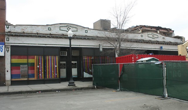
IMG_2894a741-749 W. 79th Street at Halsted. The westernmost of the four storefronts was the Auburn Park Library from the late 1930s until 1963. This building was next door to the corner commercial building demolished several years ago following a wall collapse.


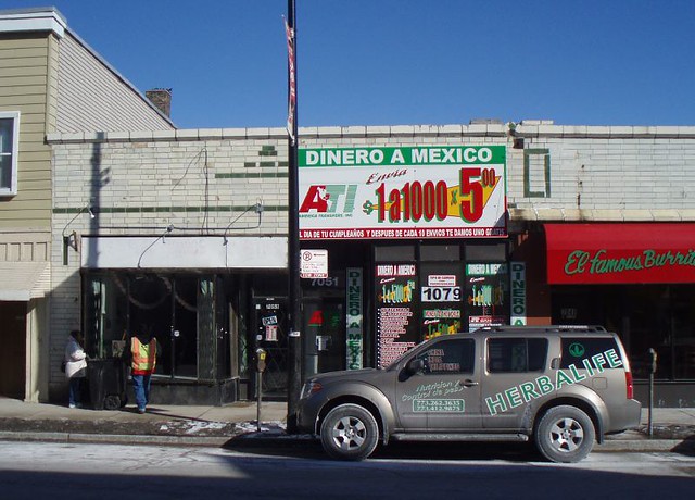
Clark Street, Rogers Park7051 N. Clark Street, Rogers Park. Originally the Casino Theater, one of a legion of early theaters, most of which lasted only a few years before larger and more modern competitors overtook them. Cinema Treasures lists the Casino as operating from 1913-14; it was cited by the city in 1913 – along with dozens of other theaters – for a total lack of any ventilation. By 1919, it was a car dealership. In recent years, the building has lost a curved parapet wall.

Before this building went up, the site was home to Patrick Leonard Touhy, an early settler, businessman and land trader in the area, who married the daughter of Phillip Rogers, platted Rogers Park, and lent his name to one of the area’s major east-west arterial streets. Separated from his wife, Mr. Touhy lived at this address alone until he passed away in 1911; his house was demolished and replaced with the theater. His wife’s mansion, at 5008 Clark (old system, 7339 Clark new system) was torn town in 1917 and is now the site of Touhy Park.

Western Avenue

2241 and 2245 N. Western Avenue


IMG_1172a
2403 W. Chicago Avenue – Liz’s Pet Shop, with thin triangular and diamond patterns surrounding a beautiful bulls-eye of stained glass above, and a completely altered storefront below. In the 1930s it was the office of Dr. Marco Petrone (1902-1966), a gynecologist and city Health Department inspector whose office also seemed to have a knack for attracting crime victims seeking emergency treatment. By 1945 it housed the Roncoli Grill.

IMG_4679a
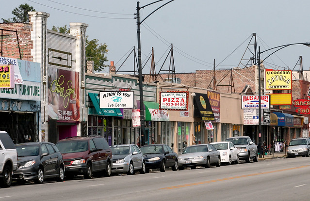
4230 1/2-4234 and 4236 S. Archer Avenue – two adjacent buildings with matching facades.

The lower, longer building on the right contains three retail storefronts; the peculiar 4230 1/2 address indicates that the third was shoehorned in at some point. 4234 was a Brighton Hobby store in the 1970s; recent occupants include the recently departed Vision To You, a pizza parlor, and a salon.

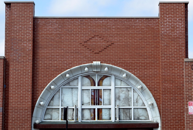
4236 S. Archer opened as the Crane Theater in 1916 – hence the grand archway; it operated as a theater into the 1950s. More recent retail tenants included a Color Mart wallpaper store in the 1970s, the Brighton Flower Shop until around 2007 (with a great neon sign), and the China Spa in 2008.

Both stores were refaced with modern red brick recently, first the theater in 2012 and then the storefronts on either side in 2013. All three came out much the worse – though at least the now-anomalous archway is no longer covered with a giant banner. The renovation included installation of bulbs into the long-disused sockets of the arch; the milky stained glass in the arched window appears to be an earlier addition by the short-lived China Spa. The current tenant, responsible for the red brick ruination, is the Gads Hill Center, a family and community support organization.

DSC_0155a

DSC_0156a

IMG_9256a

6901 S. Halsted Street – green brick striping punctuated by terra cotta medalions. The building contains apartments above and four retail outlets at the street level. The Family Loan Corporation was a long-time tenant, from the late 1940s through the 1950s. A liquor store came later, in the 1960s.


IMG_9280a

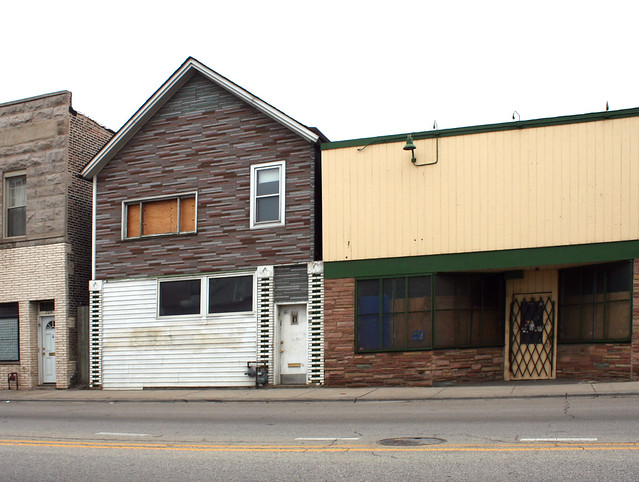
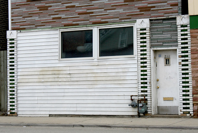
711 W. 47th Street – another curious specimen, a wood framed house tarted up with masonry accents at the street. The house is likely much older than the other buildings in this post, which likely date from the 1910s.

IMG_9281a


IMG_0646a2209 W. Cermak Road, at far right – another apartment-over-storefront configuration. It was a music store in 1919, likely the first tenant. After that the storefront housed a series of doctor’s offices, including one who practiced there for many years before moving out in 1942. The address made headlines in 1977, as another physician operating there was one of several who carried a notable new type of glasses case that the Tribune reviewed. The same doc made headlines again in 1981 under less auspicious circumstances – he and another physician were busted for supplying drugs to street gangs. 

IMG_9065a

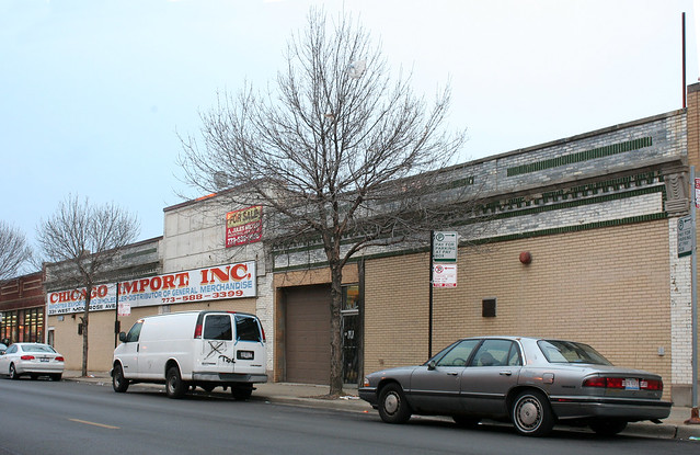
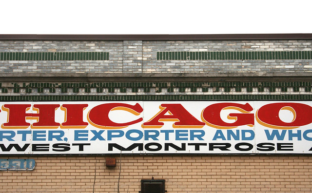
3311 W. Montrose Avenue – Chicago Import, Inc. The storefront has been infilled with blonde brick, and the limestone panels in the center appear to be a Mid Century addition.IMG_9070a

IMG_6355

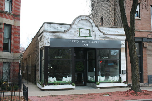
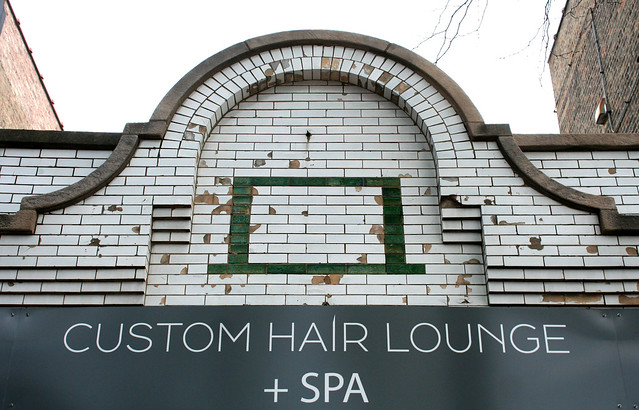
2107 N. Cleveland Avenue – Custom Hair Lounge + Spa – the green brick is merely a small accent amid handsome corbelling and an arched parapet wall, capped with limestone trim. It opened as a grocery store in 1919, and was the White House tavern in the 1950s (when an out of town patron tried to commit suicide in the restroom.) 

IMG_6359a

IMG_5998

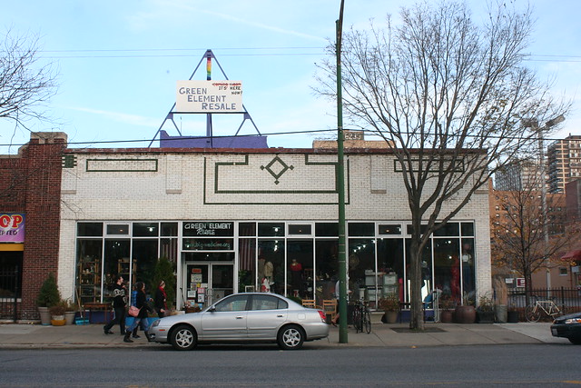
6241 N. Broadway, Uptown – Green Element Resale. Like the Casino Theater, this building has lost its upper parapet wall – as evidenced by a geometric design that is abruptly sliced off at the roofline. It was the Leon Beloian Rug Company in 1981.


IMG_8966a
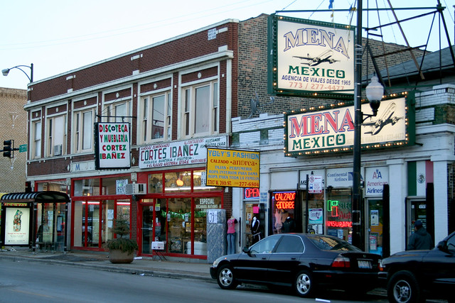
3707 W. 26th Street. Civic Savings and Loan in 1957. Vanek Travel Service in 1960. Mena Mexico Travel Agency today. This is actually a storefront addition – there’s a wood frame house behind it, still in use as a residence in 1964 when Mr. Arthur Vanek, owner of the first travel agency, passed away. The green was painted over some time between 2007 and 2011.


IMG_8722a

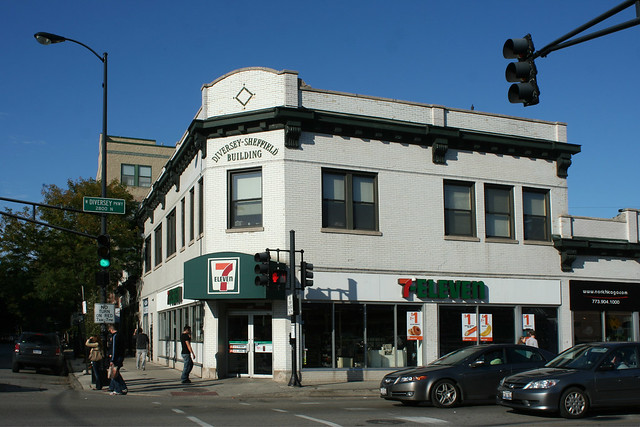
Diversey-Sheffield Building, 946-958 W. Diversey / 2801 N. Sheffield Avenue. Built in 1916, according to Chicago Architecture Info, this one featured an actual name emblazoned on the corner facade.  As with the Archer Avenue buildings, that facade was recently lost. According to the architect’s Facebook page, “the glaze on the brick was failing, the walls were deteriorating and the cornices falling off due to rust.” Modern brown brick replaced the 100 year old white glazed look. Its multiple storefronts have, and still do, housed a variety of tenants.

IMG_8723a

IMG_8726aThe fate of the two refaced stores flags up a major issue facing all these buildings – the glazing tends to flake off as the buildings age, particularly if water gets into the walls (due to poor roof or parapet maintenance) and can’t get out (due to a variety of factors.) The glazing is the brick’s finished surface, and without that surface the brick decays faster. These buildings could become an endangered species if owners continue to defer maintenance.

The Stripes Make It Go Faster

One of my favorite Mid Century Chicago decorative motifs is also among the simplest: patterns of overlapping vertical and horizontal bands, usually done in contrasting colors of brick, on the building’s walls. It’s a simple and stylish way to dress up a large wall space with no windows, particularly one on the building’s street frontage. They’re most powerful when used on a completely blank, flat, rectangular wall – a bold mass with a bold pattern inscribed on it. Often the accent brick is a bright color with a glazed finish, contrasting with the matte background brick around it.

These geometric patterns show up on MCM buildings across Chicagoland, but especially on the south side and inner south suburbs. Sadly, I was not able to uncover much about these buildings’ builders or designers, but there are some definite correlations among disparate sites that raise the old question of whether a single designer was repeating their style, or multiple designers were copying one another.

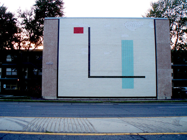
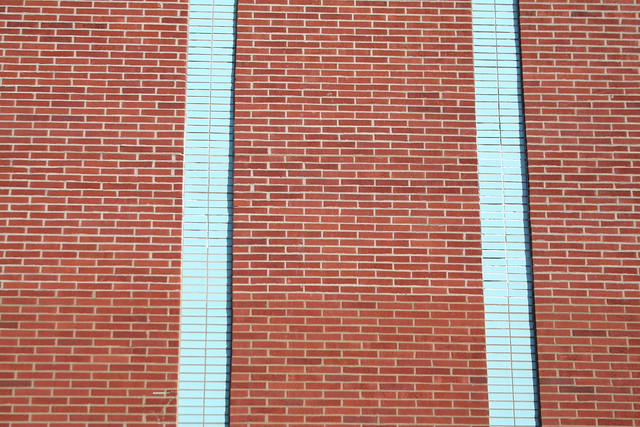
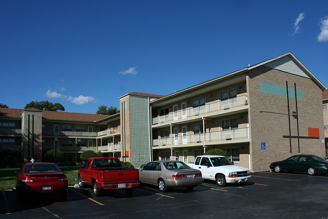
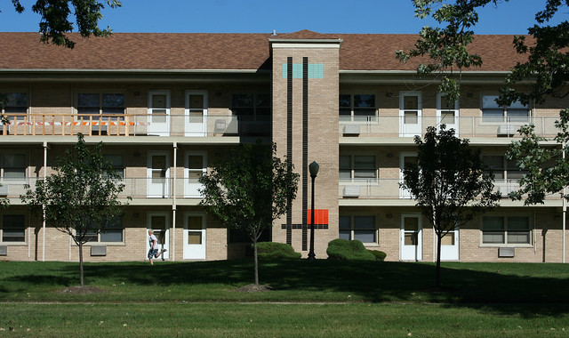
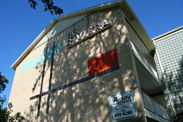
Chicago Mid-Century apartment building 7859 S. Rutherford Street at 79th, Chicago Ridge. Inevitably, those fantastic Mid-Century doors have been replaced by something cheap and inappropriate, some time during 2011-2012. This building is one of a row of four along 79th Street, and the last to retain its original entryway configuration. All four give street addresses for the side streets, rather than for their primary entries along 79th Street. Chicago Mid-Century apartment building   Chicago Mid-Century apartment building 10200, 10216, 10232 S. Crawford (aka Pulaski) Road, Oak Lawn – opened in September 1960, this trio of breezeway apartment buildings features a blank wall at the street, providing some measure of protection against the noise of busy Pulaski (aka Crawford); the geometric pattern serves as adornment for what would otherwise be an unfriendly gesture toward the street. These apartments are located only a block from Saint Xavier University and are home to many students. Chicago Mid-Century apartment building The backs of the same buildings features simple vertical stripes in a corresponding spot facing the alley: Chicago Mid-Century apartment building Chicago Mid-Century apartment building     Chicago Mid-Century apartment building The Riviera Apartments – 9739 S. Kedzie / 9732-9742 S. Troy Avenue, Evergreen Park. Opened 1962. Another breezeway building, with ornamental patterns on the end walls and the sheltered exterior stairwells.  Large light blue band, small red rectangle, connecting black stripes – if it is not the same designer as the Crawford buildings, then it’s at least someone who noticed them.  Chicago Mid-Century apartment building Chicago Mid-Century apartment building     Chicago Mid-Century apartment building 1436 W. Farwell Avenue, Rogers Park – Chicago, built by 1964

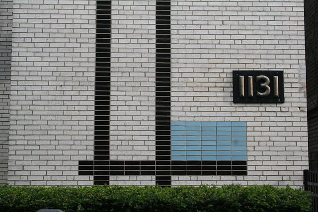
1131 W. Lunt 1125-1131 W. Lunt Avenue, Rogers Park – Chicago – opened 1963, replacing an “8 room brick” house that had stood on the lot previously. Developed by L & L Builders as luxury condominiums, when condos were a brand new commodity. The developers, apparently unaware of the doings down at south Kedzie, billed this building as “The Riviera Condominium at the Lake”.  (Or maybe they knew all too well, but figured nobody from that deep on the south side would ever venture up this far on the north side!)Chicago Mid-Century apartment building


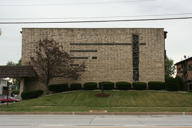
Chicago Mid-Century apartment building Deanville Condos at 9105-9111 S. Roberts Road, Oak Lawn – a pair of back-to-back walkup buildings with lower-level garages between them. Here, the vertical band is made of lava rock. Seemingly of a later vintage than the previous buildings, this pair also makes dramatic use of a quasi-mansard roof over the entryways.Chicago Mid-Century apartment building

Chicago Mid-Century apartment building 6616 S. Stewart Avenue, Englewood – Chicago. The entryway is marked by a pattern of colored geometric glass block.

Chicago Mid-Century apartment building 2030 N. Cleveland Avenue, Lincoln Park – Chicago, opened 1963. Perhaps the simplest possible iteration of the motif, but accented with a grid of raised bricks. The raised brick grid is itself another common Mid Century architectural motif that appears on many buildings across the region.


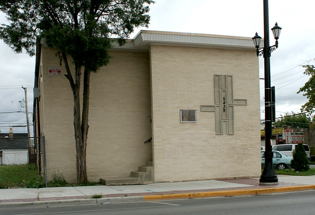
Chicago Mid-Century apartment building 5439 S. 55th Avenue at 25th Street, Cicero  – a unique example that uses concrete panels to form its decorative pattern.


Chicago Mid-Century apartment building 4343 W. 95th Street at Kostner, Oak Lawn, opened 1963. A variation on the theme, with thicker vertical bands and glass block accents. The color pattern is very similar to the alley wall of the Crawford/Pulaski buildings.Chicago Mid-Century apartment building

Some designs dispensed with the horizontal accents altogether, instead using a simple column of stacked brick banding.

Chicago Mid-Century apartment building 6148 Gage Avenue, Rosemont  


Chicago Mid-Century apartment building 9600? -9610? N. Greenwood Avenue, Niles – almost certainly the same builder as the previous example. The style is startlingly similar to that used on S. Harlem Avenue by Western Builders.

Chicago Mid-Century apartment building10425 & 10433 S. Longwood Lane, Oak Lawn – again, top to bottom vertical brick bands on a blank sidewall.

Rogers Park’s Metra Murals

IMG_1734

Every time the UP North Metra line embankment crosses a street, there are two ready-made mural canvases in the form of the retaining walls under the bridges. And one of the more delightful outcomes of Rogers Park’s recent participatory budgeting has been the addition of some amazing and wonderful murals to the underpasses (though honestly, I might have given higher priority to a weekly power washing of the sidewalks, which are covered in pigeon droppings.)

I made a quick survey this evening of the murals in my neighborhood, most of which are less than two years old.

At Pratt, this work has just appeared within the last month, and is still in progress. The first photo shows it a week ago:
IMG_1575a

Now its color palette has grown:
IMG_1766

IMG_1771

IMG_1770

Is it going to be 3D? I don’t know, but as a child of the 80s, I am pre-programmed to like this particular color palette.

The Pratt bridge itself bears some note. It is the only Metra bridge I know of that retains turn-of-the-century ornamentation:

IMG_1767

At Farwell, the northern underpass wall has a two-part mural by two different artists. West of the tracks, a surreal motor encounter, by Dan Bellini:

IMG_1756

On the east side, a similarly surreal scene by Jennifer Cronin:
IMG_1751

The two scenes are united as the road curves off onto a cliff overlooking the forest.
IMG_1755

Next up is my absolute favorite, at Morse, a colorful composition by Molly Zakrajsek and Ann Van Devender:
IMG_1738a

Each of the large, simple figures is colored not by solid fields but by a delightful profusion of tiny colored figures:
IMG_1745

IMG_1744

At Lunt, the Rogers Park Metra Station underpass is adorned with a themed pair of murals titled “Diverse Earth”.

IMG_1783

IMG_6232a

IMG_1693

As underpass murals go, the Lunt Avenue one is getting on in age, and parts have been lost to recent concrete spalling.

At the other end of the Rogers Park station, a series of colored panels with cartoon Cubist faces, by Christopher Royal, decorates the Greenleaf underpass:
IMG_1698

IMG_1699

On the other side of the same bridge, a stylized street scene by Zsofia Otvos:
IMG_1697

IMG_1700a

Last stop: the Rogers Avenue underpass. On the south side, an older and more traditional painting, without the strong-concept artistic styles of the more recent murals, seemingly done by school kids:
IMG_1720

IMG_1716

IMG_1713

On the north side,another strong-concept work – a series of colored panels, each with a slight pointer allowing the panel to be seen as a speech balloon spoken by a figure in the adjacent panel.

IMG_1715

At present, there are only three characters, so I improvised a couple more of my own.

IMG_1730

Is it incomplete? Are more figures coming? Or is it simply meant to evoke precisely this sort of interaction with the work?

All these works are somewhat ephemeral and transient. With luck, they may last five or ten years; however, they are doomed to a finite lifespan by both their medium and their setting. Paint fades and peels – but more than that, the concrete on which it sits spalls and crumbles.

IMG_1740

IMG_1701a

The bridges themselves won’t last forever, either – they’re a hundred years old, and their condition reflects that. These bridges are not part of Metra’s current bridge replacement plans (that project stops at Balmoral in Andersonville), but it’s a fair bet that once the current project is done (in 2018, according to plans), this batch will be on the table for replacement.

Neons I have known

It’s no great secret that historic neon signs are steadily disappearing from the Chicago landscape. The difficulty and cost of maintenance, along with the closing of older independent businesses, are the primary causes. Even when the signs are valued by store owners, sometimes they’re impractical to move, maintain or update.

Altered:

Jim Fong Chop Suey
Jim Fong Chop Suey, a modest sign on Touhy in West Ridge.

IMG_4198
IMG_6230
The former Erickson Jeweler sign on Clark Street in Andersonville, now a Potbelly’s.

American General Furniture...?
Tasemkin Furniture. Now covered up with generic paneling.

Replaced:

IMG_2060
IMG_4410
Eden’s Liquor on western Devon Avenue

Vanished:

The Washing Well sign
The Washing Well, Clark Street, Rogers Park. Not a neon, but still interesting.

E-Z Credit Wheels
E-Z Credit Wheels, a Western Avenue car dealership

Meyer Delicatessen
A.E. Meyer Delicatessen, Lincoln Square. The hanging sign has been relocated to the interior of the new store on this site; however, the storefront sign is gone.

Jubilee Gas for Less
Jubilee Gas for Less – this Lincoln Avenue sign has a surviving sister in the lobby of the Chicago History Museum.

DeMar's Coffee Shop Restaurant
DeMar’s Coffe Shop Restaurant – Chicago Avenue at Paulina

DSCF6070
Standee’s Coffee Shop, Edgewater – closed by corporate property managers who did not consider the 60-year-old restaurant “a solid investment”. Brilliant!

Gone dark

DSCF3462

PA305171
The “Z” Frank Cheverolet sign is a Western Avenue icon; however, it hasn’t been lit since around 2007, when the car dealership relocated. In the press, the owner stated that they’d love to donate or relocate the sign, but that it was just too big to move.

Capital-M Modernism in Rogers Park

Granville Gardens
IMG_2558

It’s always nice when the AIA Guide to Chicago notes a building I’m interested in, since that means most of the legwork (who, when, what style, original use, for what client) is already done. However, you’d think guys as educated and smart as the authors would, in a city like Chicago, know better than to tempt fate with statements like the following:

“Amazingly, the entire complex is in close to original condition.”

Granted, it’s been 17 years since those words were published in the first edition copy of the Guide, in reference to Rogers Park’s Granville Gardens apartments. But sure enough, when I first paid a visit to photograph the Moderne garden apartment complex, there was construction work underway in the courtyards. On a recent repeat visit, I discovered that the interior courtyards were being converted into parking lots. Augh!!

IMG_2586

IMG_4676

To be fair, the lots appear thoughtfully designed, retaining the two mature trees in the center of each of the two courtyards as well as a sizable band of grass around them. And hey, parking lots can always be removed. In theory.

IMG_4667

Granville Garden – now partially renamed Granville Court Apartments – stands amid the sides streets between Peterson and Devon, on the corner of Hoyne and Granville. It’s a complex of 14 buildings, connected by open terraces in groups of three and four, and arranged around the two courtyards. It’s a lovely, thoughtful way to manage housing, dense but not crowded.

IMG_4680

IMG_4668

IMG_2570

The buildings went up as a privately financed venture under government insurance and supervision, in a time when not much was being built in Chicago or elsewhere. The architects were Rissman & Hirschfeld, the year was 1938, and the styling is Moderne, with prominent corner windows and thin mullions which (knock on wood) still remain intact. For now. Architectural interest is provided by brick banding at the exterior corners, curved concrete entry canopies with scalloped edges, glass block and curved walls in the entry foyers, and the stepped massing of the buildings. Look close at the entryways and you may find some surprisingly sleek original door hardware still in place.

IMG_4695

Winchester-Hood Garden Homes
IMG_4135

Granville Gardens are not the only early Modernist housing development in Rogers Park, nor even the only one in this neighborhood. Just down the street is an even bigger complex, occupying parts of four contiguous, partially-developed city blocks. The Winchester-Hood Garden Homes were built from 1948 to 1951, to the designs of Holsman, Holsman, Klekamp and Taylor.

IMG_4158

HHK&T liked their angles. Not only do short angled bay windows form the buildings’ most distinctive feature, but the site plans place nearly all of them at slight angles to the streets and to each other. The four block plans are all different, as none of the available parcels were the same shape and size. The result is a delightful variety in the resulting garden spaces between buildings, with no two alike. Meandering sidewalks lead through the buildings and to their doors.

IMG_4149

The buildings themselves are almost Spartanly simple, though many feature three sculptured designs piercing the walls of their stairwells. The three sculptures – stylized versions of Zodiac figures Aeries, Pisces, and Capricorn – were designed by architect Coder Taylor. Each is only semi-solid, allowing light from the stairwell to illuminate its outlines at night.

IMG_4153

Winchester-Hood apartments

IMG_4720

The resulting effect in the evening, of lantern-like lights filtering from the buildings, the curving paths, and the mature trees, is like walking through some celebratory forest village.

Winchester-Hood Garden Homes

Winchester-Hood has a near-twin down on the south side, the Parkway Gardens apartments at 6415 S. Calumet. Fenced off, surrounded by parking, and in a generally rough section of town, it’s not nearly as inviting. I have yet to photograph it.

Lunt Lake Apartments
IMG_4623

HHK&T were busy after World War II. In addition to Winchester-Hood and Parkway Gardens, they acted as consulting firm to Mies van der Rhohe’s famous Lake Shore Apartments. And in 1948, the firm designed a second Rogers Park complex, the Lake Lunt Apartments.

IMG_4624

IMG_4649

Consisting of three buildings on a single large lot, Lunt Lake stands on one of the many dead-end street stubs east of Sheridan, that end at the lakefront. Lunt Lake isn’t as bucolic as its sister development, but its structures are cut from the same cloth.

One might expect a U-shaped arrangement facing the lake, but instead the buildings are simply arranged in a line along the street, doing little to take advantage of the lakefront location. Only one receives lake views. These structures also lack the the fascinating stairwell sculptures of the other complex, and the view of them from lakeside is a bit underwhelming.

Lunt-Lake Apartments

IMG_4619

Lunt-Lake was finished at a cost of $1,000,000 – quite a steal for putting up three buildings! Lunt-Lake and Winchester-Hood were both featured in Architectural Forum of January 1950, which noted the unusual brickwork. Designated “rowlock bond”, it was combined with poured, steel reinforced concrete to create a very thin, strong bearing wall.

Today, the buildings look as good as new. May they remain unblemished for another 60 years to come!

Howard Street

Howard Street marks most of Chicago’s northern-most limit, though the city line jumps a few blocks northward from Clark Street to the lake. Walking down Howard, though, you wouldn’t suspect you were on the farthest hinterland of the great metropolis. Howard is fully qualified to be the main street of an entire town, with grand commercial buildings, a magnificent theater, and highrises both old and new.

Howard Street

The catch, of course, is that Howard marks the end of Chicago in technical terms only. To the north lies the great suburban town of Evanston, only the first of many suburban outliers that stretch nearly to the Wisconsin border. In that sense, Howard is not very far from the center, and its compelling architecture merely reflects that fact.

Howard Street

Howard also benefits from its status as a transportation hub. The Red Line, one of CTA’s busiest rail lines, terminates there, handing things off to the suburban Purple and Yellow lines. Numerous bus lines arrive here as well.

Howard Street Red Line entrance

Howard has a reputation as a not-so-nice place in general, a reputation which tends to spill over to the rest of Rogers Park. It’s a bit inexplicable, given its location. Well-served by rail and bus, sandwiched between tony Evanston and the inevitable northward march of gentrification, only minutes away from the lake, it is only a matter of time before real estate here goes through the roof. When it happens, the architecture will be waiting.

Howard Street

Howard Street

The Paulina Building is just one of many ornate highlights along the strip. Another is the Werner Brothers Fireproof Warehouse, a brick box with a fancy front.

Werner Brothers Fireproof Storage building

Werner Brothers Fireproof Storage building

Werner Brothers Fireproof Storage building

The high point is the Howard Theater Building (Henry L. Newhouse, who also did the south side’s similarly-styled Atlantic Theater.) Like so many other Chicago neighborhood theaters, it was built in 1917, in the rush of post-World War I escapism. The auditorium was razed in 1999, but the lobby and commercial portion remain, converted to condominiums, and still spectacular.

Howard Theatre

Clad in shimmering silk

Howard Theatre detail

Heading east, there’s a short gap for a public park, followed by another jewel, a massive 1925 apartment building named the Broadmoor. The entrance and the corner shield ornament are both extravagantly luscious.

Howard Street

The Broadmoor

The Howard Street commercial district comes to its eastern end not with a bang or a whimper, but with a delightful profusion of 2- and 3-story flatiron buildings, a reaction to the acute angles cut by Rogers Avenue as it slices through the orthogonal grid.

Howard and Rogers

Flatiron

Like S. Michigan, the district is a sampler of architectural styles and trends, yet totally different in its atmosphere. Its prospects are likewise different; a huge condominium building recently went up, testifying to this area’s rising future. The problems will pass away in time; residents may well struggle with the rising costs. But the beauty of the architecture will remain.

Casa Bonita condominiums

Casa Bonita Condominiums

The U-shaped apartment building is a very standard 1920s Chicago development scheme, allowing a tall building with lots of rental units, while still providing each with plenty of natural light. The resulting courtyard can also become an amenity, providing a slice of nature to the residents.

These buildings are decorated in a wide variety of styles, but far and away the most elaborate one I’ve found to date is the Casa Bonita, on Ridge Avenue just north of Touhy.

Casa Bonita Condominiums

Designed in 1928 by Alexander Capraro and Morris Komar, it’s slathered in glazed white terra cotta ornament. Sculpted faces, spiral pilasters, brackets, medallions, and floral decoration are only part of the list.

Casa Bonita Condominiums

The building is well-maintained today, having been converted to condominiums. Plantings surround a small reflecting pool with a sculpture in the center.

Two trees near the open end of the courtyard ensure that it’s almost invisible from Ridge (and unfortunately make photographing the building as a whole impossible.)

Casa Bonita Condominiums

But those trees also provide a screen from the street; a grade change allows the courtyard to be sunken half a flight down from the street, further sheltering it from the busy traffic on Ridge. The entire building as it stands is a testimony to how wonderful controlled outdoor space can be, a literally shining example of the wonderful power of architecture.

Casa Bonita Condominiums

More detail photos may be seen at my Flickr space.

Something funky in Rogers Park

At first glance, it’s nothing special, just another dull 1960s apartment block, sandwiched between other buildings older and newer, larger and smaller.

Funky apartment building

But… what’s that stuff on it?

Funky apartment building

Glorious! A wall of cream brick, broken by a perfectly proportioned band of darker brown flecked with a grid of the cream brick, and with an assortment of inset abstract sculpture in concrete.

So… did somebody just have some sculpture laying around, or what?

Funky apartment building

Funky apartment building

While these creative little bits of abstract sculpture are no doubt the highlight the building, there’s also…

Funky apartment building

…one heck of an entryway, combining more of the checkerboard brick pattern from the front facade with concrete pattern blocks and a pair of demarcating brick piers. It’s a tiny celebration!

It’s at 1618 W. Sherwin Avenue, just off of Clark Street. It was built around 1962; the architect is N. S. Theodorou.

"The Shame of it All…"

Oh, the shame of it all!

I never saw what was here before; it was gone by mid-2005 when I first saw the sign. Whatever it was, it was nice enough to inspire this protest from the neighbors:

The shame of it all…

1830 West Lunt was an 1890s single family farmhouse SOLD and DEMOLISHED to be replaced with TWO houses

“May those who love us, love us
And those that don’t love us, may God turn their hearts.
If he doesn’t turn their hearts, may he turn their ankles,
so we will know them by their limping.” — an old Irish saying

Pleaes let us know if you see any developers, realtors, solicitors, or profiteers limping about.

Contact Alderman Joe Moore at the 49th Ward Office…with your opinions about zoning that allows this type of development to continue.

Neighbors for Responsible Zoning (“The Zoners”)

Oh, the shame of it all!
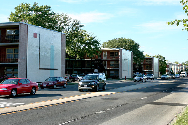
The new houses aren’t much to write home about, at least from the outside. They’ve got stagefront brick facades, with vinyl siding behind (because no one can see the side of the house. It’s invisible, don’tchaknow.) Why brick? I don’t know!! None of the houses around them have brick. I guess brick automatically equates to “quality”, and who can argue with quality?

They’re not out of scale with the neighborhood or anything; in fact they’re a bit too small to stand comfortably alongside the three-story older houses that surround them.

What makes the whole thing even more darkly hilarious is that the two new houses have sat empty for over two years now. One isn’t even finished — it only recently got its front porch, which still hasn’t been painted. One of the houses finally sold a month or two back, and the builder’s sign now reads “Only one left!” Yeah, better hurry there, folks.

The larger issue, of course, is how one should handle the eternal flux of city neighborhoods. This particular block is immensely valuable, because it’s right next to a Metra stop. 20 minute access to downtown? That’s an irresistible pull for developers. It’s amazing this hasn’t happened to the rest of the block.

Cities are always changing. Sometimes it happens slowly, in small bits and pieces like this. I don’t always like the results, but I have my doubts about the alternatives. Can you really constrain a city, tell it where to grow and where not to? Should the city remain physically stagnant? Where should growth be allowed? At what point does a building have enough architectural and historical merit to be worth curbing that growth?

All are questions with no fixed answer, but as I see endless protests and complaints about the supposed scourge of condominiums (people with money are moving into the city?! OH NOEZ!!), I find myself wondering just what people do want to happen in their city. Should it remain the same forever?